• HomeFront Page
  • Portfolioview our work
  • Serviceswhat we offer
  • BlogInspiration
  • ContactGet in touch
You are here: Home » Visual Inspiration
  • About

    This blog is written by The Affordable Design creative team as a way to share art & design that inspires us. We provide WordPress web development in Palm Beach County and beyond.

  • Contact Us

    Phone: 561-444-9190
    E-mail: nick@theaffordabledesign.com

    The Affordable Design serves all of Palm Beach County with professional, contemporary design both print and digital - and specializes in WordPress.

    • Home
    • Portfolio
    • Services
    • Blog
    • Contact

19 Aug

In a Celebratory Series, Photographer Toby Coulson Documents the Eccentric Fashions of Designer Oumou Sy

Posted by Categories: Blog Comments are off for this post
In a Celebratory Series, Photographer Toby Coulson Documents the Eccentric Fashions of Designer Oumou Sy

All images © Toby Coulson, shared with permission

When photographer Toby Coulson met iconic Senegalese fashion designer Oumou Sy in Dakar, they decided to photograph some of her most distinctive garments. “The city has an amazing energy especially as the sun goes down. I thought it would be an amazing accompaniment to Oumou Sy’s theatrical and outlandish couture pieces,” Coulson shares with Colossal. Together, they observed the area for a few days to chose spots and time the sunlight.

The result is a captivating series of photographs, which were originally published in Document Journal,  that capture the myriad textures and patterns of Sy’s unorthodox designs: A woven accessory envelops a model, lining her arms, head, and torso in circular sculptural forms. Created as a tribute to Issa Samb—a Senegalese painter, sculptor, performance artist, playwright, and poet—the patchwork-style jacket is so large that the wearer appears to be balancing on stilts as he towers above rooftops. While focused on the garments, each photograph also frames the beige architecture and sandy streets of Dakar.

Sy finds inspiration everywhere, opting to see creativity in all aspects of life and to communicate her ideas through the mundane. She explains in an interview:

I take what I can and make it my own. I enjoy working with different materials, things that surround me, that I come across in my everyday life. I’m a self-proclaimed hunter and gatherer of things; I look for natural elements to work with [such] as plants, herbs, barks, and natural dyes, using either traditional or modern techniques. I choose a material and look for a way to highlight it. I’ve never learned to read and write, and so my fashion is the most important vessel for the expression of my creativity.

The designer’s penchant for bold, dramatic fashion is informed by Senegalese culture, which prizes style and clothing as a mode of expression, beauty, and power. Coulson’s photographs translate those traditions and values through visual documentation. “It was very fulfilling to do a fashion shoot that wasn’t about selling the latest clothes and more about celebrating the work and influence on Senegalese culture of Oumou Sy,” he notes.

To follow Coulson’s photographs capturing the lives of people around the world, head to Instagram.


TOP
18 Aug

Utilizing Modern 3D Printing, Artistic Duo Rael San Fratello Constructs Coiled Earthen Architecture

Posted by Categories: Blog Comments are off for this post
Utilizing Modern 3D Printing, Artistic Duo Rael San Fratello Constructs Coiled Earthen Architecture

All images © Rael San Fratello, shared with permission

Modern architectural building methods and Indigenous materials converge in the latest endeavor by Ronald Rael and Virginia San Fratello, titled “Casa Covida.” The earthen structure is part of a MUD Frontiers/Zoquetes Fronterizos that centers on Pueblo de Los Ángeles and the ways technological advances can work in unison with historic mud-based designs. “Casa Covida” contains a bathing pool, sleeping areas, and fireplace seats for two.

To create the three-room home, the duo employs a custom, portable robot that they transport to various sites, allowing them to dig soil and other materials and immediately shape it into the necessary structures. Utilizing clay and mud, the building process is informed by the practices of Ancestral Pueblo peoples and Indo-Hispano cultures of northern New Mexico and southern Colorado. When wet, the natural materials are layered in zigzag-like coils. The undulating, textured facades generally are made with a few rows to provide insulation from the nighttime cold.

MUD Frontiers was a recent recipient of a 2020 Art + Technology grant from LACMA. It strives to consider “traditional clay craft at the scale of architecture and pottery. The end goal of this endeavor is to demonstrate that low-cost and low-labor construction that is accessible, economical, and safe is possible,” a statement says.

Based in La Florida, Colorado, and Oakland, respectively, Rael and San Fratello are known for subversive projects at the intersection of art and architecture, like the neon pink teetertotters slotted through the U.S.-Mexico border wall. Follow their latest sustainable works on Instagram. (via Hyperallergic)


TOP
18 Aug

Corporate Profile Booklet Template with Blue Accents

Posted by Categories: Blog Comments are off for this post
Corporate Profile Booklet Template with Blue Accents

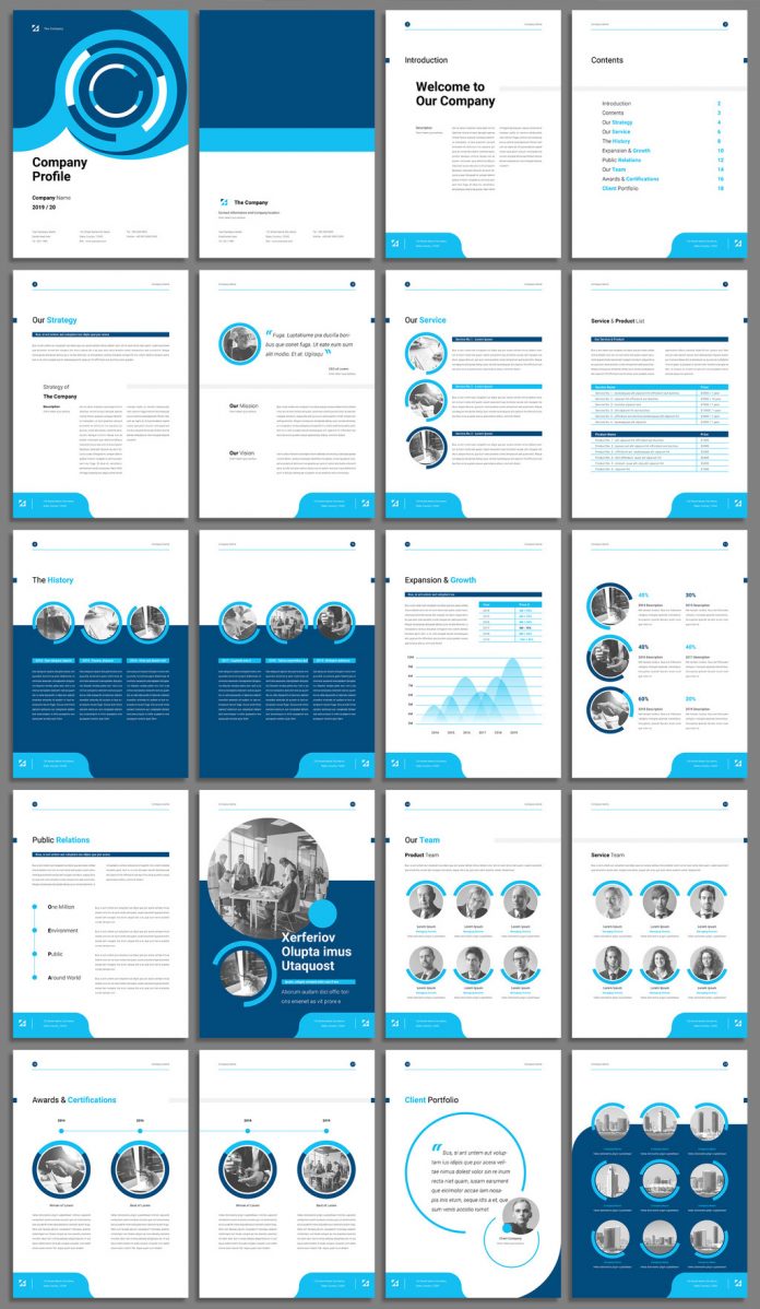
Available as fully editable Adobe Stock template, this corporate profile booklet layout will help you to present any kind of high-quality business the right way.

It’s time to introduce you to another premium design asset made for high-quality brands. Created by graphic designer and Adobe Stock contributor, @Sirisako, this corporate profile booklet template comes with 20 fully editable pages. Designed in two standard sizes A4 and US Letter, the Adobe Stock template is the right choice for everyone looking for something in a modern and clean style. Every part is completely customizable. You can add your own text, graphics, and images with just a few simple clicks. Just have a look at the unique cover design followed by a uniform, clean layout.

Please note, the download file requires Adobe InDesign. You can get the latest version from the Adobe Creative Cloud website, just have a look here. Feel free to learn more about this corporate profile booklet template by clicking on the following link or have a look at the images below.

Download at Adobe Stock
Corporate Profile Booklet Template with Blue Accents
You can purchase the license for this corporate profile booklet template here.
Download at Adobe Stock

Are you interested to see other premium graphic design resources? Our recommended Templates category covers a wide range of topics. Just have a look here. In addition, you can find a selection of trending typefaces in the Fonts category.

Subscribe to our newsletter!

The post Corporate Profile Booklet Template with Blue Accents appeared first on WE AND THE COLOR.

TOP
18 Aug

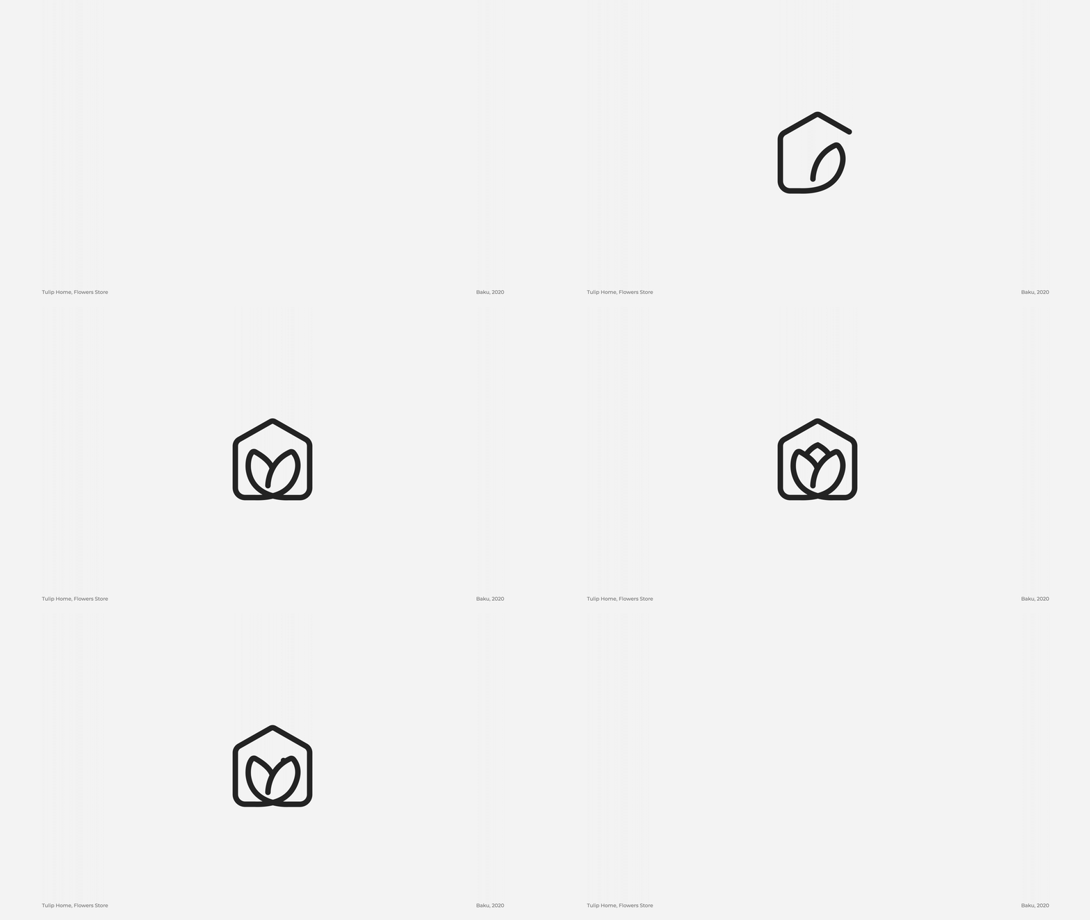
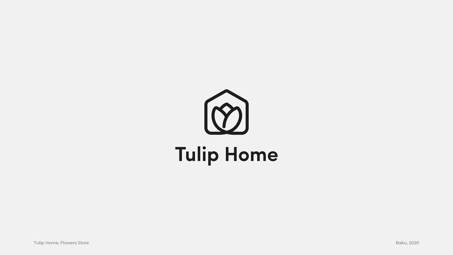
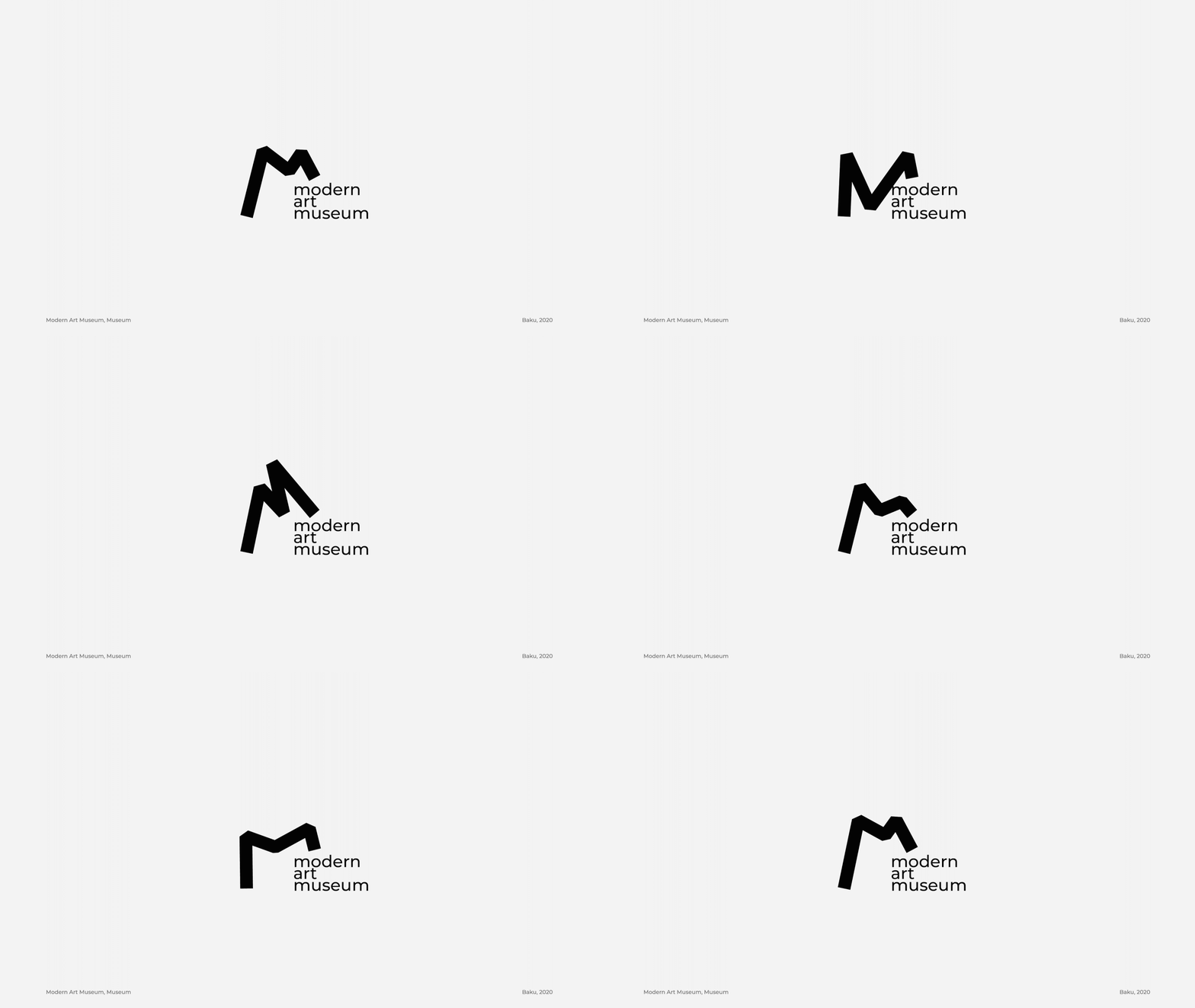
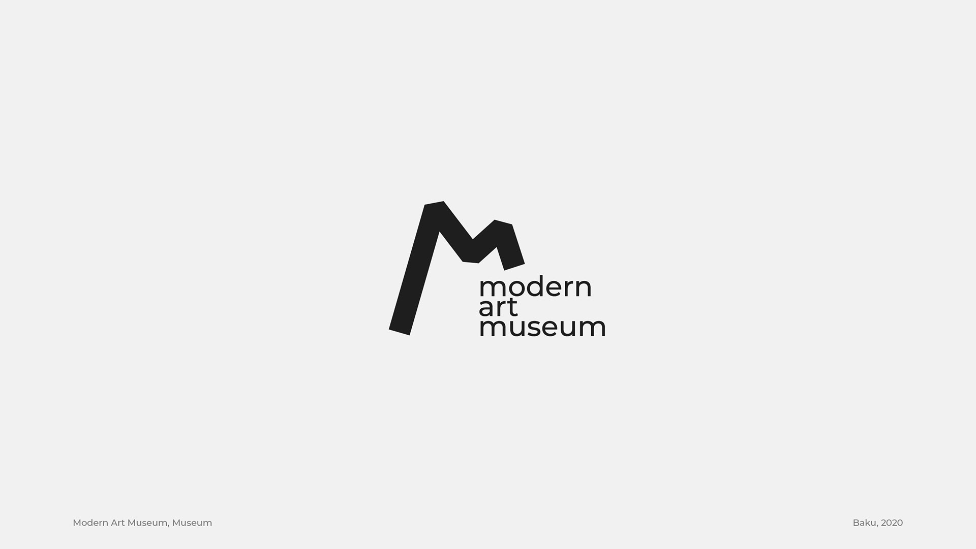
Logos and Marks Created by Mubariz Yusifzade in 2020

Posted by Categories: Blog Comments are off for this post
Logos and Marks Created by Mubariz Yusifzade in 2020

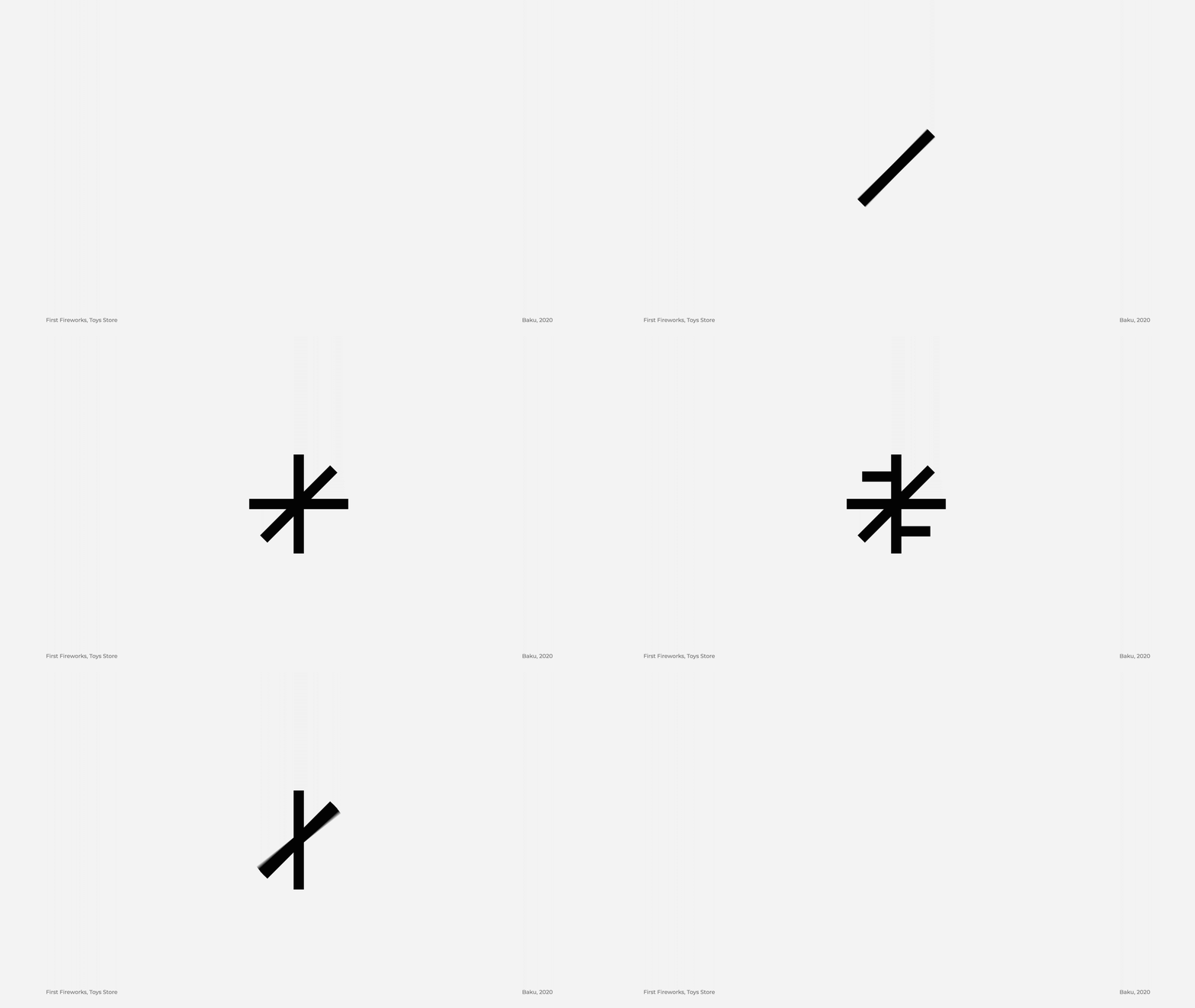
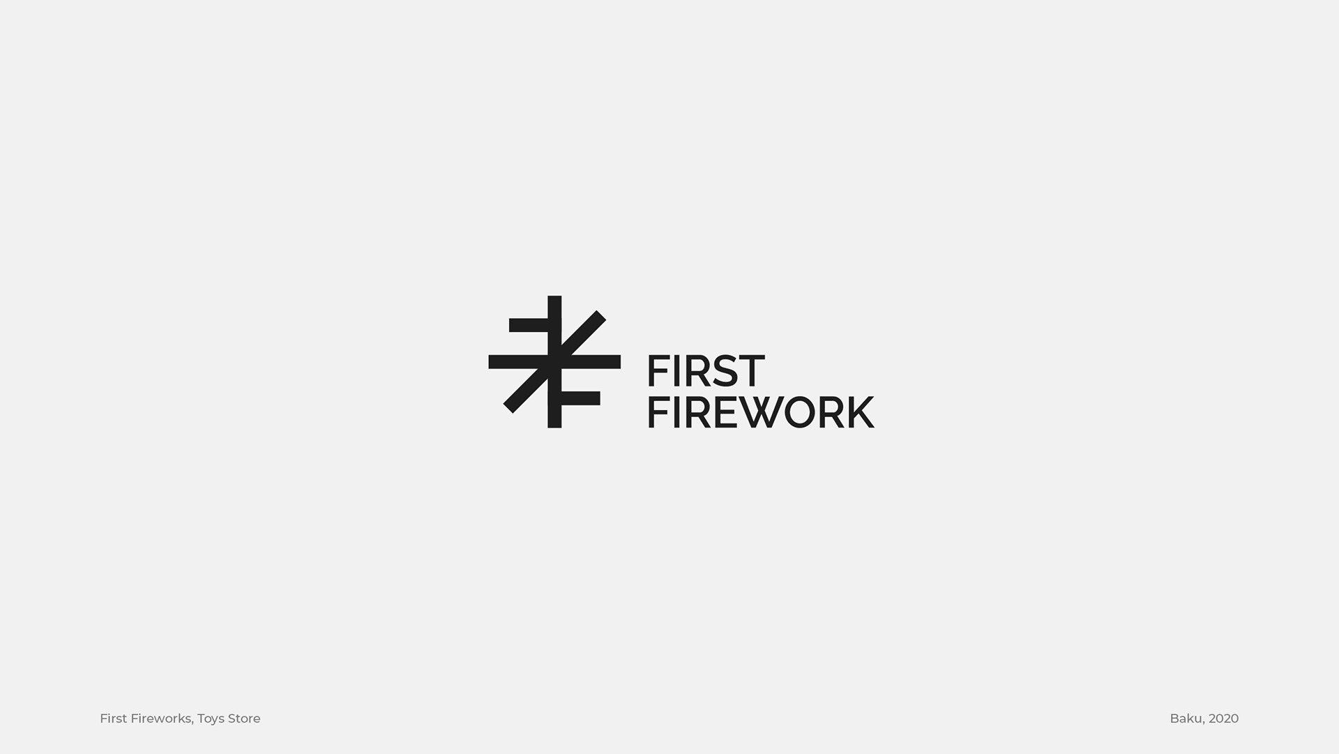
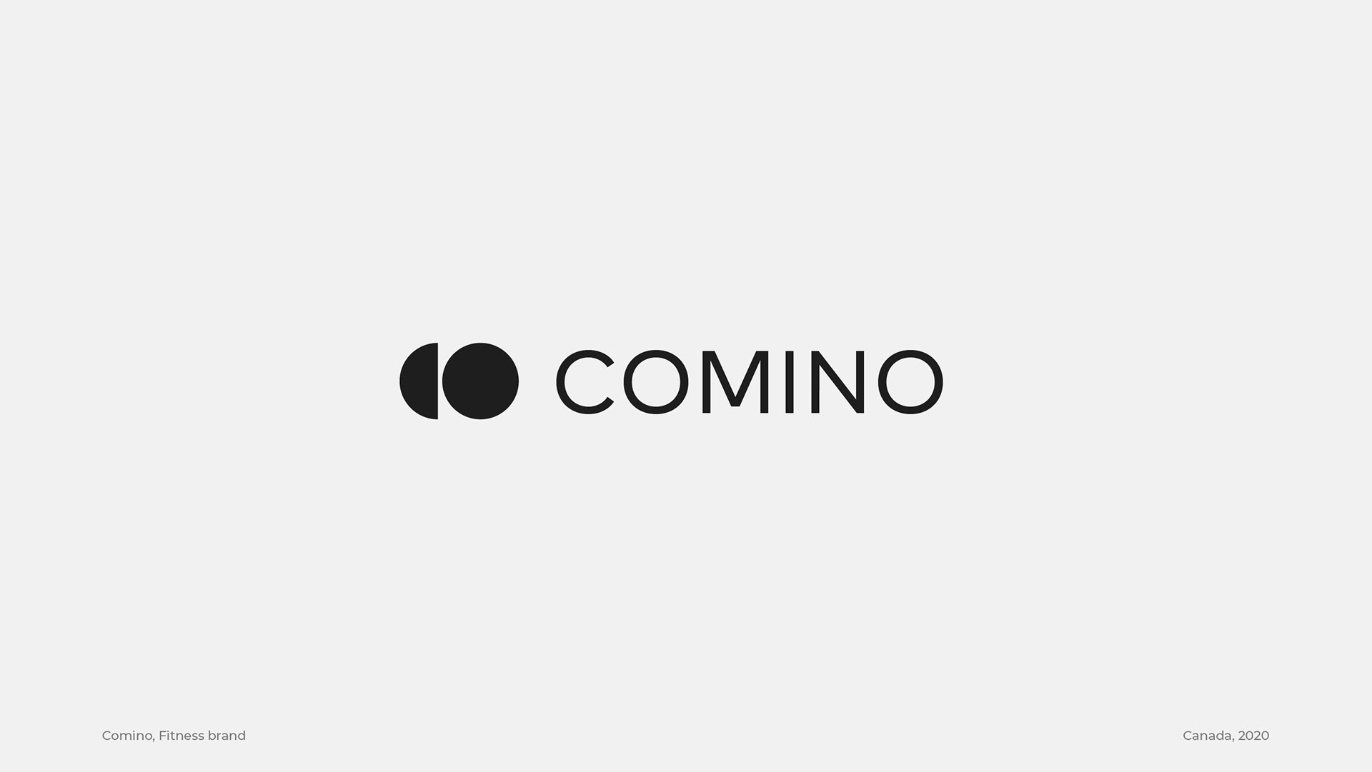
Have a look at our selection of logo designs created by Mubariz Yusifzade in 2020.

Mubariz Yusifzade is a Baku, Azerbaijan-based graphic designer with the passion to help companies establish their visual identities by providing modern and creative branding and logo design solutions. Below you can find a handpicked selection of logos and marks all created by Mubariz Yusifzade in 2020.

The talented designer is posting frequently new updates of his latest logo creations on Behance. You can see them all here.

Logo design by Mubariz Yusifzade.

All images © by Mubariz Yusifzade. Feel free to browse through our Graphic Design and Branding categories for further inspiring work created by talented graphic designers from around the globe. Furthermore, you can find useful graphic design resources in our Templates category or trending typefaces in the Fonts section.

Subscribe to our newsletter!

The post Logos and Marks Created by Mubariz Yusifzade in 2020 appeared first on WE AND THE COLOR.

TOP
16 Aug

Revay Branding by Creative Agency Sid Lee

Posted by Categories: Blog Comments are off for this post
Revay Branding by Creative Agency Sid Lee

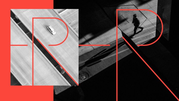
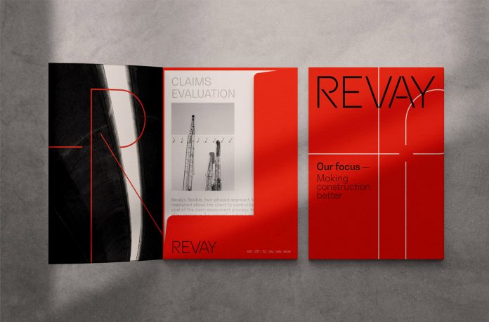
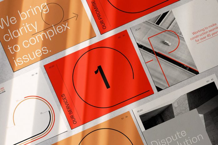
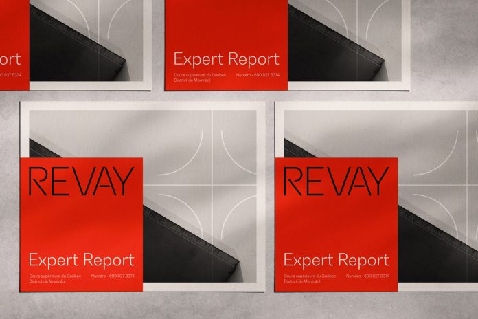
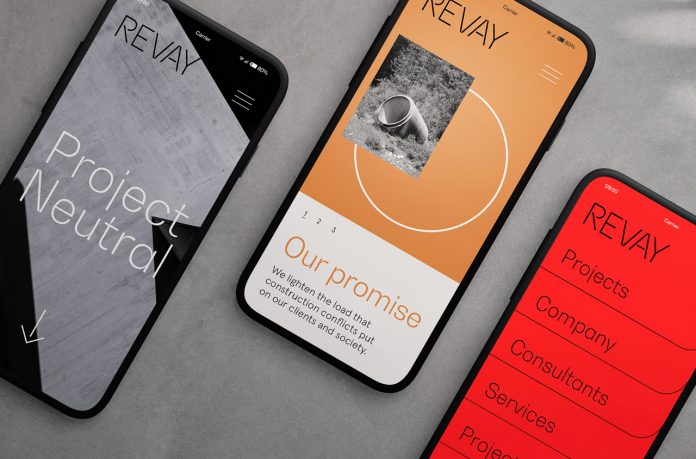
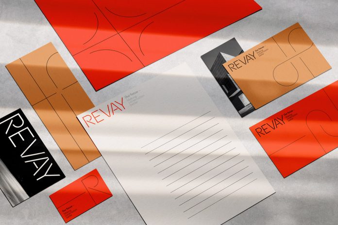
Agency Sid Lee has created a brand identity for construction management firm Revay that is solid yet light, organic yet angular.

With 600 professionals working globally out of offices in Montreal, Toronto, New York, Paris, and LA, Sid Lee is a leading creative agency specializing in a variety of branding and advertising projects. The agency was commissioned to work on a new brand identity for Revay, a construction management firm specializing in overcoming complications and stimulating developments. Sid Lee came up with a logo design based on the letter ‘R’, which is inspired by the loops of highway interchanges. It acts as a visual magnifying glass that can be used independently or together with dynamic workplace images. Solid yet light, organic yet angular, the visual identity tells Revay’s brand story while reflecting their ability to bypass issues through care and attention to detail.

Below you can find a few images of the branding project. For more of Sid Lee’s creative work, please visit their website or have a look at the portfolio on Behance.

Revay branding by creative agency Sid Lee.

All images © by Sid Lee. Do not hesitate to browse through our Graphic Design and Branding categories to find other inspiring work created by freelance graphic designers and leading studios from around the globe.

Subscribe to our newsletter!

The post Revay Branding by Creative Agency Sid Lee appeared first on WE AND THE COLOR.

TOP
14 Aug

An Interactive Display Color-Codes Hundreds of Historical Mineral Illustrations

Posted by Categories: Blog Comments are off for this post
An Interactive Display Color-Codes Hundreds of Historical Mineral Illustrations

All images © Nicholas Rougeux

Throughout the early 19th century, naturalist, illustrator, and mineralogist James Sowerby published 718 color renderings of minerals, which he accompanied with their characteristics, classifications, and other names. A Chicago-based designer recently reproduced those centuries-old illustrations in an expansive interactive arrangement. Nicholas Rougeux (previously) color-coded Sowerby’s depictions—a tedious process that required the designer to restore each mineral to its original hue and took four months to complete—from two compendia, British Mineralogy and Exotic Mineralogy, which were published between 1802 and 1817. The result is a magnifiable exhibit that captures the incredible diversity and detail of Sowerby’s geological studies.

Check out the eye-catching display on Rougeux’s site, and for those who want a physical copy categorizing the diverse materials, the designer is selling posters, too. Keep up with his contemporary approaches to historical scholarship on Twitter, Behance, and Instagram. (via Kottke)
 

TOP
13 Aug

Barcelona Pensa Branding and Posters by Studio Carreras

Posted by Categories: Blog Comments are off for this post
Barcelona Pensa Branding and Posters by Studio Carreras

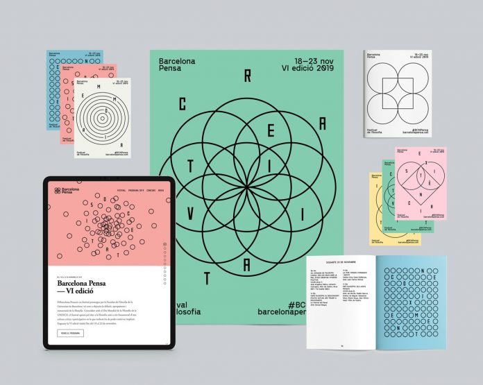
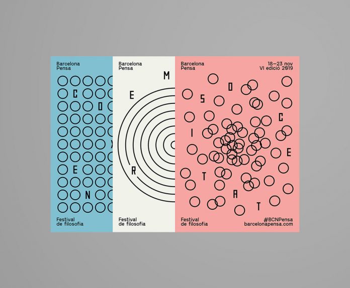
Studio Carreras has created a visual identity and poster series based on minimalist geometric shapes and symbolism for philosophy festival, Barcelona Pensa 2019.
Studio Carreras is involved in the graphic design process and the conception of the visual identity since the beginning of Barcelona Pensa, a philosophy festival consisting of numerous individual events. On its 6th edition in 2019, the festival hosted over 40 events grouped in six main pillars, each with its own graphic representation to induce reflection. These pillars are Society, Memory, Equality, Knowledge, Existence, and Creativity.

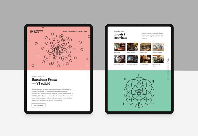
In addition to the creation of a printed program, another brand collateral has been designed including a responsive website, posters, postcards, tote bags, and a long banner that was displayed in the historic building of the University of Barcelona.

Below you can see some images of the communication and branding materials. For more of Studio Carreras’ creative work, please visit their website or follow them on Behance.

Barcelona Pensa branding and poster series by Studio Carreras.

All images © by Studio Carreras. If you want to see other inspiring projects, we recommend you to browse through our Graphic Design and Branding categories.

Subscribe to our newsletter!

The post Barcelona Pensa Branding and Posters by Studio Carreras appeared first on WE AND THE COLOR.

TOP
12 Aug

Five Striking Adobe Photoshop Text Effect Templates

Posted by Categories: Blog Comments are off for this post
Five Striking Adobe Photoshop Text Effect Templates

Make your titles visually outstanding with these five ready-to-use Adobe Photoshop text effect templates.

Created by Adobe Stock contributor @Marcel, these high-quality text effects are great for those who want to add a special visual touch to their headlines, subheadings, or short quotes. All five text effect templates are based on a high resolution and very easy to use. Whether you want to play with various colors, liquid styles, smoke, or even want to create an explosive text effect, the following Photoshop actions are exactly what you are looking for. Every effect has been designed with great attention to detail in order to produce a hyper-realistic effect.

Please note, these text effects require Adobe Photoshop. You can get the latest version from the Adobe Creative Cloud website—just have a look here. Below you can find all five Photoshop text effect templates including the respective link to the download source.

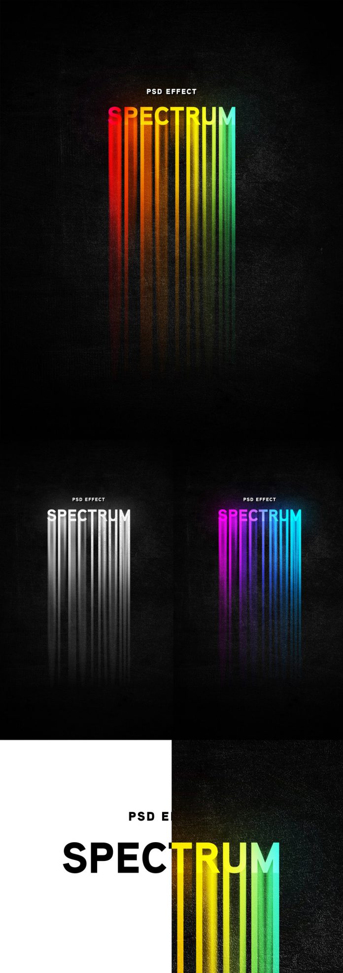
Long Barcode Color Shadow Effect Template

This long barcode color shadow effect is available as ready-to-use Photoshop action.
This long bar-code color shadow effect is available as ready-to-use Photoshop action. Just have a look here.
Download at Adobe Stock

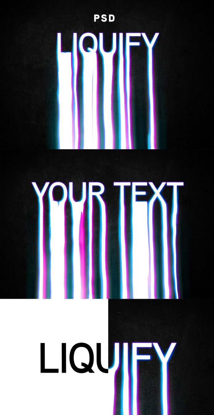
Liquid Text Effect Template

The stylish liquid text effect template can be used in Adobe Photoshop.
The stylish liquid text effect template is available for purchase here.
Download at Adobe Stock

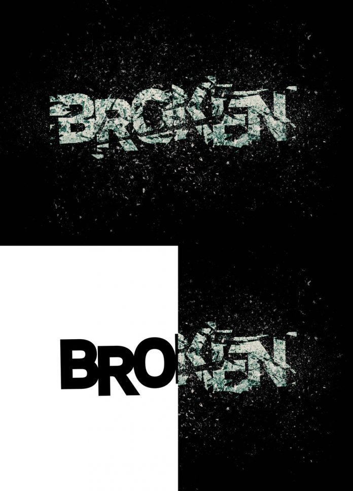
Text Explosion Effect

Using this Photoshop action, you can create exploding text effects in no time
Using this Photoshop action, you can create exploding text effects in no time. Just have a look here.
Download at Adobe Stock

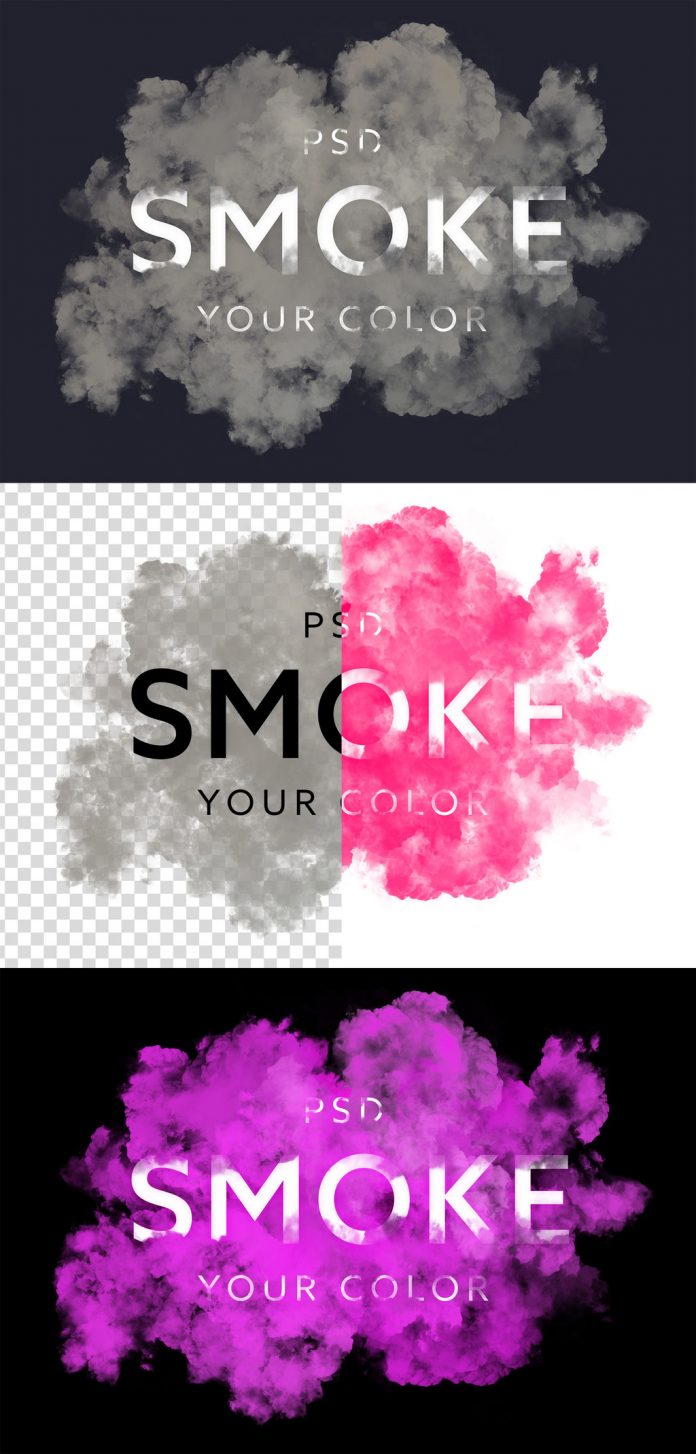
Smoke Text Effect Template vol. 1

This hyper-realistic smoke text effect is available as an easy-to-use Photoshop template.
This hyper-realistic smoke text effect is available as an easy-to-use Photoshop template here.
Download at Adobe Stock

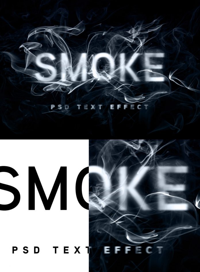
Smoke Text Effect Template vol. 2

This is another smoke text effect template for Adobe Photoshop.
This is another smoke text effect template for Adobe Photoshop. You can get it here.
Download at Adobe Stock

If you want to discover more graphic design resources, feel free to browse through our Templates category. The section includes reviews of countless design assets for creative professionals. No matter what you are looking for, premium logo templates, icons, textures, patterns, website themes, illustrations, or vector graphics, you will find it in the Templates category.

Subscribe to our newsletter!

The post Five Striking Adobe Photoshop Text Effect Templates appeared first on WE AND THE COLOR.

TOP
12 Aug

30 Day Logo Challenge by Gianni DeSilva

Posted by Categories: Blog Comments are off for this post
30 Day Logo Challenge by Gianni DeSilva

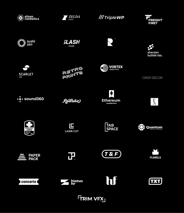
30 logos in 30 days, a personal design challenge by Gianni DeSilva.

Gianni DeSilva is a Boca Raton, FL based graphic designer who mainly specializes in a wide range of branding projects. As a personal project to challenge and improve his own creative skills, he decided to produce 30 unique logos in 30 days. On a daily basis, he managed to create a great logo series consisting of unique designs in different styles. Just have a look below or visit Gianni’s website to see every single logo in detail.

30 logos designed in 30 days by Gianni DeSilva.

All images © by Gianni DeSilva. Do not hesitate to browse through our inspiring Graphic Design category to find other outstanding work created by talented graphic designers from all over the world. In addition, you can find highly professional logo templates and other design assets in our Templates category.

Subscribe to our newsletter!

The post 30 Day Logo Challenge by Gianni DeSilva appeared first on WE AND THE COLOR.

TOP
11 Aug

Swiss Graphic Design Inspired Posters based on Typography Terms

Posted by Categories: Blog Comments are off for this post
Swiss Graphic Design Inspired Posters based on Typography Terms

Graphic designer Mehman Mammedov has created a Swiss graphic design inspired series of posters based on the Adobe Fonts Glossary Typography Terms.

Using Adobe’s Fonts Glossary Typography Terms as a reference, Mehman Mammedov has created an amazing poster series inspired by the principles of Swiss graphic design. So these posters are not only nice to look at, but you can also learn something about a few typographic terms. All of the following poster designs have been created by Mehman Mammedov with the help of Adobe Illustrator.

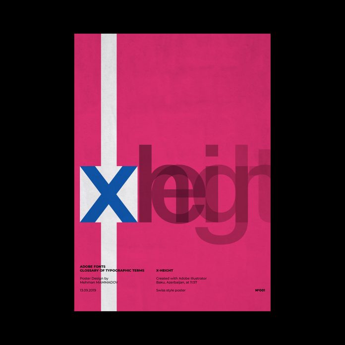
X-HEIGHT

X-HEIGHT, typographic poster design inspired by Swiss graphic design.
“Traditionally, x-height is the height of the lowercase letter x. It is also the height of the body of lowercase letters in a font, excluding the ascenders and descenders. Some lower-case letters that do not have ascenders or descenders still extend a little bit above or below the x-height as part of their design. The x-height can vary greatly from typeface to typeface at the same point size.”

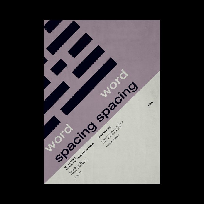
WORD SPACING

WORD SPACING, typographic poster design inspired by Swiss graphic design.
“Adjusting the average distance between words to improve legibility or to fit a block of text into a given amount of space.”

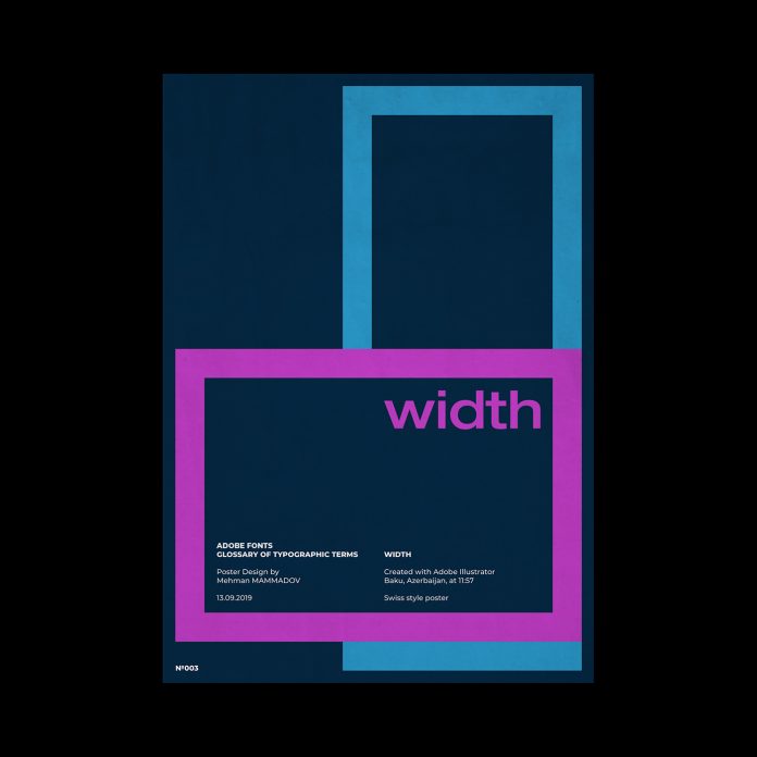
WIDTH

WIDTH, typographic poster design inspired by Swiss graphic design.
One of the possible variations of a typeface within a type family, such as condensed or extended.

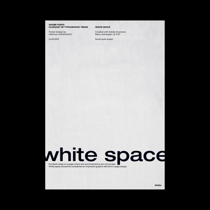
WHITE SPACE

WHITE SPACE, typographic poster design inspired by Swiss graphic design.
“The blank areas on a page where text and illustrations are not printed. White space should be considered an important graphic element in page design.”

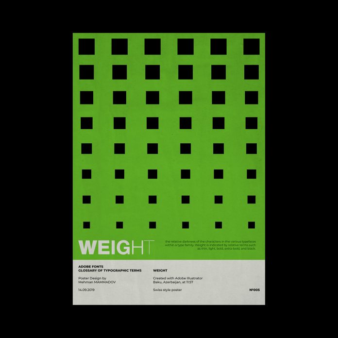
WEIGHT

WEIGHT, typographic poster design inspired by Swiss graphic design.
“The relative darkness of the characters in the various typefaces within a type family. Weight is indicated by relative terms such as thin, light, bold, extra-bold, and black.”

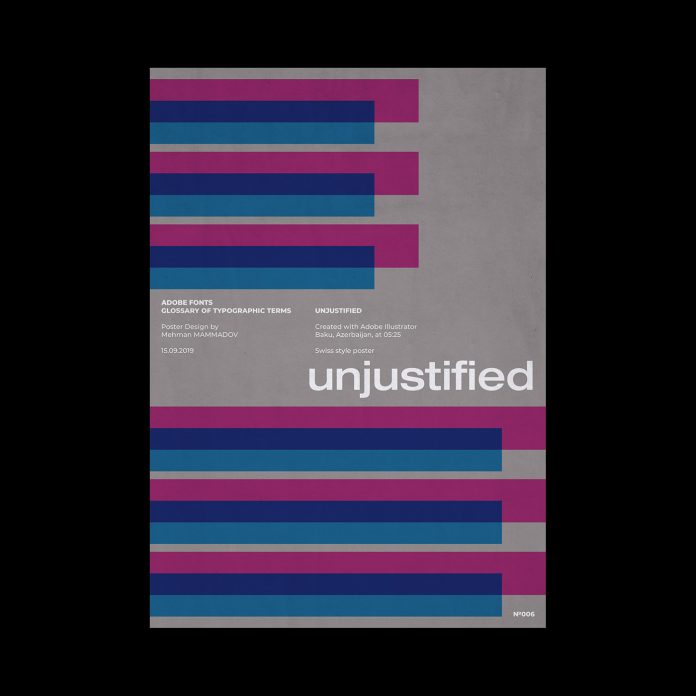
UNJUSTIFIED

UNJUSTIFIED, typographic poster design inspired by Swiss graphic design.
“Depending on alignment, this term refers to text which is set flush left, flush right, or centered.”

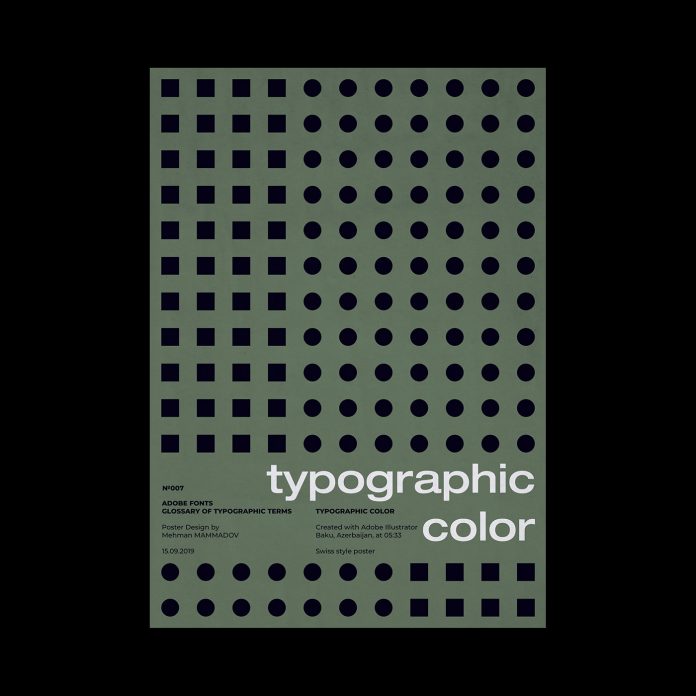
TYPOGRAPHIC COLOR

TYPOGRAPHIC COLOR, typographic poster design inspired by Swiss graphic design.
“The apparent blackness of a block of text. Color is a function of the relative thickness of the strokes that make up the characters in a font, as well as the width, point size, and leading used for setting the text block.”

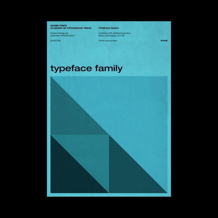
TYPEFACE FAMILY

TYPEFACE FAMILY, typographic poster design inspired by Swiss graphic design.
“Also known as family. The collection of faces that were designed together and intended to be used together. For example, the Garamond font family consists of roman and italic styles, as well as regular, semibold, and bold weights. Each of the style and weight combinations is called a face.”

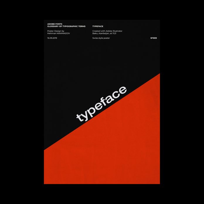
TYPEFACE

TYPEFACE, typographic poster design inspired by Swiss graphic design.
“The letters, numbers, and symbols that make up a design of type. A typeface is often part of a type family of coordinated designs. The individual typefaces are named after the family and are also specified with a designation, such as italic, bold or condensed.”

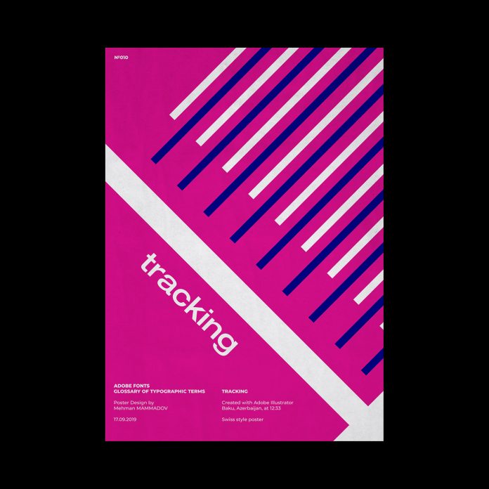
TRACKING

TRACKING, typographic poster design inspired by Swiss graphic design.
The average space between characters in a block of text. Sometimes also referred to as letterspacing.

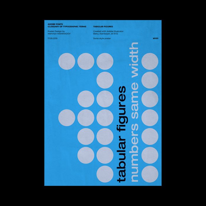
TABULAR FIGURES

TABULAR FIGURES, typographic poster design inspired by Swiss graphic design.
“Numerals that all have the same width. This makes it easier to set tabular matter.”

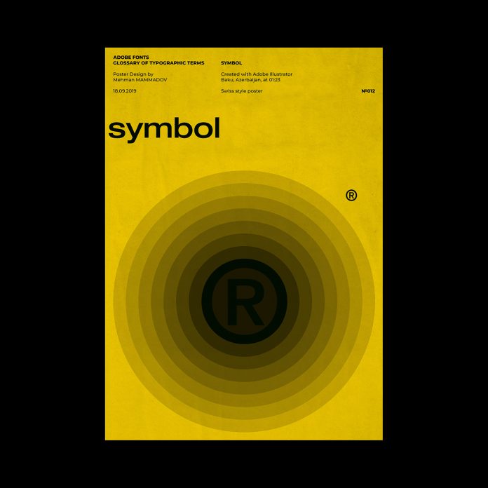
SYMBOL

SYMBOL, typographic poster design inspired by Swiss graphic design.
A category of type in which the characters are special symbols rather than alphanumeric characters.

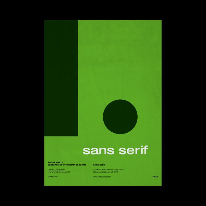
SANS SERIF

SANS SERIF, typographic poster design inspired by Swiss graphic design.
“A typeface that does not have serifs. Generally a low-contrast design. Sans serif faces lend a clean, simple appearance to documents.”

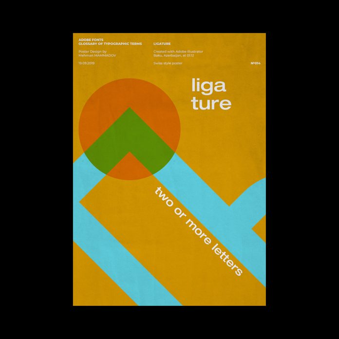
LIGATURE

LIGATURE, typographic poster design inspired by Swiss graphic design.
“Two or more letters tied together into a single letter. In some typefaces, character combinations such as fi and fl overlap, resulting in an unsightly shape. The fi and fl ligatures were designed to improve the appearance of these characters. Letter combinations such as ff, ffl and ffi are available in all Adobe OpenType Pro fonts and selected Adobe OpenType Standard fonts.”

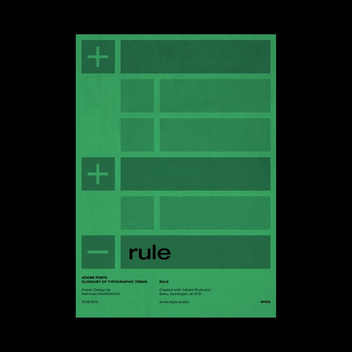
RULE

RULE, typographic poster design inspired by Swiss graphic design.
“A solid or dashed graphic line in documents used to separate the elements of a page. Rules and other graphic devices should be used sparingly, and only for clarifying the function of other elements on the page.”

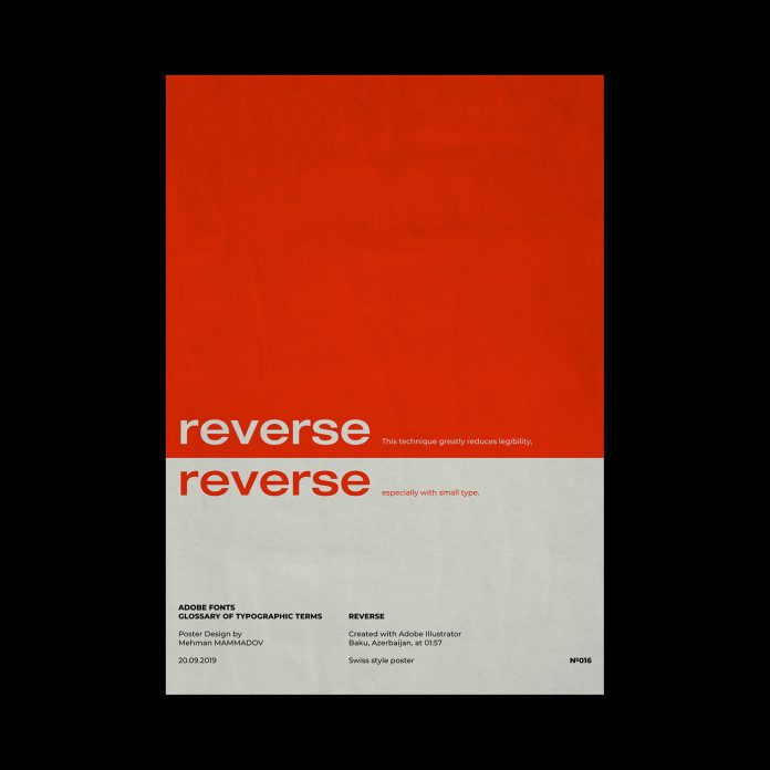
REVERSE

REVERSE, typographic poster design inspired by Swiss graphic design.
“The technique of printing white or light-colored text on a black or dark background for emphasis. This technique greatly reduces legibility, especially with small type.”

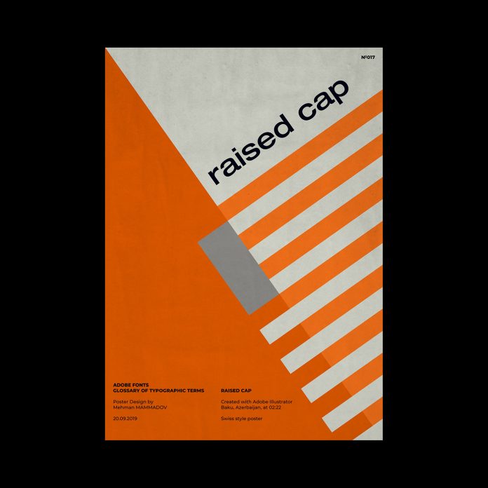
RAISED CAP

RAISED CAP, typographic poster design inspired by Swiss graphic design.
“A design style in which the first capital letter of a paragraph is set in large point size and aligned with the baseline of the first line of text. Compare to a drop cap.”

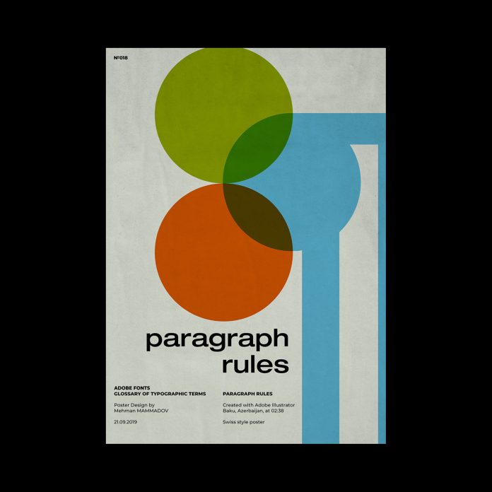
PARAGRAPH RULES

PARAGRAPH RULES, typographic poster design inspired by Swiss graphic design.
“Graphic lines associated with a paragraph that separate blocks of text. Rules are commonly used to separate columns and isolate graphics on a page. Some desktop publishing programs allow paragraph styles to be created that include paragraph rules above and/or below the paragraph.”

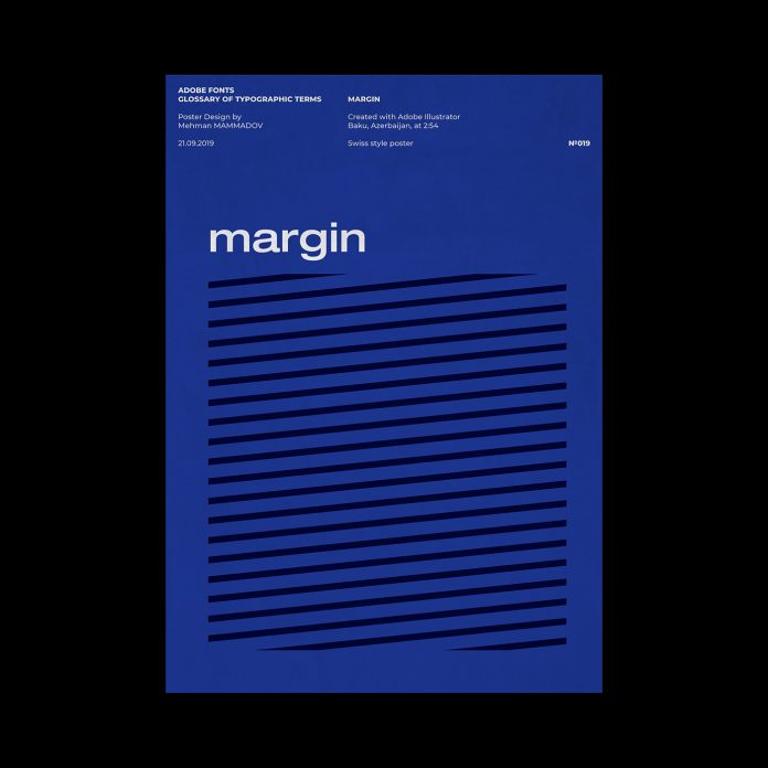
MARGIN

MARGIN, typographic poster design inspired by Swiss graphic design.
“The white spaces around text blocks. Margins typically need to be created on the edges of a page, since most printers can’t print to the very edge. White space also makes a document look better and easier to read.”

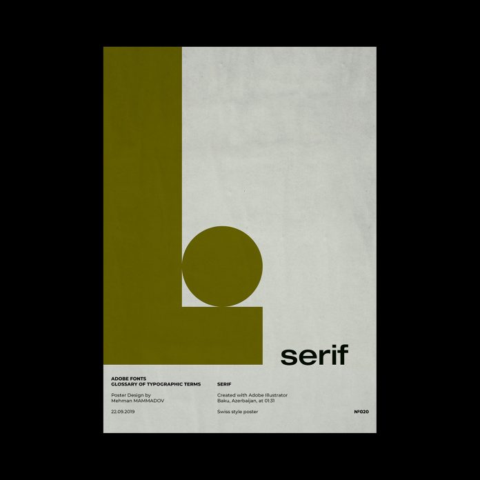
SERIF

SERIF, typographic poster design inspired by Swiss graphic design.
“Small decorative strokes that are added to the end of a letter’s main strokes. Serifs improve readability by leading the eye along the line of type.”

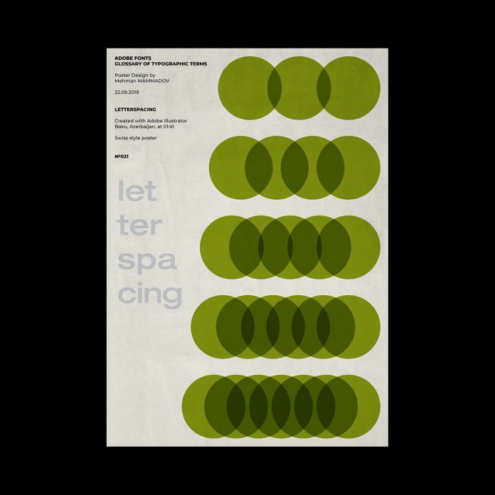
LETTERSPACING

LETTERSPACING, typographic poster design inspired by Swiss graphic design.
“Adjusting the average distance between letters in a block of text to fit more or less text into the given space or to improve legibility. Kerning allows adjustments between individual letters; letterspacing is applied to a block of text as a whole. Letterspacing is sometimes referred to as tracking or track kerning.”

All images © by Mehman Mammedov. Do not hesitate to browse through our inspiring Graphic Design category to see other outstanding work created by talented graphic designers from all over the world.

Subscribe to our newsletter!

The post Swiss Graphic Design Inspired Posters based on Typography Terms appeared first on WE AND THE COLOR.

TOP
Page 21 of 34« First«...10...1920212223...30...»Last »
  • Navigation

    • Home
    • Portfolio of Work
    • Services
    • Blog
    • Contact Us
  • Client

    • Log in
    • Entries feed
    • Comments feed
    • WordPress.org
  • Contact Us

    • E-mail: nick@theaffordabledesign.com
    • Phone: 561-444-9190

Search our website

  • Home
  • Portfolio of Work
  • Services
  • Blog
  • Contact Us
© copyright 2014 www.theaffordabledesign.com