• HomeFront Page
  • Portfolioview our work
  • Serviceswhat we offer
  • BlogInspiration
  • ContactGet in touch
You are here: Home » Visual Inspiration
  • About

    This blog is written by The Affordable Design creative team as a way to share art & design that inspires us. We provide WordPress web development in Palm Beach County and beyond.

  • Contact Us

    Phone: 561-444-9190
    E-mail: nick@theaffordabledesign.com

    The Affordable Design serves all of Palm Beach County with professional, contemporary design both print and digital - and specializes in WordPress.

    • Home
    • Portfolio
    • Services
    • Blog
    • Contact

21 Mar

A 100-Day Advent Calendar for Design Devotees, in Honor of Herb Lubalin’s 100th Birthday

Posted by nick Categories: Blog Comments are off for this post
Portrait of Herb Lubalin, courtesy of the Lubalin family (all images courtesy The Cooper Union)

In 1977, when the pioneering graphic designer Herb Lubalin turned 59, his firm announced his birthday in a very public, endearing, and totally nerdy way that could only be for a devotee of type. It bought ad space on the front page of the New York Times and printed one short line: “This article wasn’t set in Avant Garde Gothic. Happy Birthday Herb Loobalin from LSC&P.” The Avant Garde Gothic typeface, then just a few years old, represents just one of Lubalin’s lasting and most famous contributions to design; it’s been been used for innumerable texts, from Twin Peaks‘s opening credits to Wienerschnitzel’s logo.

“You don’t have to be Irish to love Ireland,” late ’70s advertisement Lubalin designed for the Tourist Board for the Republic of Ireland

This year, Lubalin is receiving another apt and design-savvy tribute. He would have turned 100 on March 17th, and to commemorate the centenary of his birth, his alma mater Cooper Union has launched an online project that reexamines his career. Adopting the form of an advent calendar, Lubalin 100 will highlight various objects over 100 days, through June 24, and provide context for each. The posters, magazines, and other material are all drawn from the institution’s Herb Lubalin Study Center of Design and Typography, which has housed the designer’s entire archive since 1985. Lubalin died in 1981 at the age of 63.

“The driving force of this project is to allow the more general public, as well as designers, to understand Lubalin’s work in a more nuanced way,” the Center’s curator Alexander Tochilovsky told Hyperallergic. “Which means trying to highlight some of the anecdotes behind the work, so people have a better sense of how the work operates and what made it significant.”

The website’s early entries offer some examples of Lubalin’s visions, from an eye-catching ad he designed for Ireland’s tourism board to a cheeky holiday card he produced with his partner Thomas Paul Carnase. There’s also a condensed but thorough biography, which follows the trajectory of his career from letterer for a sign company to creative director of an advertising agency to head of his own design firm. Further “days” of Lubalin 100 will explore more of Lubalin’s seminal and lesser-known designs in more detail, including works his clients rejected.

Louise Fili’s birthday ad for Herb Lubalin on the front page of the New York Times’ March 17, 1977 issue

The Center chose the calendar format to tell Lubalin’s story because it is “so complex,” Tochilovsky said. “By parsing it over 100 days, it gives us an opportunity to be thoughtful and not overwhelm with every piece. We can cover a lot of territory but also be brief, [and] hit all the important points.”

Among his major works are designs executed for a series of magazines published by Ralph Ginzburg: Eros, Fact, and Avant Garde, for which Lubalin conceived the Avant Garde Gothic typeface. The visuals of each, Tochilovsky said, were “absolutely perfect” for their respective material, which ranged from erotica to satirical commentary on current affairs. Lubalin 100 will spotlight this design work but also the editorial content that demanded it, much of which is not widely known about today.

“Most people experience graphic design in its final form, and I think the work gets flattened into just its aesthetics,” Tochilovsky said. “I think Lubalin’s work suffers the most from that issue because it’s so graphic, it just becomes like eye candy. But here’s all this other stuff that makes it even more interesting, important, and timeless.”

Holiday card for 1972, by Herb Lubalin and Thomas Paul Carnase

Online visitors will also learn about the evolution of individual designs. Lubalin rarely worked alone, relying on collaborators to execute his designs with specific skills, and the Center will present mini profiles of some of these individuals, from Carnase to Tony DiSpigna, a master of drawn lettering.

Part of this online tribute will also explore the uncommon choices Lubalin made as a graphic designer, beyond his creative output. His studio culture stood out for its time for some of these decisions: Lubalin hired quite a few women as designers and often took on lesser-known clients, at times working for free when people couldn’t afford his services.

Reacting to the status quo of graphic design at the time, Lubalin’s work was expressive, visualizing language so messages were not just relayed to people, but truly seen. His designs collapsed the borders between text and image. Although some of his calligraphy can appear dated to contemporary eyes, revisiting them is a reminder of a time when typography was slowly evolving, and visually stimulating imagery — now an everyday experience — was not especially common.

“Lubalin understood design as an experience, and he understood that there are ways, through good, thoughtful design, you can make someone take notice,” Tochilovsky said. “What he did was make the formal qualities of language come through and engage the viewer on a subtle level. You’re going to remember those types of images much more, especially in the context of 1950s. It’s profound how different that approach was at the time.”

Cover of Fact magazine, designed by Herb Lubalin (1964)
Thomas Paul Carnase’s logo for a 1977 Cooper Union catalog
Thomas Paul Carnase, “Poster for VGC” (1965)
Cover of ‘Graphis’ magazine, designed and lettered by Tony Di Spigna (white lettering), Alan Peckolick, and Ernie Smith (1979)


Poster by Tony Di Spigna
TOP
25 Jan

A Visual Typology of Japanese Logos

Posted by nick Categories: Blog Comments are off for this post
A Visual Typology of Japanese Logos
Spread from ‘Logos from Japan,” published by Counter-Print (all images courtesy Counter-Print)

A few years ago, the UK-based design store and publisher Counter-Print released a book that surveyed contemporary graphic design in Japan. Realizing that it had amassed a massive range of logos, the team decided to work on a follow-up publication focused on these symbols of identity alone. The result, published late last year, is an simple but elegantly printed reference that captures current trends in Japanese visual branding.

Cover of ‘Logos from Japan,” published by Counter-Print

At 60 pages long, the book features a diverse variety of logo types, from those for factories to those for pharmacies, bookstores, bakeries, and even a tofu store, whose geometric logo is a clever take on its blocky products. There are a few examples that might be recognizable to readers outside of Japan, such as Uniqlo’s red-and-white logo, but most are designed by smaller businesses. Logos from Japan is image-heavy, with just a short introduction by Counter-Print’s co-founder Jon Dowling, which provides a very brief history of Japanese logo design.

“One reason Japanese design stands apart from that of many other countries is that it doesn’t always follow the strict international code of design in evidence today,” Dowling writes, referring to the influences of the International Typographic Style, or Swiss Style. “Japanese design is unique in the way that it unites traditional and modern aspects of design.”

Dowling explains how Japanese graphic design has roots in the traditional artistry of ancient seals, beautifully handcrafted shop signs — known as kanban — and family crests. Uniqlo’s logo, for instance, is a modern take on the four character stamps, usually dipped in red ink; many other logos are structured within the circle, which was used for centuries to contain mon, the embellished emblems of different clans.

  
Spread from ‘Logos from Japan,” published by Counter-Print

The book is divided into thematic chapters that highlights some interesting trends across different industries. “Architecture,” for instance, centers entirely on logos that integrate the shapes of roofs, both western and Japanese; “Nature” focuses on those that incorporate natural landforms — Mount Fuji, unsurprisingly, is a common motif. There are also separate sections for logos with the Latin alphabet and for those with Hiragana, Katakana, and Kanji characters. The latter stands out on its own as a fascinating overview of contemporary Japanese typography.

Logos from Japan is not a comprehensive survey but rather a collection of logos handpicked by Counter-Print, so the selections inherently reflect a bias. But the hundreds of examples collected succeed in representing a range of styles; together, they offer a satisfying glimpse into the lively landscape of Japanese design.

Spread from ‘Logos from Japan,” published by Counter-Print

Logos from Japan is available through Counter-Print.

TOP
03 Jan

The Dynamic Soviet Film Posters of the 1920s and ’30s

Posted by nick Categories: Blog Comments are off for this post
Bildunterschrift: Anton Lavinsky, film poster for <em>Miss Mend</em> (1927) (© TASCHEN, Susan Pack, California)
Bildunterschrift: Anton Lavinsky, film poster for Miss Mend (1927) (© TASCHEN, Susan Pack, California)

In the pre-Stalin Soviet Union of the 1920s and ’30s, there was a dynamic creativity in the arts, including in one of the newest forms of media: film. Film Posters of the Russian Avant-Garde, out now from Taschen, chronicles this era through 250 film posters by 27 artists, and examines how the disparate influences of Constructivist shapes and cinematic montage collided in their designs.

“The new political structure created by the Bolshevik Revolution produced a profound sense of social responsibility and encouraged artists to experiment in multiple fields, particularly in architecture, industrial design, and graphic design,” Christopher W. Mount, formerly a curator at the Museum of Modern Art, writes in a foreword.

Cover of <em>Film Posters of the Russian Avant-Garde</em> (courtesy Taschen)
Cover of Film Posters of the Russian Avant-Garde (courtesy Taschen)

Film Posters of the Russian Avant-Garde was first issued in 1995, and the new edition reaffirms the vibrancy of this period of graphic design. The posters are from the collection of Susan Pack, who started acquiring them in the 1970s. Pack’s extensive book essay delves into the artists and film history of the early 20th century. The first films screened in Russia were the work of the French Lumière brothers, and were imported to celebrate the coronation of Tsar Nicholas II in 1894; their announcements were simple typographical ads.

“Within little more than a decade, a thriving film industry was established,” Pack writes. “However, World War I and the turmoil of the 1917 Revolution made film production and distribution increasingly difficult. Famine, civil war, and a foreign blockade prevented the importation of foreign films, raw film, and equipment.” Then in 1919, Lenin nationalized the industry. “The general belief was that the film industry had been the tool of profit hungry capitalists before the Revolution; now it was to be a source of education and inspiration for the masses,” Pack states.

Significantly, these posters were all made before Soviet realism became the dominant art form under Stalin, and there was a fluidity and freedom in styles. Part of what fueled this were the diverse backgrounds of the poster artists, such as the prolific brothers Georgii and Vladimir Stenberg who came from set design and Constructivist sculpture (and together made around 300 posters), and Alexander Rodchenko who worked in photography and industrial design. Their experimentation is especially remarkable considering the speed at which these posters were printed. Pack notes that two artists — Vladimir Stenberg and Mikhail Dlugach — “recalled that it was not unusual for them to see a film at three o’clock in the afternoon and be required to present the completed poster by ten o’clock the next morning.” To make their job even more stressful, many of the printing presses were in chronic disrepair, as they predated the 1917 Revolution.

Pages from <em>Film Posters of the Russian Avant-Garde </em> (photo of the book for Hyperallergic)
Pages from Film Posters of the Russian Avant-Garde (photo of the book for Hyperallergic)

Nevertheless, their film posters were distinct in eschewing the glamor of Hollywood and proposing incredible scenes of action, in which elements of photography, lithography, and collage are overlaid. Perspectives are often skewed, faces presented larger-than-life, and colors are vivid. “One of the great innovations in Soviet filmmaking during this period was the concept of montage,” Pack writes, and indeed that use of montage was featured in the pioneering Soviet film Battleship Potemkin (1925). Montage likewise found its way onto the posters with their actors, typography, and geometric forms intersecting at unexpected angles.

These posters were ephemeral advertisements, not meant to be saved. In fact each of the posters in Film Posters of the Russian Avant-Garde is among just a handful of surviving copies. “When one considers that the poster artists assumed their work would be torn down and thrown away after a few weeks, it is astonishing that they continued to strive to maintain such a high standard,” Pack writes. “Clearly, these innovative flights of the imagination do not deserve to be consigned to oblivion”

Mikhail Dlugach, film poster for <em>Yego Kariera</em> (1928) (© TASCHEN, Susan Pack, California)
Mikhail Dlugach, film poster for Yego Kariera (1928) (© TASCHEN, Susan Pack, California)
Smolyakovsky, film poster for <em>Konveier smerti</em> (1933) (© TASCHEN, Susan Pack, California)
Smolyakovsky, film poster for Konveier smerti (1933) (© TASCHEN, Susan Pack, California)
Pages from <em>Film Posters of the Russian Avant-Garde </em> (photo of the book for Hyperallergic)
Pages from Film Posters of the Russian Avant-Garde (photo of the book for Hyperallergic)
Nikolai Prusakov and Grigori Borisov, film poster for <em>Puteshestvie na Mars</em> (1926) (© TASCHEN, Susan Pack, California)
Nikolai Prusakov and Grigori Borisov, film poster for Puteshestvie na Mars (1926) (© TASCHEN, Susan Pack, California)
Nikolai Prusakov, film poster for <em>Pyat minut</em> (1929) (© TASCHEN, Susan Pack, California)
Nikolai Prusakov, film poster for Pyat minut (1929) (© TASCHEN, Susan Pack, California)
Pages from <em>Film Posters of the Russian Avant-Garde </em> (photo of the book for Hyperallergic)
Pages from Film Posters of the Russian Avant-Garde (photo of the book for Hyperallergic)
ZIM, film poster for <em>Spartakiada</em> (1927) (© TASCHEN, Susan Pack, California)
ZIM, film poster for Spartakiada (1927) (© TASCHEN, Susan Pack, California)

Film Posters of the Russian Avant-Garde by Susan Pack is out now from Taschen.

TOP
30 Dec

An Illuminating History of Modern Graphic Design

Posted by Categories: Blog Comments are off for this post
An Illuminating History of Modern Graphic Design
A page from the 2014 reissue of the New York City Transit Authority Graphics Standards Manual showing a diagram explaining the use of arrows in wayfinding signage in subway stations (photo courtesy of Standards Manual)

There are design nerds, and then there are design nerds whose handling of the subjects they’re passionate about manages to transform abiding obsessions into illuminating, resonant art. Such is the touch brought by the graphic designers-turned-publishers Jesse Reed and Hamish Smyth to the first group of books that their small, Brooklyn-based publishing company, Standards Manual, has produced in just the past few years.

The press’s newest title, New York City Transit Authority: Objects, vividly exemplifies Reed and Smyth’s finely tuned approach, but in order to understand how and why it does, it helps to know a bit about how they somewhat unexpectedly became publishers, a story that often seems to be the stuff of happenstance and uncannily good timing.

Reed, who was born in Australia to American parents and returned to the United States as an infant, where he grew up in Ohio, told me during a recent interview, “My undergraduate thesis project at the University of Cincinnati was the redesign of New York City’s subway map.” He asked as much as he stated, “Maybe, somehow, a lot of what we’ve done can be traced back to that project?”

After graduating from his university’s School of Design, Architecture, Art and Planning (DAAP), he landed a job in New York at the Museum of Modern Art’s in-house design department and in 2012 joined the staff of Pentagram, the international design consultancy, where he worked with company partner Michael Bierut. Before joining Pentagram in 1990, Bierut, who had also studied at DAAP, worked for a decade with the legendary Italian designer Massimo Vignelli (1931-2014), the creator of the New York City subway map that was first issued in 1972 and a related signage system, both of which are still in use today (although the map has been revised numerous times).

The cover and pages from the original Graphics Standards Manual of the New York City Transit Authority, published in 1970, featuring a graphic-design scheme created by Massimo Vignelli and Bob Noorda of Unimark (photos courtesy of Standards Manual)

Reed met Hamish Smyth, an Australian, while they were both employed at Pentagram. Smyth, who earned an undergraduate degree in design from the Royal Melbourne Institute of Technology (known as “RMIT University”) in Adelaide, had done an internship at Pentagram and was later hired full-time. Smyth also became a member of Bierut’s team, contributing to corporate-identity, publication-design, and other projects.

Reed recalled that, at Pentagram, among their clients was New York City’s Department of Transportation, for which they helped create a wayfinding system for pedestrians — freestanding panels with maps that started appearing on sidewalks in 2013. Around that time, in a basement at the company’s offices, the two designers and another colleague came across an original copy of the so-called graphics standards manual for the color-coded signage system that Vignelli and his partner Bob Noorda’s design firm Unimark had devised for New York City’s public-transportation department (now the Metropolitan Transportation Authority). It was published in 1970.

That five-ring binder, with a bright-orange cover, was filled with precise instructions about how the scheme’s plain, sans serif typeface (Standard; later Helvetica) was to be used on station-name and other informational signs, how specific colors would represent each subway line, and how directional arrows would be integrated into type-bearing signboards. For the young designers, stumbling upon the Vignelli manual was like unexpectedly discovering a lost Dead Sea scroll.

“Technically,” Reed remembered, “the book was no longer protected by copyright; its content was now in the public domain.” He and Smyth then created, as a labor of love, a website, which no longer exists, on which they posted material from that original manual. Around that time, serendipity struck again, for the city’s public-transportation agency became a Pentagram client. Meanwhile, Reed and Hamish decided to try to republish the manual in a high-quality facsimile edition. Hoping to raise just over $100,000 to cover the costs of producing one thousand copies, in 2014 they launched a Kickstarter campaign. For what it was worth, they also obtained the current MTA’s permission to republish the old Vignelli manual.

The cloth cover and a spot-color-printed page from the facsimile reissue of the New York City Transit Authority Graphics Standards Manual, published in 2014 by the Brooklyn-based company Standards Manual (photos courtesy of the publisher)

“We were stunned,” Reed told me. “We announced the fund-raising campaign online, and by noon of the first day, we had reached our goal. A big spurt of support came from other designers, for sure. Ultimately, we raised enough to be able to produce and sell roughly 8000 copies.”

That edition of New York City Transit Authority: Graphics Standard Manual instantly became a collector’s item. Printed in Italy (“No printer in the US could handle it,” Reed observed), it featured three different kinds of paper, twelve separate spot colors (rich, luscious hues produced using individual inks), a cloth cover, and a hand-sewn binding. That volume measured 13.5 inches square and featured high-resolution digital scans of each page of the original manual, in effect presenting it as some kind of preserved artifact.

“Another great coincidence,” Reed noted, “was that, when Vignelli’s son Luca, a photographer, heard about our project, he kindly loaned us his father’s personal copy of the original manual, which contained some of Massimo’s handwritten annotations. That’s the copy we used to make the scans for the reprint.”

With that ambitious project, while still working at Pentagram, Reed and Smyth established their design-book publishing company, naming it “Standards Manual.” Today, that first book is essentially out of print, with copies turning up for resale at high prices. To meet demand, though, Standards Manual issued a second, less costly, mass edition in a slightly smaller format, which is still available.

“From start to finish, that first project took us about six months,” Reed explained, adding, “We like to work fast.”

The reissued NASA design-standards manual comes packaged in a silver wrapper; Richard Danne and Bruce Blackburn’s design program included such ordinary agency office supplies as stationery and specialized memo paper (photos courtesy of Standards Manual)

The designers went on to republish, also in meticulously crafted, facsimile form, the National Aeronautics and Space Administration’s 1975 Graphics Standards Manual, which featured an institutional-identity scheme designed by Richard Danne and Bruce Blackburn. With its orange-red, dark-gray, and black palette, and its NASA logo spelled out in a unique, geometric-serpentine typeface, Danne and Blackburn’s design program for the U.S. space agency gave it a sleek, futuristic feel. Known as the “worm,” their logo was in use until 1992, when NASA switched to a more old-fashioned symbol resembling a Boy Scout’s merit badge.

Writing in an introductory essay in the NASA Graphics Standards Manual reissue, Christopher Bonanos, the author of a history of Polaroid cameras, notes that, when Danne and Blackburn’s small, New York-based firm came up with their scheme, “Few people in those early days of NASA were thinking about graphic design. The agency was run by a mix of military folks, flyboys and bureaucrats, and not a lot of them were concerned with the field that was more often called ‘commercial art.’”

Danne had come from creating movie posters, including a memorable one for Rosemary’s Baby in 1968. Blackburn came from a background in corporate-identity design, having worked for Chermayeff & Geismar, a New York-based firm that was founded in the late 1950s and, like Vignelli Associates, occupies an important place in the history of modern communications design. Blackburn had just won a competition for the job of devising a symbol for the bicentennial celebration of the American Revolution in 1976. Of Danne and Blackburn’s design scheme for NASA, Bonanos writes, “It was bold, like NASA itself; it was technological in its swoop. The two capital As lacked crossbars, suggesting rocket nose cones or the shock waves that those nose cones produced.”

Standards Manual has also published a reissue of the guidelines for the use of the symbol for the bicentennial celebration of the American Revolution in 1976, designed by Bruce Blackburn (photos courtesy of the publisher)

Reed and Smyth have also published a reproduction of the manual describing the use of Blackburn’s star-shaped symbol for the 1976 Bicentennial, which turned up in everything from postage stamps to license plates, as well as a reissue of the standards manual for the US Environmental Protection Agency’s graphic-design scheme, which was developed by Steff Geissbühler of Chermayeff & Geismar and published in 1977. “Graphic design for U.S. government agencies and institutions was in its infancy,” the Swiss-born Geissbühler writes in the new edition.

With these successful projects behind them, Reed and Smyth both left Pentagram earlier this year to devote their energy full-time to producing books; together, they also founded Order, a design company. Their office in the Greenpoint section of Brooklyn features a small storefront bookstore where Standards Manual’s titles and other design books are sold.

Standards Manual’s newest book, New York City Transit Authority: Objects, is not a reproduction of any earlier, graphic-design guidelines but rather something of an outgrowth of their work on the New York City subway system’s 1970 manual: hundreds of photographs of historical artifacts related to the Big Apple’s public-transportation system — old Metrocards, subway tokens, line workers’ gloves, a button commemorating the 1980 transit employees’ strike, and more — from the collection of Brian Kelley, a commercial still life photographer who began amassing Metrocards in 2011. “I have a wide range of passion projects,” Kelley told me in a recent e-mail interview, noting that his collection of maps of national parks is one of his newest.

Kelley noted that he especially appreciates the “beautiful” transit-related memorabilia he has found dating from the late 1800s through the 1970s. “After that period,” he noted, “the quality seems to go down, almost as though the people who designed the pieces stopped caring so much about what they were putting out into world.”

Standards Manual’s newest book, New York City Transit Authority: Objects, features photographs of items from Brian Kelley’s collection of public-transportation-related memorabilia (photos courtesy of the publisher)

It’s the opposite impulse that seems to motivate Reed and Smyth as they focus on what they consider to be some of the definitive, standards-setting works of modern design, celebrating their artistic qualities while recognizing their enduring, practical contributions to the field.

That sensibility will be reflected again in Identity: Chermayeff & Geismar & Haviv, a new book they are assembling now, which will focus on the innovations of an iconic American design firm (which now bears an updated name) and will be published next spring. “It’s our first monographic book,” Reed noted, “and it marks a thematic direction we would like to explore, looking in depth at the work of certain important designers.”

In keeping with their company’s well-tested model, it is already taking customers’ advance orders for the new book. So far, they have been coming in at a steady pace, proving, perhaps, that where Standards Manual goes, devoted design nerds will enthusiastically follow.

TOP
23 Nov

The Golden Age of the Illustrated Book Dust Jacket

Posted by Categories: Blog Comments are off for this post
The Golden Age of the Illustrated Book Dust Jacket
Spines of books from the collection of Martin Salisbury (photo by Simon Pask)

In the 19th century, dust jackets on books were just protective paper wrappers, thrown away after a book was purchased. The prized cover was the leather underneath, and although some of these bindings had elegant designs, the dust jacket rarely referenced the interior contents. The Illustrated Dust Jacket, 1920-1970 by Martin Salisbury, out now from Thames & Hudson, chronicles how this once disposable object became a major creative force in publishing.

“In view of its origins as a plain protection to be discarded on purchase, and the relatively recent acceptance of the detachable jacket as an integral part of the book and its identity, it is ironic that for today’s book collectors the jacket is key — the presence of an original jacket on a sought-after first edition now greatly adds to its value,” Salisbury writes in the book. The Illustrated Dust Jacket concentrates on the 20th-century heyday of the dust jacket, when artists were experimenting with printing and illustration techniques, and publishers were recognizing its advertising potential. Although the first known illustrated dust jacket dates to the 1830s, this was the era in which it was actively designed.

Cover of <em>The Illustrated Dust Jacket, 1920-1970</em> (courtesy Thames & Hudson)
Cover of The Illustrated Dust Jacket, 1920-1970 (courtesy Thames & Hudson)

“The rapid rise of the pictorial dust jacket through the 1920s and 1930s coincided with the Art Deco period in contemporary design,” Salisbury notes. “Inevitably, the movement’s ubiquitous dynamic, geometric motifs pervaded the covers of many books.” The Illustrated Dust Jacket begins with short descriptions on the artistic movements that influenced these influential decades of book design, and then highlights over 50 of its artists through more than 300 images.

For instance, Ancona, aka Edward D’Ancona, brought a 1930s film noir aesthetic to crime fiction, while Vanessa Bell instilled a simplicity and painterly style on her sister Virginia Woolf’s books.  Other early 20th-century illustrators came from the realist school, including N. C. Wyeth who studied with Howard Pyle, and involved his passion for landscapes and the natural world on covers for the 1939 The Yearling and 1928 Westward Ho!.

By the 1950s there was more of an interest in lifestyle publications that offered aspirational information on travel, food, and home improvement. Heather Standring created designs for publishers in the UK and USA, her meticulously sketched lines with punctuating color adorning the 1954 Mushroom Cooking (she later authored How to Live in Style in 1974). Alongside was a “Kitchen Sink” social realism popular in the UK, as well as the more florid, lyrical neo-romanticism.

“Many of the so-called neo-romantic artists worked across a range of fine and applied arts,” Salisbury states. “Most of the key figures illustrated books and/or contributed jacket designs, leaving us with a mini ‘golden age’ of book designs and illustration.” Hand-rendered lettering by designers like John Minton and Keith Vaughan added to the individual character of these books, enticing the reader with the promise of a transporting narrative.

Salisbury has identified numerous book illustrators, yet a large number of the dust jackets were unsigned, their creators now anonymous. And as he notes in The Illustrated Dust Jacket, even a successful designer such as Edward McKnight Kauffer, known for his use of form and geometry on covers for The Invisible Man (1952) and Intruder in the Dust (1948), was not “widely appreciated during his own lifetime in his native America.” The Illustrated Dust Jacket argues for celebrating the design and art of the dust jacket, and the often obscure creators behind these innovative covers.

Art by Aubrey Hammond for <em>Metropolis</em> by Thea von Harbou (Readers Library, 1927). Hammond’s design juxtaposes delicate color harmony with nightmarish vision. (Collection of Mark Terry/Facsimile Dust Jackets L.L.C.)
Art by Aubrey Hammond for Metropolis by Thea von Harbou (Readers Library, 1927). Hammond’s design juxtaposes delicate color harmony with nightmarish vision. (Collection of Mark Terry/Facsimile Dust Jackets L.L.C.)
Art by Edward Bawden for <em>The Hammering</em> by Hal Martin (Faber and Faber, 1960) Edward Bawden's lino-cutting techniques informed his color-separation line work, where he would often use a knife to scrape away areas of black ink to create texture (© The Estate of Edward Bawden)
Art by Edward Bawden for The Hammering by Hal Martin (Faber and Faber, 1960). Edward Bawden’s lino-cutting techniques informed his color-separation line work, where he would often use a knife to scrape away areas of black ink to create texture (© The Estate of Edward Bawden)
Art by Ancona for <em>The Night Flower</em> by Walter C. Butler (The Macaulay Company, New York, 1936). “Ancona,” aka Edward D’Ancona, used dramatic contrasts of light and dark for this mystery novel (one of only two written by Frederick Faust under this pseudonym) and echoes the film noir genre of the period. (© “Ancona” (Edward D’Ancona), from the collection of Martin Salisbury, photo by Simon Pask)
Art by Ancona for The Night Flower by Walter C. Butler (The Macaulay Company, New York, 1936). “Ancona,” aka Edward D’Ancona, used dramatic contrasts of light and dark for this mystery novel (one of only two written by Frederick Faust under this pseudonym) and echoes the film noir genre of the period. (© “Ancona” (Edward D’Ancona), from the collection of Martin Salisbury, photo by Simon Pask)
Art by Edward McKnight Kauffer for <em>Let It Come Down</em> by Paul Bowles (Random House, New York, 1952). The jacket for the first American edition of Bowles’s second novel employs a technique informed by Edward McKnight Kauffer’s earlier experience of stenciling or “pochoir.” Bowles’s lead character, Nelson Dyar, is depicted metaphorically entering the dark underworld of Tangiers. (© Simon Rendall)
Art by Edward McKnight Kauffer for Let It Come Down by Paul Bowles (Random House, New York, 1952). The jacket for the first American edition of Bowles’s second novel employs a technique informed by Edward McKnight Kauffer’s earlier experience of stenciling or “pochoir.” Bowles’s lead character, Nelson Dyar, is depicted metaphorically entering the dark underworld of Tangiers. (© Simon Rendall)
Pages from <em>The Illustrated Dust Jacket, 1920-1970</em> (photo of the book for Hyperallergic)
Pages from The Illustrated Dust Jacket, 1920-1970 (photo of the book for Hyperallergic)
Art by Ric Fraser for <em>Drugs and the Mind</em> by Robert S. de Ropp (Scientific Book Club, 1957) Dr. de Ropp’s first book introduced readers to the joys and mental tortures of ancient herbs and modern drugs. (courtesy the Fraser Family)
Art by Ric Fraser for Drugs and the Mind by Robert S. de Ropp (Scientific Book Club, 1957) Dr. de Ropp’s first book introduced readers to the joys and mental tortures of ancient herbs and modern drugs. (courtesy the Fraser Family)
Art by Alvin Lustig for <em>Anatomy for Interior Designers</em> by Francis de N. Schroeder (Whitney Publications, New York, 1948). Lustig’s distinctive hand-rendered lettering was a key pictorial feature of the early editions of this jacket design. In later editions this was removed and replaced by a font, a rather ill-fitting Akzidenz-Grotesk Bold. (Reproduced by permission of the Alvin Lustig Archive)
Art by Alvin Lustig for Anatomy for Interior Designers by Francis de N. Schroeder (Whitney Publications, New York, 1948). Lustig’s distinctive hand-rendered lettering was a key pictorial feature of the early editions of this jacket design. In later editions this was removed and replaced by a font, a rather ill-fitting Akzidenz-Grotesk Bold. (Reproduced by permission of the Alvin Lustig Archive)
Art by Milton Glaser for <em>The Electric Kool-Aid Acid Test</em> by Tom Wolfe (Farrar, Straus and Giroux, New York, 1968) (Reproduction courtesy Milton Glaser Studio, collection of Mark Terry/Facsimile Dust Jackets L.L.C.)
Art by Milton Glaser for The Electric Kool-Aid Acid Test by Tom Wolfe (Farrar, Straus and Giroux, New York, 1968) (Reproduction courtesy Milton Glaser Studio, collection of Mark Terry/Facsimile Dust Jackets L.L.C.)
Art by Barnett Freedman for <em>The Faber Book of Children’s Verse</em> edited by Janet Adam Smith (Faber and Faber, 1953). Many of Freedman’s book jackets were designed to repeat the front image on the back seamlessly. The design is also repeated on the cover boards. (© The Estate of Barnett Freedman, from the collection of Martin Salisbury, photo by Simon Pask)
Art by Barnett Freedman for The Faber Book of Children’s Verse edited by Janet Adam Smith (Faber and Faber, 1953). Many of Freedman’s book jackets were designed to repeat the front image on the back seamlessly. The design is also repeated on the cover boards. (© The Estate of Barnett Freedman, from the collection of Martin Salisbury, photo by Simon Pask)
Pages from <em>The Illustrated Dust Jacket, 1920-1970</em> (photo of the book for Hyperallergic)
Pages from The Illustrated Dust Jacket, 1920-1970 (photo of the book for Hyperallergic)
Art by Arthur Hawkins, Jr. for <em>Barron Ixell: Crime Breaker</em> by Oscar Schisgall (Longmans, Green & Co., New York, 1929). For this collection of stories featuring the intrepid international sleuth Barron Ixell, Hawkins’s highly theatrical design is repeated to create a full wraparound jacket. (© The Estate of Arthur Hawkins, Jr., photo courtesy Hyde Brothers Booksellers, Fort Wayne, Indiana)
Art by Arthur Hawkins, Jr. for Barron Ixell: Crime Breaker by Oscar Schisgall (Longmans, Green & Co., New York, 1929). For this collection of stories featuring the intrepid international sleuth Barron Ixell, Hawkins’s highly theatrical design is repeated to create a full wraparound jacket. (© The Estate of Arthur Hawkins, Jr., photo courtesy Hyde Brothers Booksellers, Fort Wayne, Indiana)
Art by Barbara Jones for <em>The Unsophisticated Arts</em> by Barbara Jones (Architectural Press, 1951). Jones’s dust jacket for her own book is one of the more memorably idiosyncratic designs of the 20th century. (© The Estate of Barbara Jones)
Art by Barbara Jones for The Unsophisticated Arts by Barbara Jones (Architectural Press, 1951). Jones’s dust jacket for her own book is one of the more memorably idiosyncratic designs of the 20th century. (© The Estate of Barbara Jones)
Pages from <em>The Illustrated Dust Jacket, 1920-1970</em> (photo of the book for Hyperallergic)
Pages from The Illustrated Dust Jacket, 1920-1970 (photo of the book for Hyperallergic)
Art by Rockwell Kent <em>Mountain Meadow</em> by John Buchan (Literary Guild of America, New York, 1941). The artist’s lifelong preoccupation with the drama and beauty of landscape is given full rein in this spectacular wraparound design. The exaggerated, almost heroic, posing of the foreground figures suggests the influence of Soviet Realism. (© The Estate of Rockwell Kent, courtesy the Plattsburgh State Art Museum, Plattsburgh College Foundation, Rockwell Kent Gallery and Collection, Bequest of Sally Kent Gorton, Plattsburgh, New York)
Art by Rockwell Kent Mountain Meadow by John Buchan (Literary Guild of America, New York, 1941). The artist’s lifelong preoccupation with the drama and beauty of landscape is given full rein in this spectacular wraparound design. The exaggerated, almost heroic, posing of the foreground figures suggests the influence of Soviet Realism. (© The Estate of Rockwell Kent, courtesy the Plattsburgh State Art Museum, Plattsburgh College Foundation, Rockwell Kent Gallery and Collection, Bequest of Sally Kent Gorton, Plattsburgh, New York)

The Illustrated Dust Jacket, 1920-1970 by Martin Salisbury is out now from Thames & Hudson.

TOP
03 Nov

In North Korea, the Graphic Design of Everyday Objects Promotes National Identity

Posted by Categories: Blog Comments are off for this post
In North Korea, the Graphic Design of Everyday Objects Promotes National Identity
Pages from an Air Koryo notebook given out to business-class passengers (all images from the Collection of Nicholas Bonner, published by Phaidon in Made in North Korea: Graphics from Everyday Life in the DPRK, by Nicholas Bonner)

For over two decades, Nicholas Bonner has taken foreigners into North Korea through the travel company he co-founded, Koryo Tours. During these many visits, he collected and saved the tickets, food labels, candy wrappers, hotel welcome cards, and other bits of ephemera he came across, finding himself enchanted by their graphic design. Selections from his personal collection are now published by Phaidon in Made in North Korea, a beautifully designed book that highlights the relationship between the country’s visual culture and its national identity.


Cover of Made in North Korea: Graphics From Everyday Life in the DPRK by Nicholas Bonner, published by Phaidon

The collection represents a subjective, personal archive rather than a thorough survey of North Korean’s design ephemera. Eight short essays by Bonner on topics such as brand identity, the production of graphics, and ephemera for tourists add a personal touch to the tome; even more stories are told through captions that shed light on daily life in the isolated country.

Because all product packaging is designed for state approval, the visuals present a clearly recognizable “house style,” as Bonner puts it, which has largely remained consistent particularly because designers receive little exposure to foreign influence. Designs are typically very simple: unlike Western ads, they are crafted to inform rather than seduce. Nonetheless, they are aesthetically pleasing and cleverly executed, incorporating images that celebrate North Korean culture.

Many of the objects Bonner has collected feature traditional motifs such as the national flower — the magnolia — or cranes and pine trees, which are symbols of longevity and health. The Workers’ Party emblem also often appears on everyday objects like greeting cards, envelopes, and event tickets. Well-known North Korean landmarks, too, are popular pictorial tropes intended to stir national pride: an image of Mount Kumgang represents Korean strength and citizens’ good health; depictions of a steel plant nods to the country’s powerful industrial forces. Placing these images on everyday items imbues them with what Bonner describes as a “instantly recognizable Koreanness” that marks a product as the best possible option available.


Ponghak beer bottle label

“North Koreans are taught, starting in kindergarten, to value their country and society in non-material terms,” Bonner writes in one essay. “There is absolute common understanding that their country is ‘the best’ not because it has the most money or material goods, but because it is ‘Korean … The idea that North Korea is best is reinforced and amplified in the graphic identity of all manner of products.’”

Most of the objects in Made in North Korea are from trips Bonner made between 1993 to 2005, from the bars he visited to hotels that sheltered him to the Air Koryo flights he took to and fro Beijing. The more recent objects reveal how packaging was gradually shifting, particularly after July 2002, when North Korea introduced major economic reforms that allowed private markets to emerge. While, for decades, designs were mostly hand-drawn, products with digitally rendered packaging began to dominate shelves to compete with the growing influx of international brands. And as North Korean artists received more outside influences, their designs evolved into a more globalized style, becoming more polished but more also more uniform.

As Bonner describes it, the period on which his book centers is a “golden age” of graphic design in the DPRK, when commercial designs focused on craftsmanship above competition and spoke directly to a specific culture.

Wrapping paper, featuring some of Pyongyang’s architectural highlights – the Koryo Hotel, Railway Station, Ice Rink, Military Circus, Mansudae Art Theatre and the Grand People’s Study House
Example of a hotel welcome cards
Card from a souvenir set of Pyongyang Metro postcards
Postcard from a 1973 set of cards that depict scenes from the revolutionary opera ‘Song of Mount Gumgang-san,’ which centers on the family of Hwang Sok Min, who was exploited and oppressed under the Japanese occupation of Korea
Tinned food label for squid
3D lenticular postcard extolling a plethora of beauty products aimed at women containing Kaesong Ginseng — a quintessential North Korean panacea
Pyongyang brand cigarette carton
Packaging for sweets
Ticket for the 1996 Mass Games entitled ‘Down with Imperialism Union’
Spread from Made in North Korea: Graphics From Everyday Life in the DPRK by Nicholas Bonner, published by Phaidon
Spread from In North Korea, Graphic Design Promotes National Identity by Nicholas Bonner, published by Phaidon

Made in North Korea is available through Phaidon.

TOP
12 Oct

A Graphic Designer’s Love Letter to the Endangered Signage of Barcelona

Posted by Categories: Blog Comments are off for this post
A Graphic Designer’s Love Letter to the Endangered Signage of Barcelona
Photograph by Louise Fili from <em>Grafica de les Rambles</em> (courtesy Princeton Architectural Press)
Photograph by Louise Fili from Gráfica de les Rambles (courtesy Princeton Architectural Press)

“I’ve been photographing signage for as long as I can remember,” graphic designer Louise Fili told Hyperallergic. The latest book of her signage images — Gràfica de les Rambles: The Signs of Barcelona — is out now from Princeton Architectural Press. In the introduction, she describes the “sense of urgency” that compelled her first two European signage publications — one on Italy, another on Paris — as their distinct mosaics, wrought iron, neon, gold leaf, stained glass, and other historic signage were disappearing.

Photograph by Louise Fili from <em>Grafica de les Rambles</em> (courtesy Princeton Architectural Press)
Cover of Gràfica de les Rambles (courtesy Princeton Architectural Press)

In fact, one of the signs she’d planned to document in Barcelona vanished just before she arrived. Instead of the silvery, looping text above Fotos López there was just a silhouette of the now missing typography. “I was beside myself because I felt like I had missed the removal of this by a matter of minutes,” she said. “The next day I just happened to have been interviewed by a journalist for the newspaper El Paìs, and I was still so upset about it, and I guess he must have asked me where it was. Two days later the article came out, and a week later I had just returned back to New York, and I get an email from the grandson of the original founder.”

That grandson, Angel López, said that he and his family were moved by her interest, and offered to remount the sign for a photograph. Although the photo studio had closed, they still owned the building and the sign, which had been removed out of concern for theft. “I went back as fast as I could,” Fili said. “The whole family came out for the event. It was really wonderful.”

Photographs of the family with the sign lead Gràfica de les Rambles, which is divided into sections like Art Deco, monograms, mosaics, and cursives. Most of these photographs are close-ups of the lettering, although a few zoom out to take in a whole façade of a pastry shop or fabric store, capturing how the signage is part of the architecture. Before she visits a city, Fili spends hours on Google Street View exploring potential sites, but by the time she arrives, the signs are sometimes gone. Once a business closes, its placards and decorative flourishes often disappear with it.

“There are never going to be signs as beautiful as these,” she said. “All the materials they worked with and all the typography they worked with, and there’s no other way to preserve them other than just keeping them on the building.”

Photograph by Louise Fili from <em>Grafica de les Rambles</em> (courtesy Princeton Architectural Press)
Photograph by Louise Fili from Gràfica de les Rambles (courtesy Princeton Architectural Press)

Fili is known for the use of typography in her graphic design, both in her work as the art director at Pantheon Books, and with her own studio, Louise Fili Ltd., that since 1989 has created logos and food packaging involving elegant lettering. Signage has long been an inspiration. She still has her 35mm slides and point-and-shoot photographs from previous trips to Barcelona, which she first visited in the 1970s, and used this archive as a starting point for the book.

“These were always meant to be for my own reference and enjoyment,” she said of the photographs. “As technology improved and I finally started shooting digitally, I realize that there was a possibility of putting them into a book. At the same time, it was the same technology that was making a lot of the signs disappear.” A hand-painted letterform from the 19th century might be replaced by a printed digital sign, a neon script, once extinguished, might be exchanged for LEDs.

Photograph by Louise Fili from <em>Grafica de les Rambles</em> (courtesy Princeton Architectural Press)
Photograph by Louise Fili from Gràfica de les Rambles (courtesy Princeton Architectural Press)

“For years I would always travel to Europe whenever possible and I would go to flea markets and bookstores for things to inspire me in my work,” she said. “When the dollar was not strong and the flea market was drying up, I still had the museum of the street. The great thing about the typography and signage is nobody is using a font. It’s always hand lettering, and there are always going to be new surprises.”

From the numerous sculpted and wrought iron monograms on the residential buildings of the Eixample district, to the gilded pharmacy signs in the distinctly Catalan style of Art Nouveau known as Modernista, Gràfica de les Rambles is a rich collection of Barcelona’s vernacular signage. “I think every city has its own distinctive signage,” Fili said, and her photographs argue that’s something worth preserving.

Photograph by Louise Fili from <em>Grafica de les Rambles</em> (courtesy Princeton Architectural Press)
Photograph by Louise Fili from Gràfica de les Rambles (courtesy Princeton Architectural Press)
Pages from <em>Gráfica de les Ramblas: The Signs of Barcelona</em> (photo of the book for Hyperallergic)
Pages from Gràfica de les Rambles: The Signs of Barcelona (photo of the book for Hyperallergic)
Photograph by Louise Fili from <em>Grafica de les Rambles</em> (courtesy Princeton Architectural Press)
Photograph by Louise Fili from Gràfica de les Rambles (courtesy Princeton Architectural Press)
Pages from <em>Gráfica de les Ramblas: The Signs of Barcelona</em> (photo of the book for Hyperallergic)
Pages from Gràfica de les Ramblas: The Signs of Barcelona (photo of the book for Hyperallergic)
Photograph by Louise Fili from <em>Grafica de les Rambles</em> (courtesy Princeton Architectural Press)
Photograph by Louise Fili from Gràfica de les Rambles (courtesy Princeton Architectural Press)

Gràfica de les Rambles: The Signs of Barcelona by Louise Fili is out now from Princeton Architectural Press.

TOP
26 Apr

Remixing Six Centuries of Iconic Graphic Designs

Posted by Categories: Blog Comments are off for this post
Remixing Six Centuries of Iconic Graphic Designs
Pages from Graphic: 500 Designs that Matter, showing Pirelli logo (left) and Pirelli Slippers advertising (right) (courtesy Phaidon)

In Graphic: 500 Designs that Matter from Phaidon, the McDonald’s red and yellow 1962 logo faces off against an equally blaring 1924 Constructivist poster by Alexander Rodchenko, with a woman yelling through a cupped hand. On another spread of pages, the flat, red cover of the 1900 Michelin Guide is compared to a different form of guidance, the 2000 Common Worship service and prayer books adorned with crossed titles by Derek Birdsall and John Morgan. The recently released book remixes 600 years of graphic design to encourage a fresh look at its most iconic visuals through unexpected connections of color, shapes, patterns, and themes.

Cover of Graphic: 500 Designs that Matter (courtesy Phaidon)

The material is derived from the 2012 Phaidon Archive of Graphic Design, offering a more compact, affordable history of graphic design (although it’s still a stout tome). It’s also very much a visual book. While there is a timeline with details on each entry at the end of Graphic: 500 Designs that Matter, the text is a bit small for reading straight through. Instead, it’s best approached by opening the book to any of its over 700 pages, and contemplating what the two images, which may be made decades apart, have in common. And they are diverse, and sometimes not as familiar, with magazines, advertisements, flags, typefaces, logos, album covers, books, newspapers, and posters from around the world.

The oldest example is the 1377 Jikji, a South Korean Buddhist text that is the earliest known book printed with moveable metal type. It’s joined with Paul Rand’s 1947 Thoughts on Design, its consideration of order and beige colors resonating with the historic manuscript. John Venn’s 19th-century diagram of interlocking circles, itself following medieval symbols of the Holy Trinity, reappears on the 1997 album art for Spiritualized’s Ladies and Gentlemen We Are Floating in Space. Other pairs are less visual and more thematic. Oliviero Toxcanin’s controversial 1982 United Colors of Benetton advertisement with a photograph of AIDS patient David Kirby is contrasted with the somber lines of Gerald Holtom’s 1958 symbol for the Campaign for Nuclear Disarmament. Based on the “N” and “D” semaphore signals, it was widely adopted in the 1960s as the peace sign. Some reveal influences, like a 1920s Bauhaus poster alongside MoMA’s bold red logo designed by Ivan Chermayeff and Matthew Carter. The publication is a broad compendium of nonverbal communication, and all the intentional and haphazard collisions on the way.

Pages from Graphic: 500 Designs that Matter, showing Women of the Revolution poster (left) and I love New York logo (right) (courtesy Phaidon)
Pages from Graphic: 500 Designs that Matter, showing Kino Glaz poster (left) and CBS logo (right) (courtesy Phaidon)
Pages from Graphic: 500 Designs That Matter, showing Pierre Legrain binding, book cover (left) and VideoEx poster (right) (courtesy Phaidon)
Pages from Graphic: 500 Designs That Matter, showing Rolling Stone magazine cover (left) and Black Power / White Power poster by Tomi Ungerer (right) (courtesy Phaidon)

Graphic: 500 Designs that Matter is out now from Phaidon.

TOP
27 Sep

90 Hand drawn Templates and +1,000 other vintage resources for…

Posted by nick Categories: Blog Comments are off for this post

90 Hand drawn Templates and +1,000 other vintage resources for $34.

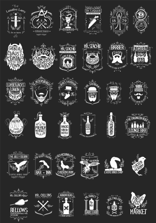
 If you’re constantly looking for the beautiful homesick vintage styles, this time you can stop for a while and check all the huge amount of resources including in this bundle. You can combine different elements and create infinite amount of results. This huge bundle include:

  • 190 editable vector templates
  • Over 560 vector elements from 46 different sets
  • 200 vintage vector illustrations
  • 12 gorgeous hand-drawn fonts with their original vector files
  • 100 frames and borders
  • 50 hand-drawn vector ornaments
  • 54 premium seamless patterns
  • 11 vector alphabet sets
  • 73 super high-resolution textures
  • 188 Photoshop and vector brushes
  • 6 incredible Photoshop Actions

It’s stuffed with $4,035 worth of super premium resources, but it can be yours for $39

Grab it here; http://bit.ly/vintagekit

via DesignCloud http://ift.tt/1ngilb6

TOP
26 Sep

Refresh Your Tech with These Colorful Wallpapers

Posted by nick Categories: Blog Comments are off for this post

via Design Milk » Art http://ift.tt/1nbnzVy
TOP
Page 32 of 34« First«...1020...3031323334»
  • Navigation

    • Home
    • Portfolio of Work
    • Services
    • Blog
    • Contact Us
  • Client

    • Log in
    • Entries feed
    • Comments feed
    • WordPress.org
  • Contact Us

    • E-mail: nick@theaffordabledesign.com
    • Phone: 561-444-9190

Search our website

  • Home
  • Portfolio of Work
  • Services
  • Blog
  • Contact Us
© copyright 2014 www.theaffordabledesign.com