• HomeFront Page
  • Portfolioview our work
  • Serviceswhat we offer
  • BlogInspiration
  • ContactGet in touch
You are here: Home » Visual Inspiration
  • About

    This blog is written by The Affordable Design creative team as a way to share art & design that inspires us. We provide WordPress web development in Palm Beach County and beyond.

  • Contact Us

    Phone: 561-444-9190
    E-mail: nick@theaffordabledesign.com

    The Affordable Design serves all of Palm Beach County with professional, contemporary design both print and digital - and specializes in WordPress.

    • Home
    • Portfolio
    • Services
    • Blog
    • Contact

30 Nov

The Hepworth Prize for Sculpture

Posted by nick Categories: Blog Comments are off for this post
The Hepworth Prize for Sculpture

Leeds based design agency, Passport, designed the much acclaimed brand identity for The Hepworth Prize for Sculpture. The biennial award is awarded to any British or UK-based artist, of any age, at any stage in their career, who has made a significant contribution to the development of contemporary sculpture. The award returned for its second instalment in 2018 and The Hepworth asked Passport to be involved again.

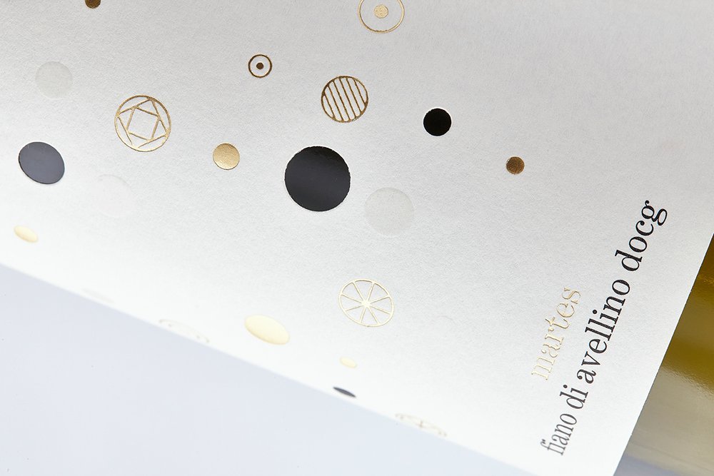
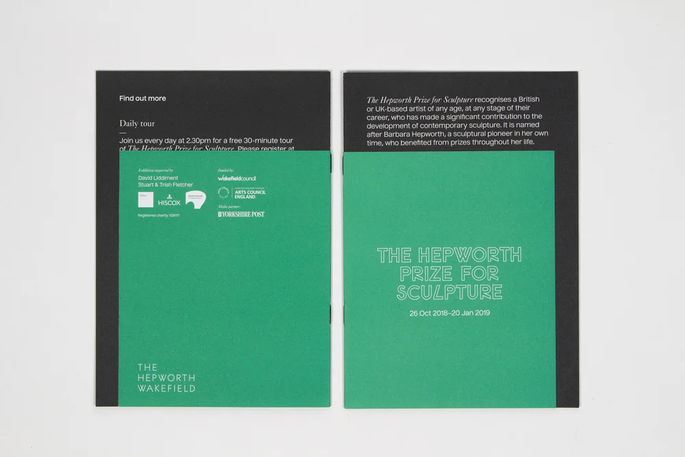
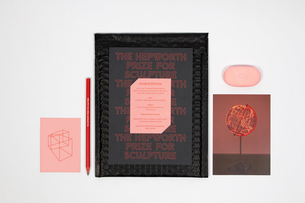
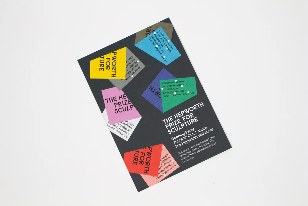
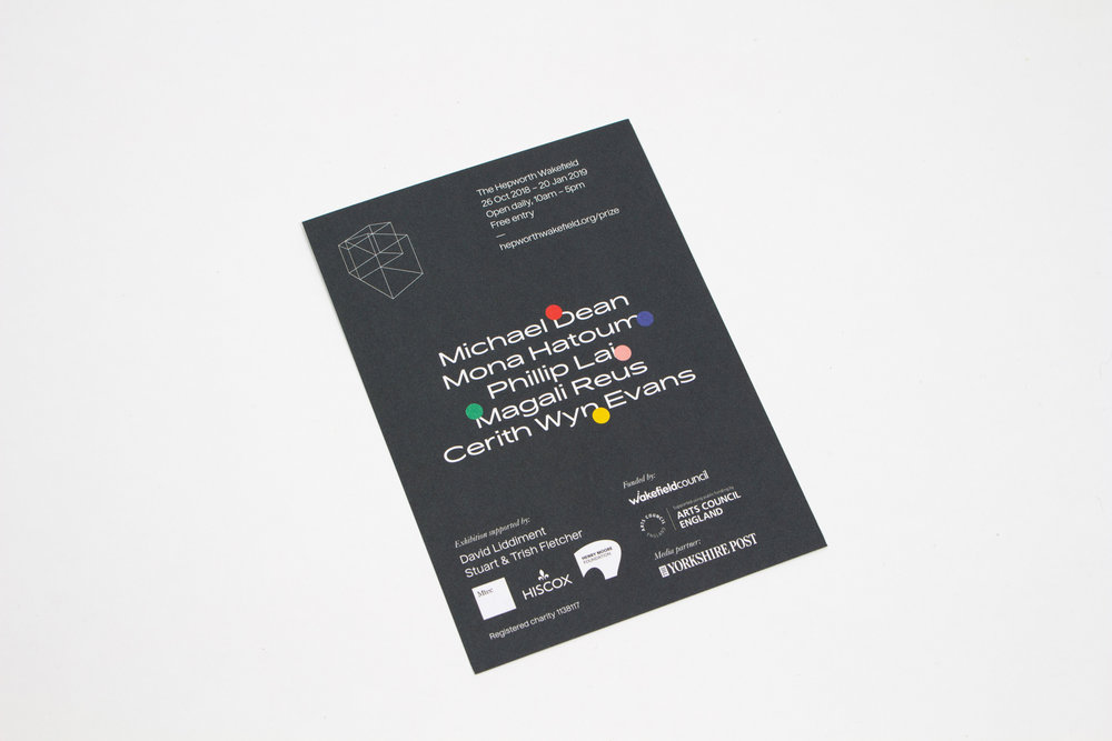
Passport’s original branding for 2016 was based on the idea that it could be ‘pulled apart and reassembled for each year of the Prize.’ For the second year, they completely renewed the visuals, using the angles within the logo. Passport have used the 2D campaign assets and given the impression of three dimensions, by representing folds and depth in the format of the branding pieces, such as flyers, billboards and brochures.

f1fb7d73719881.5c17c07b6ccf9.jpg
The Hepworth Prize for Sculpture 2018

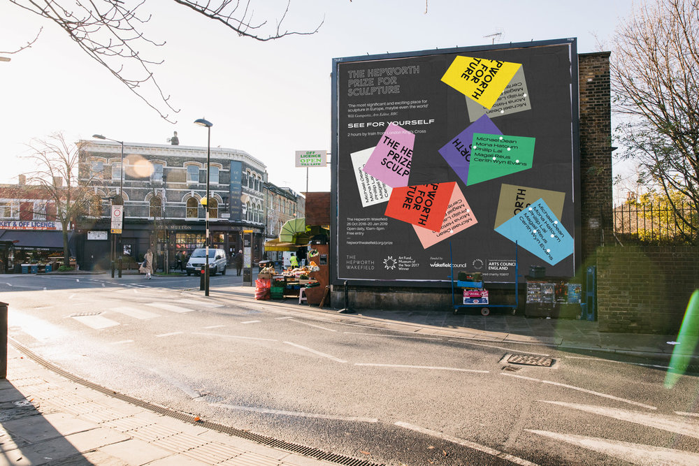
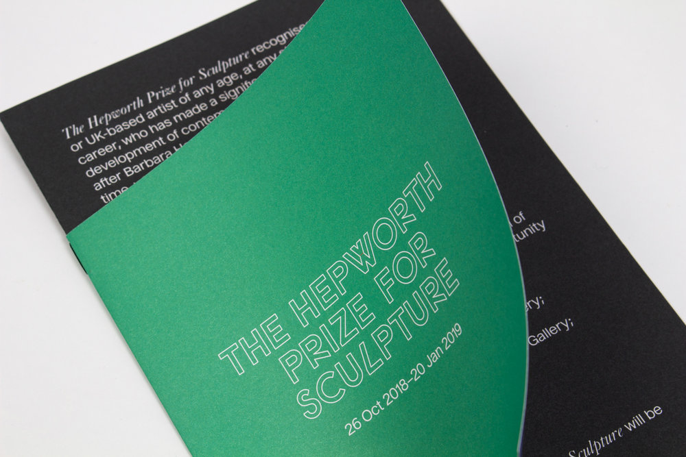
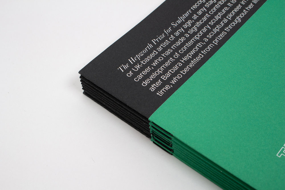
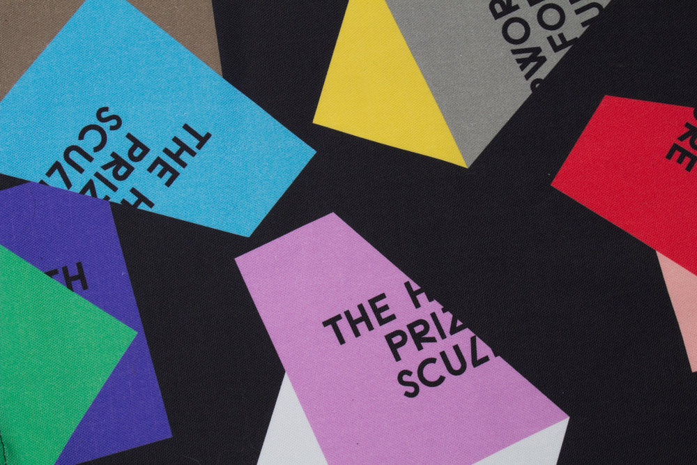
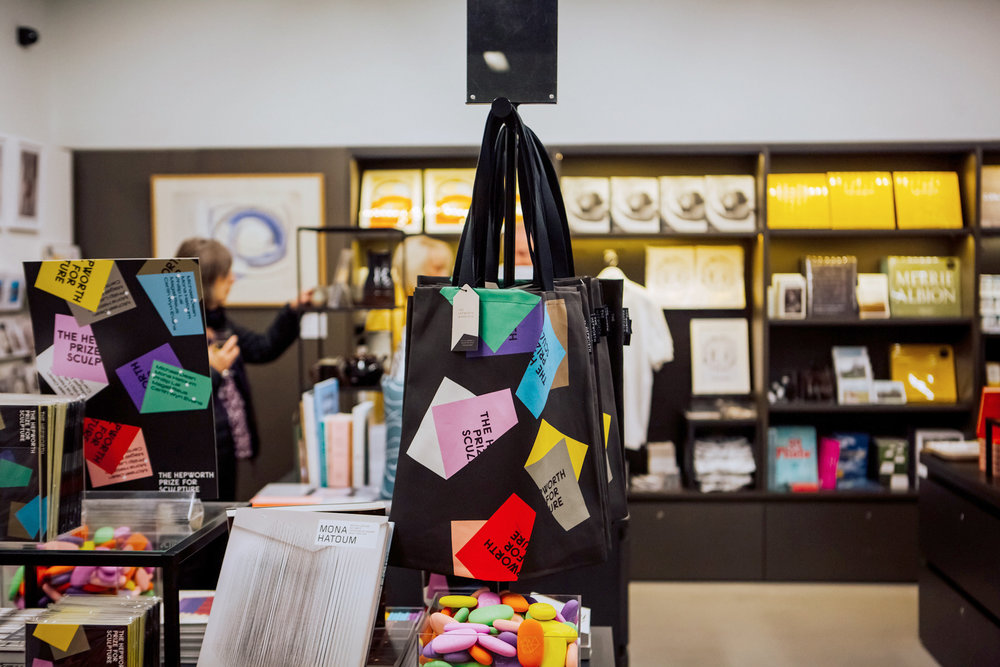
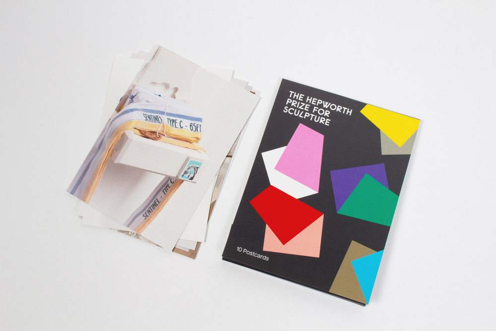
They’ve used a strong, bold colour palette, using contrasting colour pairings that work together perfectly. The confetti style imagery adds to the celebratory tone of voice. We love the use of black backgrounds to help draw attention to the 3D folded elements on the marketing pieces which bring the identity to life, putting at the forefront the accessibility and closeness of the competition. This is also a kind of graphical sculpture, the assets aping the 3D nature of sculpture in a 2D space. These pieces included; nationwide digital, print and outdoor marketing campaign, invitations, promotional materials, indoor & outdoor exhibition way-finding & signage, gallery interpretation guide, leaflets, flyers, social media content, assets for film, tote bags and gift shop merchandise. We’d especially love one of those colourful tote bags.

The Hepworth Prize for Sculpture 2018
4824d773719881.5c13dbe8471b6.jpg
The Hepworth Prize for Sculpture 2018
b4dac873719881.5c17c07b73e20.jpg
The Hepworth Prize for Sculpture 2018

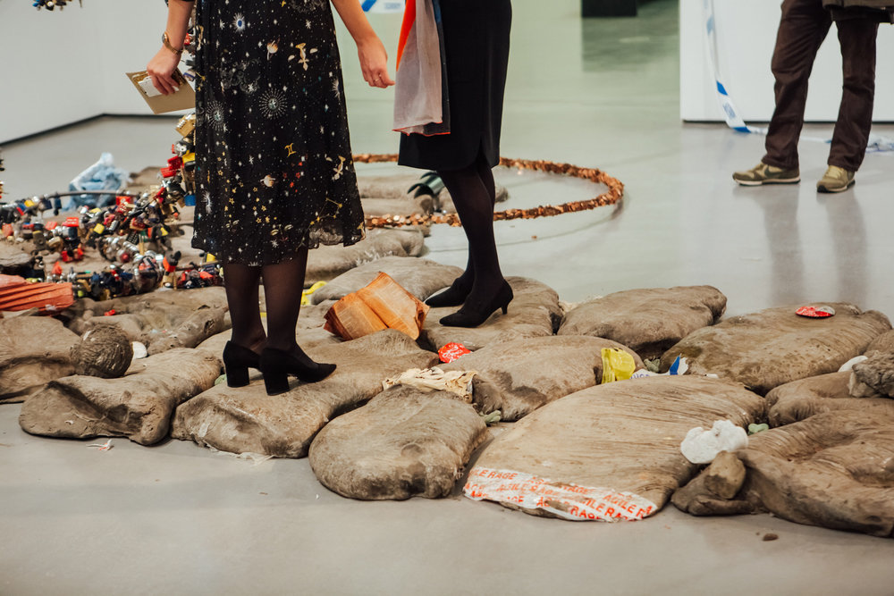
The second Hepworth Prize for Sculpture was awarded to Cerith Wyn Evans at an award dinner at The Hepworth Wakefield on Thursday 15 November.

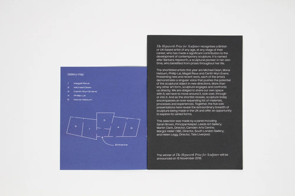
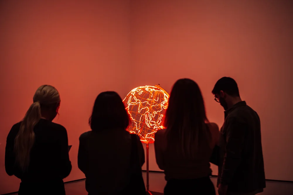
The other shortlisted artists were Michael Dean, Mona Hatoum, Phillip Lai and Magali Reus. Presenting new and recent work, each of the artists demonstrated a singular voice that pushed the potential of the sculptural object in new directions. Exhibition photography by Helena Dolby.

An all-round beautiful identity which works perfectly in The Hepworth. We are already looking forward to the ident for 2020. See more from Passport here.

TOP
09 Nov

Olipop Drinks

Posted by nick Categories: Blog Comments are off for this post
Olipop Drinks

Break Maiden have designed a strong, bright and first-rate brand identity for Olipop drinks brand. The first clinically backed digestive health beverage was desperately in need of a brand refresh and Break Maiden have they done just that. 

With links to old cola style typography, they’ve created a strong type approach with a classic look. This gives the packaging a fun, nostalgic look and feel with allusions to the simple and wholesome nature ascribed to many products of the past. Alongside the typography, Break Maiden have added some lovely fruit illustrations, these simple vector drawings give the packaging a clean and playful feel.

The launch of Olipop’s new look was presented with these brilliantly art-directed shots, photographed by Andi Devon. The photographs use the same colours as those on each pack and give a fun, cutesy approach using matching striped straws and feature some of the ingredients in the drinks. The photography certainly shows of the brilliant palette chosen by Break Maiden and these photographs help bring the whole project to life.

The branding screams tasty, stylish soft drink. A delicious and sparkling look for digestive health, with fibre, prebiotics and botanical extracts.

Olipop Drinks
Olipop Drinks
Olipop Drinks
Olipop Drinks
Olipop Drinks
Olipop Drinks
Olipop Drinks
Olipop Drinks

To see more work from Florida’s Break Maiden studio, see here.

And more photography by Andi Devon here.

TOP
07 Nov

Graphic Designer Awazu Kiyoshi’s Fantastical World

Posted by nick Categories: Blog Comments are off for this post
Graphic Designer Awazu Kiyoshi’s Fantastical World
Awazu Kiyoshi, poster for The 5th Exhibition of Contemporary Japanese Sculpture (1973), offset lithograph, 40 1/2 x 28 3/4 in., Los Angeles County Museum of Art, Marc Treib Collection (© Awazu Kiyoshi Estate, photo © Museum Associates/LACMA. All images courtesy of LACMA)

Japanese graphic designer Awazu Kiyoshi (1929–2009) developed a style that eschewed simplicity and clean line and instead drew viewers into psychedelic visual cornucopias. Born in Tokyo and self-taught, Awazu began his career creating film posters. He became known for working with a variety of themes and within different disciplines. He designed posters for film and theater, collaborated with architects and urban designers, and addressed social issues in his work. His style has elements that recall pop or psychedelic art, yet his use of color and iconography reveals a unique aesthetic.

In his essay “Tracing the Graphic in Postwar Japanese Art”  for the catalogue accompanying MoMA’s 2012–13 exhibition Tokyo 1955–1970: A New Avant-Garde Michio Hayashi writes of Awazu’s attitude towards his work: “… ‘instructions’ (shiji) were beginning to pervade urban space by means of modern design […] the city was regulating people’s behavior and manners down to the smallest detail […] Awazu sought to create ‘gaps/fissures/openings’ (sukima) in the increasingly regulated and flattened urban plain.” Hayashi explains that Awazu’s approach rebuked modernist design ideals and instead engaged with indigenous culture, popular symbols, and untidy visuals.

In a 1973 poster for an exhibition, The 5th Exhibition of Contemporary Japanese Sculpture, Awazu inflects the natural world and sculptural object with surrealism. A figure’s head is replaced by a wooden beam. A swan swims in a blue color field that is either water or sky, depending on one’s vantage point. A turtle swims past a pyramid, and tiny human figures cross a bridge upon which the headless giant stands. The poster evokes sculpture in the artist’s use of scale, as well as his pairing of unexpected elements and exploration of the boundaries between the inanimate and the animate. The result is an artwork that provides an immersive viewing experience, rather than information alone.

Awazu’s works are complex, and for an audience not familiar with Japanese culture a full understanding may require some research into their motifs and symbols. What is immediately clear is the joy of peeling away visual layers and falling deeper and deeper into a fantastical world. Delight, engagement, and emotional response are the functions of his artworks. Their forms follow.

Awazu Kiyoshi, “Seishū Hanaoka’s Wife” (1970), offset lithograph, 40 3/8 x 28 3/4 in., Los Angeles County Museum of Art, Marc Treib Collection (© Awazu Kiyoshi Estate, photo © Museum Associates/LACMA)
Awazu Kiyoshi, “Flower Hall” (1970), offset lithograph, 40 5/8 x 28 7/8 in., Los Angeles County Museum of Art, Marc Treib Collection (© Awazu Kiyoshi Estate, photo © Museum Associates/LACMA)
Awazu Kiyoshi, “The Friends” (1969), offset lithograph, 28 1/2 x 20 1/4 in., Los Angeles County Museum of Art, Marc Treib Collection (© Awazu Kiyoshi Estate, photo © Museum Associates/LACMA)
Awazu Kiyoshi, “Surging Waves” (1971), offset lithograph, 28 3/4 x 20 1/4 in., Los Angeles County Museum of Art, Marc Treib Collection (© Awazu Kiyoshi Estate, photo © Museum Associates/LACMA)
Awazu Kiyoshi, “Women: People of the Kumehachi Troupe” (1977), offset lithograph, 28 5/8 x 20 1/2 in., Los Angeles County Museum of Art, Marc Treib Collection (© Awazu Kiyoshi Estate, photo © Museum Associates/LACMA)
Awazu Kiyoshi, “Mussorgsky = Ravel: Pictures At An Exhibition/Ravel: La Valse/ Zubin Mehta/ New York Philharmonic” (1979), Los Angeles County Museum of Art, Marc Treib Collection (photo © Museum Associates/LACMA)
Awazu Kiyoshi, “Crowded Ground: Apart from Life” (1970), offset lithograph, 40 3/8 x 28 3/4 in., Los Angeles County Museum of Art, Marc Treib Collection (© Awazu Kiyoshi Estate, photo © Museum Associates/LACMA)
TOP
31 Oct

Bottles Galore!

Posted by nick Categories: Blog Comments are off for this post
Bottles Galore!

Designing a bottle label is a dream project for many Designers. With more and more bottles on supermarket shelves, as a brewery/distillery, making sure yours stands out is a big job. From beautiful illustrations to strong typography, there’s a huge mixture of designs out there today. We’ve found many amongst our Inspo Finds recently and thought we’d show you some of our favourites… we wouldn’t mind trying a few either!

fagerström-2.jpg
fagerström-1.jpg
fagerström03.jpg

Wake by Fagerström

Olipop-2.jpg
Olipop-3.jpg
Olipop-4.jpg
Olipop-1.jpg

Olipop by Break Maiden

Wines of the wisemen-1.jpg
Wines of the wisemen-2.jpg
Wines of the wisemen-3.jpg
Wines of the wisemen-4.jpg

Wines of the wisemen by nju: comunicazione

Tauraite Country Spirits-4.jpg
Tauraite Country Spirits-2.jpg
Tauraite Country Spirits-5.jpg
Tauraite Country Spirits-1.jpg
Tauraite Country Spirits-3.jpg

Tauraite Country Spirits by AKU

Kuura Cider-1.jpg
Kuura Cider-2.jpg
Kuura Cider-3.jpg
Kuura Cider-4.jpg
Kuura Cider.jpg

Kuura Cider by Werklig

Hellstrøm Sommer-1.jpg
Hellstrøm Sommer-2.jpg
Hellstrøm Sommer-3.jpg
Hellstrøm Sommer-4.jpg
Hellstrøm Sommer-5.jpg
Hellstrøm Sommer-6.jpg

Hellstrøm Sommer by OlssønBarbieri

Co-op Beers, Ciders & Spirits-2.jpg
Co-op Beers, Ciders & Spirits-1.jpg
Co-op Beers, Ciders & Spirits-3.jpg
Co-op Beers, Ciders & Spirits-4.jpg
Co-op Beers, Ciders & Spirits-5.jpg
Co-op Beers, Ciders & Spirits-6.jpg
Co-op Beers, Ciders & Spirits-7.jpg
Co-op Beers, Ciders & Spirits-8.jpg
Co-op Beers, Ciders & Spirits-9.jpg

Co-op Beers, Ciders & Spirits by Robot Food

Bedow_St-Erhard_packaging-09.jpg
Bedow_St-Erhard_packaging-04.jpg
Bedow_St-Erhard_packaging-05-3.jpg
Bedow_St-Erhard_packaging-06.jpg
Bedow_St-Erhard_packaging-08-1.jpg
Bedow_St-Erhard_packaging-12-1.jpg

St Erhard by Bedow

download-2.jpg
SDCO-Partners.jpg
download-3.jpg
SDCO-Partners-1.jpg

Brightland by SDCO Partners


For more packaging projects, please head over to our Pinterest.

TOP
30 Sep

Jervois & Co – Estate Agents

Posted by nick Categories: Blog Comments are off for this post
Jervois & Co – Estate Agents

Jervois & Co is the big new player in Auckland’s local residential business. Led by Amy Wildman, a one-woman band, Jervois & Co focuses solely on Herne Bay. Amy offers a refreshing estate agent approach based on honesty, tailored marketing and a ‘charge less, do more’ ethos.

Seachange studio have developed a flexible, modern brand that speaks to all audiences. With a clean and classic san-serif doing most of the work, the design can be smooth and fresh whilst remaining enthusiastic and message-driven. In the brand’s logo, Seachange have opted for a superscript ‘o’, linking back to the ‘Co’ in the logo, as well as referencing the longitudinal/latitudinal degrees symbol.

The branding itself stands well out in a corporate estate agent world, it wouldn’t look out of place as a new fashion brand. The campaign images aren’t like the usual competition, it’s smooth and stylish, with a pop-art, attention-grabbing look.

Jervois & Co
Jervois & Co
Jervois & Co
Jervois & Co
Jervois & Co
Jervois & Co Estate Agents
Jervois & Co
Jervois & Co Estate Agents

Seachange also created a number of custom made For Sale and Open Home signs, made from powder-coated steel, to fit in with the brand. The straightforward signs are understated but have a modern flair to them thanks to a combination of the typography and unusual signage as a medium. 

A well thought out brand which is distinctive within it’s corporate world, with lovely typographically-led branding. Amy is sure to show the competitors who’s top dog.

Jervois & Co

To see more work from Seachange, click here.

TOP
06 Sep

From Eastern Europe

Posted by nick Categories: Blog Comments are off for this post
From Eastern Europe

Our favourite online book-shop, Counter-print, have a new book! Featured over on our feed, we couldn’t resist a blog post about their brilliant new book.

‘From Eastern Europe’ is the third book from their geographical series. The series also features ‘From Japan’ and ‘From Scandinavia’, which can now all be purchased in a set here. The new book showcases a variety of work from some of Eastern Europe’s most prolific, as well as up-and-coming designers, illustrators and agencies; Anna Kulacheck, The Bakery, AKU, Dima Pantyushin, Metaklinika to name a few.

As many of the Counter-print books, ‘From Eastern Europe’ has been designed by multi-disciplinary graphic design studio Leterme Dowling. Their on-going work with Counter-print have quickly become regularly spotted in most design studios, with their ability to showcase an inspiring and thought-provoking editorial piece. The books themselves are beautifully designed and feel like the high-quality you would expect from Counter-print.

An extra highlight of this new book is that the first 150 copies of the book sold come with a free riso print by contributor Dima Pantyushin, printed by Before Breakfast. A great opportunity to get a limited print as well as a brilliant inspirational book!

Inspo-Finds-Counterprint-From-Eastern-Europe
unnamed-6.jpg

‘From Eastern Europe’ is out now and available to purchase through Counter-Print: https://www.counter-print.co.uk/collections/all-books/products/from-eastern-europe

TOP
01 Sep

Trés Cool

Posted by nick Categories: Blog Comments are off for this post
Trés Cool

The resort of Deauville, on the Côte Fleurie of France’s Normandy region, is the site of Trés Cool: a music, food and art festival set up by the local community. Their new brand identity by Studio Ouam is strong, colourful and creative. Ouam have created an identity around the iconic ‘stripes of Deauville’, taking inspiration from the beach, particularly the stripes on parasols, that they’ve brought to rural Deauville for the festival. Combining this with typical images of the rural French idyll, the branding not only brings a summer holiday vibe to the festival but ties said vibe intimately to the setting.

The colours consist of bold yellows, blues and pinks, with simple playful and almost child-like illustrations of horses and flowers. The overall look makes this festival feel family-friendly and importantly safe. The collage style over-layed patterns are such fun, the chicken is our favourite. The simple Cooper Black typeface also adds a cheerful, good-natured ideology to the event. 

Tres Cool branding
Tres Cool branding
Tres Cool branding
Tres Cool branding
Tres Cool branding
Tres Cool branding
Tres Cool branding
Tres Cool branding
Tres Cool branding
Tres Cool branding

Studio Ouam is a creative agency based in Paris and Bordeaux, born of 3 friends and artistic directors, click here to see more of their work. We also featured their POOMCLAP project back in 2017.

TOP
31 Jul

Tinted Window: No.1: Hervé Guibert

Posted by nick Categories: Blog Comments are off for this post
Tinted Window: No.1: Hervé Guibert
TW-3.jpg

‘Tinted Window is a journal that publishes compendiums of texts and images that focus on one person, place or object.’

Earlier this year, the brilliant London based design studio, Regular Practice launched a Kickstarter campaign for the first issue of journal, Tinted Window.

The first issue of the magazine will focus on French writer and photographer, Hervé Guibert and will feature originally commissioned as well as newly translated texts. The 96 pages (ish) will be presented in a de-bossed PVC slipcase. It’s a printed piece to read and enjoy but also to cherished, they’ll be collectable but easy to navigate [not sure if that’s the right word]. Regular Practice have also created a new custom font for TW and what a beauty it is.

‘Thematically, our scope is wide, but Tinted Window’s defining feature is its commitment to exploding its subject; to seeing it from multiple angles. To these ends, we want to go further than most publishers to bring together new responses from leading writers, and to source new translations into the English language.’ – Oscar Gaynor, Tinted Window Editor

TW-4.jpg
TW-2.jpg
TW-5.jpg

Oscar Gaynor and Alex Bennett are the minds behind Tinted Window, both graduates from the Critical Writing Maters programme at the Royal College of Art. The grafters have put their skills to this new venture which we are very excited about. 

Back their campaign over at Kickstarter and follow their journey here.

TOP
30 Jun

Leeds Pub Piano Competition

Posted by nick Categories: Blog Comments are off for this post
Leeds Pub Piano Competition

Leeds Pub Piano Competition returned to Leeds after nearly 30 years this year. The LPPC, for short, brings together three simple ingredients: Pints, a Piano and a Pub. A fine combo!

The brilliant Saul Studio, also based in Leeds, were asked to create this exciting brand identity. Using typeface Exposit (TIGHTYPE), who’s vertically changing characters develop and respond to the music of a Yorkshire folksong, they’ve added a playful side in the logo (see here!). The brand is placed squarely in the atmosphere of a lively pub, tying together type, style and attitude to emulate a pint, piano and pub feel in the design itself.

InspoFinds-Leeds-Pub-Piano-Competition
75cc9069852271.5bab9848ad810.jpg

An effective brand identity that’s been pushed typographically and implemented to a sharp, well thought out standard.

You can find out more about Leeds Pub Piano Competition over on their instagram and more brilliant work from Saul Studio can be found here.

TOP
07 May

Melania Trump Designed the Logo for Her “Be Best” Initiative

Posted by nick Categories: Blog Comments are off for this post
Melania Trump Designed the Logo for Her “Be Best” Initiative
The logo for "Be Best" allegedly designed by Melania Trump herself (image courtesy the White House)
The logo for “Be Best” allegedly designed by Melania Trump herself (image courtesy the White House)

Graphic designers the world over probably groaned at the news that First Lady of the United States Melania Trump designed the logo for her new “Be Best” initiative, which New York Times journalist Julie Davis reports came about because the First Lady likes “clean lines” and “wanted something that would appeal to children.”

The “new” Be Best brochure, left, and the FTC brochure from 2014, right, are very much alike (all images courtesy the White House)

The logo is part of a campaign aimed at “encouraging children to BE BEST in their individual paths, while also teaching them the importance of social, emotional, and physical health.” Cue eye roll. Many people find it hard to imagine the FLOTUS spearheading a campaign about emotional and social health when her partner, the President of the United States, regularly disparages and humiliates people, while constantly lying about issues both major and minor (CNN recently reported that Donald Trump had lied more than 3,000 times in 466 days).

Let’s remember that FLOTUS has an originality problem, so it seems only fitting that the Be Best pamphlet is an almost exact copy of a document published by the Federal Trade Commission in January 2014 — h/t @RMac18. Of course, this isn’t the first time she’s cribbed from the Obama administration, or event the second. Perhaps we’ll soon discover that she copied this logo, too.

Everyone is an artist and designer nowadays, whether we like it or not, so it shouldn’t be a surprise that Melania Trump has thrown her hat into the ring.

Melania Trump designed the “Be Best” logo herself, an East Wing official told us. She likes clean lines, the official said, & wanted something that would appeal to children pic.twitter.com/6lABdOjkHp

— Julie Davis (@juliehdavis) May 7, 2018

Tell us what you think about the FLOTUS’s Be Best logo.

Take Our Poll

TOP
Page 31 of 34« First«...1020...2930313233...»Last »
  • Navigation

    • Home
    • Portfolio of Work
    • Services
    • Blog
    • Contact Us
  • Client

    • Log in
    • Entries feed
    • Comments feed
    • WordPress.org
  • Contact Us

    • E-mail: nick@theaffordabledesign.com
    • Phone: 561-444-9190

Search our website

  • Home
  • Portfolio of Work
  • Services
  • Blog
  • Contact Us
© copyright 2014 www.theaffordabledesign.com