• HomeFront Page
  • Portfolioview our work
  • Serviceswhat we offer
  • BlogInspiration
  • ContactGet in touch
You are here: Home » Visual Inspiration
  • About

    This blog is written by The Affordable Design creative team as a way to share art & design that inspires us. We provide WordPress web development in Palm Beach County and beyond.

  • Contact Us

    Phone: 561-444-9190
    E-mail: nick@theaffordabledesign.com

    The Affordable Design serves all of Palm Beach County with professional, contemporary design both print and digital - and specializes in WordPress.

    • Home
    • Portfolio
    • Services
    • Blog
    • Contact

03 Jul

Aesop Wines

Posted by Categories: Blog Comments are off for this post

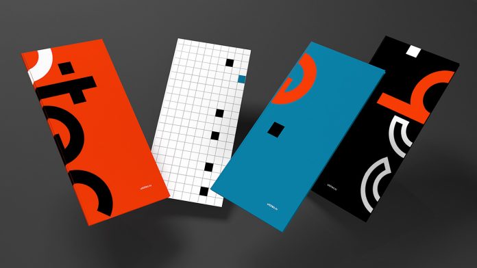
Wine label designs for Aesop Wines, a winery based in Napa Valley, California, producing high quality wines from carefully farmed, sustainable vineyards in the Napa region.

The labels created by the London-based studio leverage a pattern which draws inspiration from how the sun’s light hits the foggy mountain landscapes of Northern California. They reveal a story around the land’s relationship with the elements — and Aesop’s thoughtfully crafted, sustainable relationship with Mother Nature.

MIRADOR | Aesop WinesMIRADOR | Aesop WinesMIRADOR | Aesop WinesMIRADOR | Aesop WinesMIRADOR | Aesop Wines

TOP
03 Jul

Kommigraphics

Posted by Categories: Blog Comments are off for this post
Kommigraphics

Kommigraphics is an independent visual communication agency based in Athens, Greece, with a varied portfolio including branding, packaging, web design and implementation as well as online & offline marketing services.

The agency focuses on creating custom web design, brand identities, packaging design with immersive print & digital experiences for brands across different markets and around the globe. They aim to see all projects in a holistic way in order to deliver effective, worthy and memorable results that stand out.

MIRADOR | KommigraphicsMIRADOR | KommigraphicsMIRADOR | KommigraphicsMIRADOR | KommigraphicsMIRADOR | KommigraphicsMIRADOR | Kommigraphics

TOP
03 Jul

Elliot Ulm

Posted by Categories: Blog Comments are off for this post

Elliot Ulm is a freelance graphic designer from Sydney, Australia.

His moto is “I have a degree, I hope that’s okay” and it most certainly is. The artworks he creates and posts on his instagram are fun and the satirical comments are always on point. No wonder many designers can relate.

MIRADOR | Elliot UlmMIRADOR | Elliot UlmMIRADOR | Elliot UlmMIRADOR | Elliot UlmMIRADOR | Elliot UlmMIRADOR | Elliot UlmMIRADOR | Elliot UlmMIRADOR | Elliot Ulm

TOP
03 Jul

Graphic Design & Branding by Futura for Soy by Sato

Posted by nick Categories: Blog Comments are off for this post

Graphic design and branding by studio Futura for Soy by Sato, a high-end Asian bao restaurant located in Doha Qatar.

Soy by Sato is a high-end Asian Bao restaurant in Doha, Qatar. Soy is one of the oldest and most traditional staple foods in Asian cuisine. It is more than just an ingredient, it is the basis of various Asian civilizations.

To reflect this, graphic design studio Futura created a graphical system in which raw materials tell the beginnings of Asian culture as we know it, and in which primitivism was portrayed with modern illustrations and graphism. Primitivism is a type of aesthetic idealization that either emulates or strives for a “primitive” experience. In this case, it is represented by circles and arcs. The use of copper and rose gold creates a refined aesthetic that bridges the balance between sophistication and raw goods. Just see it for yourself.

Graphic design and branding by studio Futura for Soy by Sato, a high-end Asian bao restaurant located in Doha Qatar.

All images © by graphic design and branding studio Futura. For more inspiration, just browse through our popular Graphic Design and Branding categories.

Subscribe to our newsletter!

The post Graphic Design & Branding by Futura for Soy by Sato appeared first on WE AND THE COLOR.

TOP
03 Jul

Master’s Degree Students Exhibition Design by JenWei Huang for the Department of Visual Design

Posted by nick Categories: Blog Comments are off for this post
Master’s Degree Students Exhibition Design by JenWei Huang for the Department of Visual Design

Graphic design and visual identity development by JenWei Huang for the Stop/NKNU master’s degree students exhibition at the Department of Visual Design.

JenWei Huang is an artist and graphic designer at the Design Center at TDU. The Design Center, located on a side wing of the Shigeo Fukuda Design Museum, mainly focuses on commercial and poster arts, which are showcased in various locations around the world.

Based on a visual concept themed around the idea of movement, JenWei Huang just finished the design for the Stop/NKNU master’s degree students exhibition at the Department of Visual Design. Please read more below the following image.

Stop/NKNU Master Degree Students Exhibition design by JenWei Huang for the Department of Visual Design.

JenWei Huang says: “When facing a still picture, we tend to pursue a dynamic presentation. It might be a visual rhythm, or it might also be a supplement to the stage action—these all show overture to moves or changes. What kind of scene would it be like, to reflect on and remain at a simple stop? Between and in between movements, nature, and phenomena in the category of materialism are the interrelationships of contradiction and unity. The whole concept is about linearity. The rotation of slot machines connects human operations. Line length and thickness variations integrate the visual system, representing the presence of the theme of the year.”

Stop/NKNU Master Degree Students Exhibition design by JenWei Huang for the Department of Visual Design.

Creative & Art direction: JenWei Huang
Design: JenWei Huang
Copywriting: ChangChing Lin
Photography: ChiYin Shih

Feel free to find other inspiring projects in our extensive Graphic Design and Branding categories.

Subscribe to our newsletter!

The post Master’s Degree Students Exhibition Design by JenWei Huang for the Department of Visual Design appeared first on WE AND THE COLOR.

TOP
03 Jul

Adobe InDesign Brand Manual Template with Blue Accents

Posted by nick Categories: Blog Comments are off for this post
Adobe InDesign Brand Manual Template with Blue Accents

Available for download with two standard sizes (A4 and US Letter), this Adobe InDesign brand manual template with blue accents covers all common topics of today’s branding projects.

Created by Adobe Stock contributor @MrTemplater, this highly professional and well-designed brand manual template comes with 32 pre-made pages that can be customized in Adobe InDesign. If you decide to download this template to document your own graphic design and branding projects, you get two standard sizes (A4 and US Letter). Every section is fully editable. This Adobe InDesign template is perfect to present any graphic design or branding project to your clients the right way. It is fully print-ready but you can also save it as a PDF to send it via email to clients or upload the file to your website or portfolio.

Please note, this product requires Adobe InDesign. You can get the latest version from the Adobe Creative Cloud website, just have a look here. Feel free to learn more about this brand manual template by clicking on the following link or have a look at the images below.

Download at Adobe Stock.

Adobe InDesign brand manual template with blue accents from MrTemplater.

Download at Adobe Stock.

For those of you looking for more graphic design resources, we recommend you to check out our extensive Templates category. The section includes several reviews of high-quality design assets made for creative professionals. Using these files, you can speed up your workflow and reduce your costs, while designing outstanding products for print or web in a minimum of time.

Subscribe to our newsletter!

The post Adobe InDesign Brand Manual Template with Blue Accents appeared first on WE AND THE COLOR.

TOP
03 Jul

Six High-Quality Presentation Templates for Keynote, Powerpoint, and Google Slides

Posted by nick Categories: Blog Comments are off for this post
Six High-Quality Presentation Templates for Keynote, Powerpoint, and Google Slides

This is our list of six premium presentation templates for Keynote, Powerpoint, and Google Slides.

In the past few months, we have often been asked which presentation templates we would recommend. Due to the huge and very confusing range of templates, it was not easy to provide you with a quick answer. That’s why we did some research and looked for outstanding templates that can be used for different needs. Our selection was made based on different criteria regarding usability, features, and design. Below you can find our handpicked selection of six highly professional presentation templates for use in Keynote, Powerpoint, and Google Slides.

Keynote Templates

Mokswa Agency Keynote Template

Mokswa: Agency Keynote Template
Mokswa Agency Keynote Template

This modern keynote template will help you to turn ideas into persuasive visual presentations to communicate your messages clearly, meet your goals, and exceed expectations in everything from thought leadership and sales to everyday employee communication. It features 120+ unique slides with a total of 800+ slides. It is based on a resolution of 19:6 (1920×1080). It is super easy to edit. Mokswa comes with six ready-made themes: blue, green, orange, red, magenta, and monochrome. Furthermore, it is equipped with 500+ fully editable font icons. Via drag and drop you can work super fast. Mokswa also comes with elegant transition animations and object animations as well as beautiful company profile slides. The pre-made data charts and infographics are also very easy to edit. Last but not least, this presentation includes a device mockup with a drag and drop screen placeholder as well as maps of Europe, US, Asia, Australia, Germany, and the UK.

You can download Mokswa at Envato Elements.

CHLOE Keynote Brand Guidelines

CHLOE Keynote Brand Guidelines

Because many of our readers are working as graphic and brand designers, we thought a brand manual should not be missing in our selection. The CHLOE template is fully editable, so the versatile layout gives you many possibilities of creativity. Just add your own text, drop your images into the placeholders, change all colors with a few clicks, and you are done. The expressive design will help you to convince your clients, partners, and potential customers. All elements and icons can be changed in size and color without loss of quality. Photo editing works also very fast and easy with drag and drop. This Keynote presentation template comes with 50 unique slides as well as 400 vector line icons and numerous vector devices including a phone, tablet, watch, and a notebook.

You can download CHLOE at Creative Market.

Powerpoint Templates

Agio Powerpoint Presentation

Agio Powerpoint Presentation

Based on a clean, modern, and restrained design but packed with lots of features—this is Agio! Believe it or not but this template is equipped with 630 presentation slides in total based on 70 unique and editable designs. Furthermore, it comes with 9 options of color themes, image placeholders with slide master, numerous icons, and a widescreen slide format of 16:9 HD (1920 x 1080 pixels). Please note, photos in the preview are not included but all vector graphics are included. Just click on the following link to learn more.

You can download Agio at Envato Elements.

Simple Powerpoint Presentation

Simple Powerpoint Presentation

This Powerpoint presentation template is called Simple Presentation because it is based on the idea to provide you with simple functionality mixed with an eye-catching design. This trending Powerpoint template is a great tool to show market shares or personal and corporate portfolios. It’s so easy to customize to fit your needs. The layout is based on an aspect ratio of 1240 x 1754 px (landscape). There is a dark and a light version included and all graphics are fully resizable and editable. Only free fonts have been used.

You can download this simple presentation at Envato Elements.

Google Slides Templates

Creative Google Slide Template

Creative Google Slides Template

The Creative Google Slides Template is equipped with five premade color variations. Whether business or personal needs, it was made for multipurpose presentations. All elements are fully editable within Google Slides. There is no need for other software. Just add your content, replace placeholders with your images, change the color, etc. You have all the freedom to create the perfect presentation according to your business. This well-designed template comes with 120+ slides in 5 premade color schemes. That’s 25 slides for each template. In addition, it comes with pixel-perfect illustrations and a range of graphics.

You can download this creative Google Slides template at Envato Elements.

NORS Google Slides Template

NORS Google Slides Template

This clean and creative layout gives you many possibilities for creativity. All photos and mockups used in the presentation preview are included as a free bonus. You can edit everything easily in Google Slides. This outstanding template features 130+ unique and creative slides and comes with 620+ free font icons. It is based on an aspect ratio of 16×9 Full HD format (1920x1080px). All objects are fully editable and all graphics are vectors. They are also fully resizable and editable.

You can download the NORS Google Slides template at Creative Market.

Do not hesitate to find other graphic design assets or presentation templates in our recommended Templates category. In addition, you can find trending typefaces in our Fonts section.

Subscribe to our newsletter!

The post Six High-Quality Presentation Templates for Keynote, Powerpoint, and Google Slides appeared first on WE AND THE COLOR.

TOP
03 Jul

COVID-19 Vector Icons

Posted by nick Categories: Blog Comments are off for this post
COVID-19 Vector Icons

This well-designed icon set of fully editable COVID-19 vector graphics is available for download at Adobe Stock.

Due to the coronavirus pandemic, the icons most used by graphic designers in 2020 are clearly themed around the COVID-19 crisis and related issues such as health and hygiene. To address this issue, Adobe Stock contributor Wavebreak Media has created a COVID-19 icon set that can be used by graphic designers in a great variety of projects ranging from print to web. Based on simple lines and clear geometric shapes, the kit consists of 15 fully editable vector graphics in a uniform style. Furthermore, the set comes in six design options. Thanks to the use of vector graphics, every single detail can be customized according to your own needs. You can transform these icons to any size or change colors in seconds. No matter if you want to use these icons on a website, mobile app, or for large-scale signage, these graphics look great in any size.

Please note, to edit these files you need professional graphic design software such as Adobe Illustrator. You can get the latest version from the Adobe Creative Cloud website, just have a look here. For further information about these COVID-19 vector icons, just click on the following link.

Download this set at Adobe Stock.

COVID-19 Vector Icons
This COVID-19 vector icons is available here.

Download this set at Adobe Stock.

If you are interested to see more graphic design resources, we recommend you to check out our Templates category. The section includes several reviews of highly professional products for different needs. It’s our aim to provide creative professionals with the best design assets for all kinds of projects. Hence, our Templates category is a huge collection of vector graphics, icons, logo templates, website themes, pre-made presentations, website themes, textures, just to name a few.

Subscribe to our newsletter!

The post COVID-19 Vector Icons appeared first on WE AND THE COLOR.

TOP
03 Jul

How do You Explain Cancer to Children?

Posted by nick Categories: Blog Comments are off for this post
How do You Explain Cancer to Children?

Children’s communication design by Get it Studio for Swiss Cancer Associations.

In Switzerland, 250 children are diagnosed with cancer every year, which makes it the leading cause of death by illness among children in the country. Swiss Cancer Associations visit schools with cancer-stricken children to talk about the disease, treatment, and precautionary measures needed in the classroom.

After many years of use, the existing communication media felt outdated. That’s why the creative team of Get it Studio was asked to work on a fresh communication media campaign that encourages children and adolescents to ask questions, express doubts, and talk about their anxiety in the face of their classmates’ illness. To captivate the children’s attention and encourage discussions, the graphic designers created a fun, colorful, and reassuring universe consisting of print materials and motion graphics. Each subject is presented through a short video with a narrative line that links them all together to form a whole. Below you can find a few examples. For more, just visit the website of Get it Studio.

Children's communication design by Get it Studio for Swiss Cancer Associations.
Children’s communication design by Get it Studio for Swiss Cancer Associations.
Children's communication design by Get it Studio for Swiss Cancer Associations.
Children’s communication design by Get it Studio for Swiss Cancer Associations.
Children's communication design by Get it Studio for Swiss Cancer Associations.
Children’s communication design by Get it Studio for Swiss Cancer Associations.
Children's communication design by Get it Studio for Swiss Cancer Associations.
Children’s communication design by Get it Studio for Swiss Cancer Associations.

Any footage © by Get it Studio. Do not hesitate to browse through our Graphic Design, Illustration, and Motion categories to find other inspiring work created by talented designers and creatives from all over the world.

Subscribe to our newsletter!

The post How do You Explain Cancer to Children? appeared first on WE AND THE COLOR.

TOP
03 Jul

Graphic Design & Branding by Studio Liteplane for URBITEC

Posted by nick Categories: Blog Comments are off for this post
Graphic Design & Branding by Studio Liteplane for URBITEC

Graphic design studio Liteplane has developed a modern brand identity based for URBITEC.

Urbitec is a Russian company specializing in technical equipment and new technologies. The creative team of Moscow-based graphic design and branding studio Liteplane has been asked to develop a fresh new corporate identity including logo and communication materials that masterfully reflect the forward-thinking approach of the company. They came up with a very graphic solution based on simple typography and geometric shapes in vivid colors. Below you can see the sophisticated result. For more, please visit their website or follow the studio on Behance.

Graphic design and branding by studio Liteplane for URBITEC.

All images © by Russian graphic design studio Liteplane. We recommend you to browse through our popular Graphic Design and Branding categories to find other inspiring projects realized by freelance designers and leading studios from around the globe.

Subscribe to our newsletter!

The post Graphic Design & Branding by Studio Liteplane for URBITEC appeared first on WE AND THE COLOR.

TOP
Page 28 of 34« First«...1020...2627282930...»Last »
  • Navigation

    • Home
    • Portfolio of Work
    • Services
    • Blog
    • Contact Us
  • Client

    • Log in
    • Entries feed
    • Comments feed
    • WordPress.org
  • Contact Us

    • E-mail: nick@theaffordabledesign.com
    • Phone: 561-444-9190

Search our website

  • Home
  • Portfolio of Work
  • Services
  • Blog
  • Contact Us
© copyright 2014 www.theaffordabledesign.com