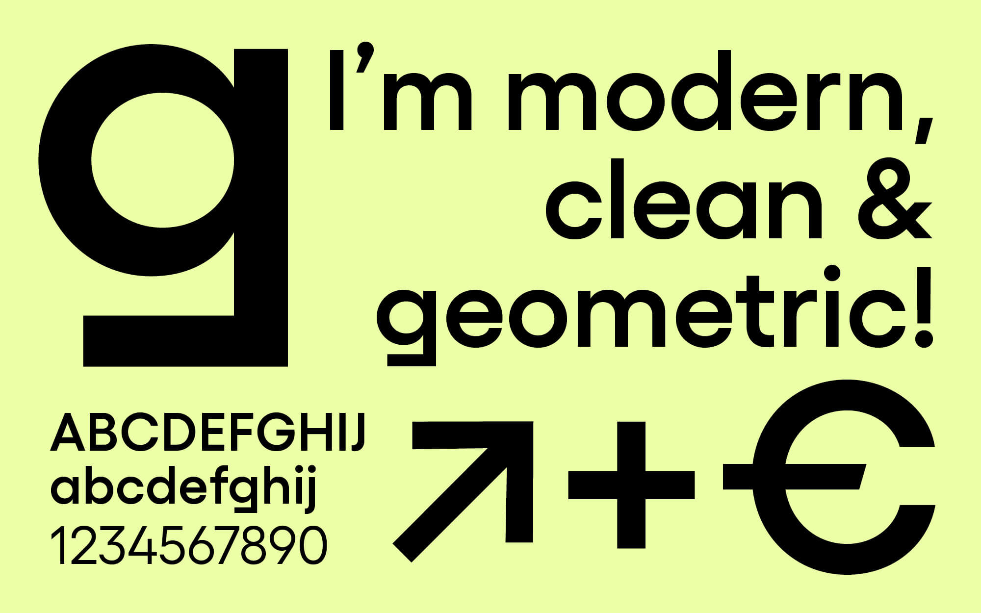
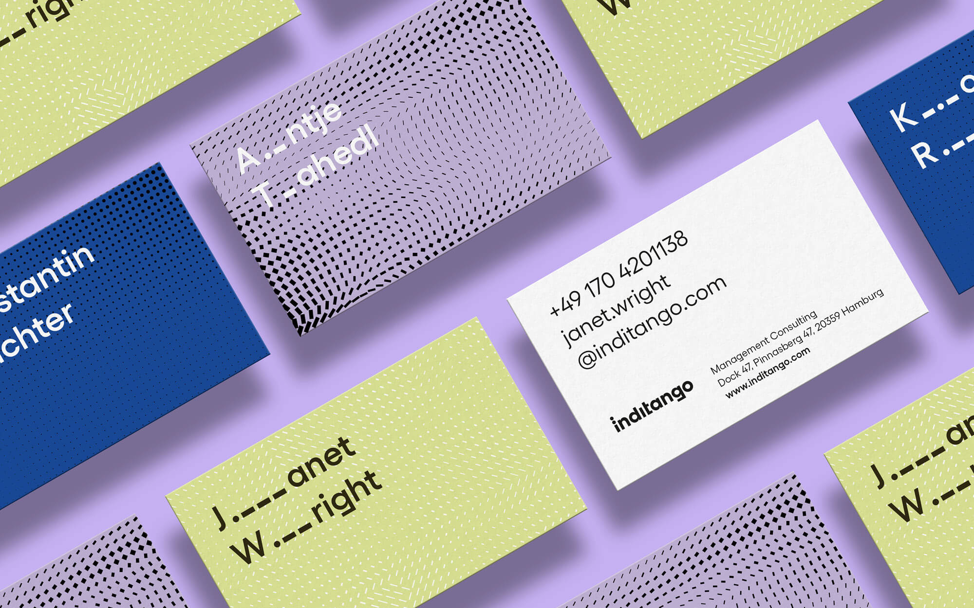
German award-winning agency EIGA was commissioned to work on a new brand identity for Inditango—one of Europe’s leading management consultancies.
In most industries today, IT is the basis for success. Inditango enables organizations to manage IT like a business. The company is one of Europe’s leading management consultancies with a focus on increasing the added value of IT. Inditango commissioned agency EIGA to work on a relaunch of the existing brand identity. The goal was to create a new visual language that expresses the uniqueness of the company’s authentic and progressive approach through brand strategy, visual identity, and digital communication. Please read more below.

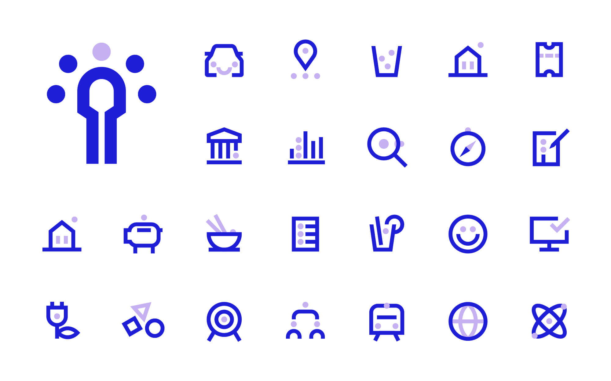
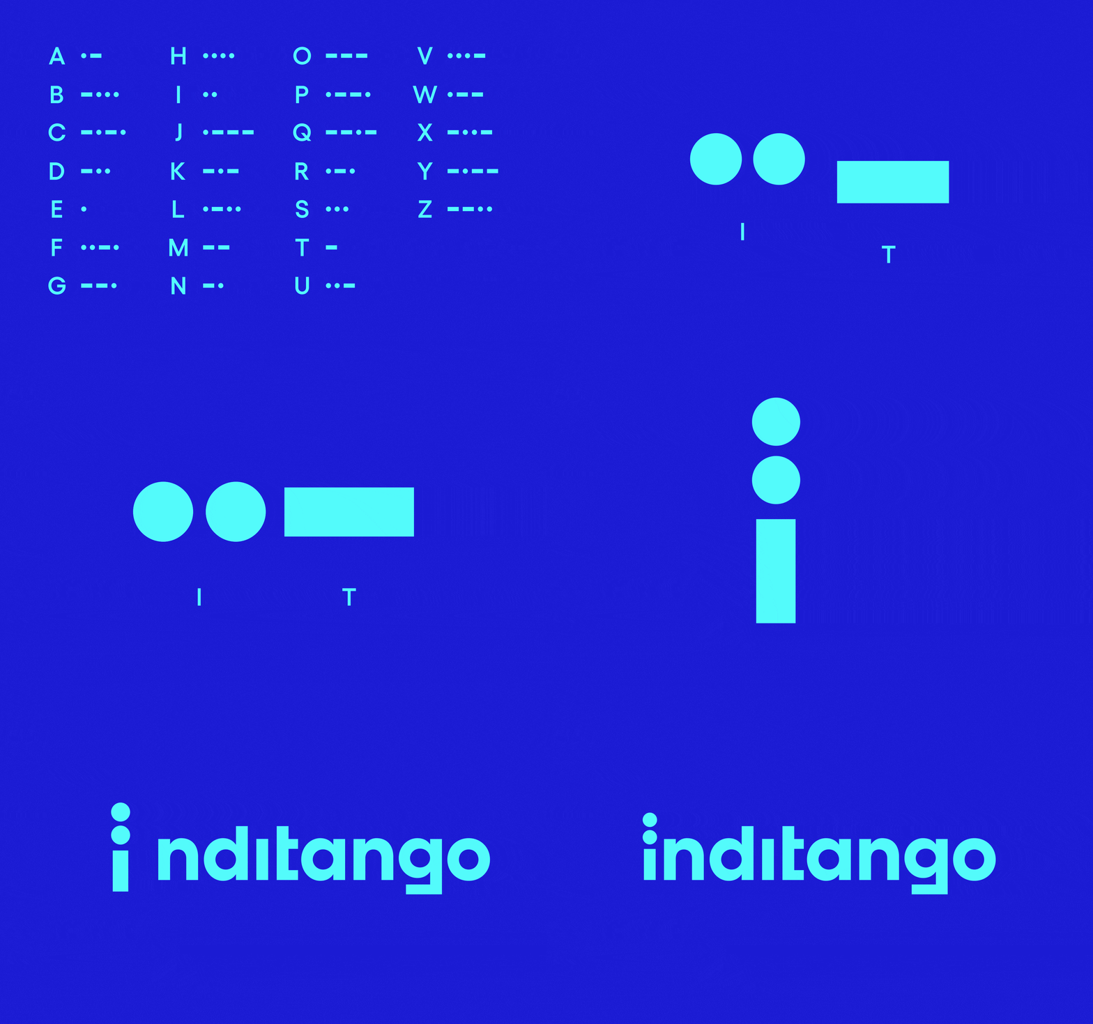
The unique brand name is derived from the phonetic NATO alphabet. The abbreviation IT is reproduced as “India” and “Tango”. So it only seemed logical to use the visual system of the Morse code to complete the design—two dots for the letter “i” and a single dash for the letter “t”. All visual elements including logo, layout grid, illustrations, and icons are derived from these basic elements. Below you can find more of the new brand identity.


All images © by EIGA. Feel free to browse through our Graphic Design and Branding categories to find other inspiring work created by outstanding designers and leading studios from all over the world.
Subscribe to our newsletter!
The post Brand Identity Relaunch by EIGA Design for Inditango appeared first on WE AND THE COLOR.
