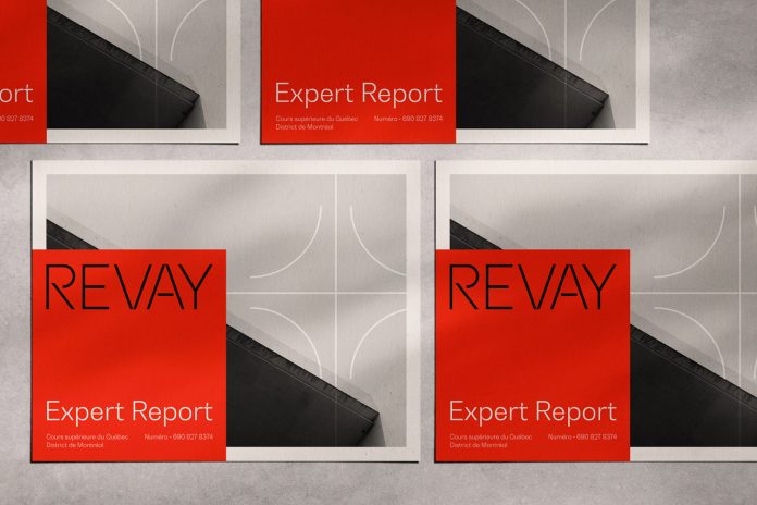
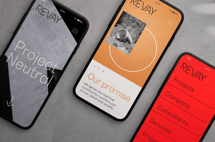
Agency Sid Lee has created a brand identity for construction management firm Revay that is solid yet light, organic yet angular.
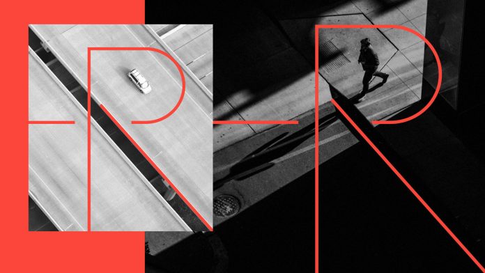
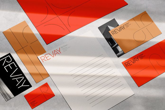
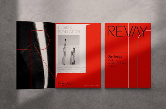
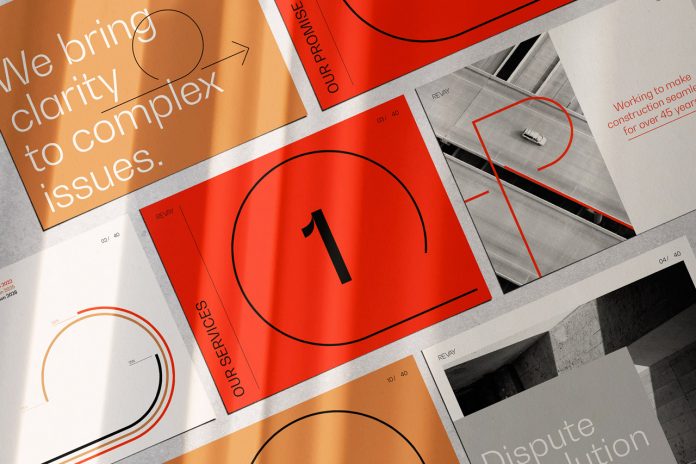
With 600 professionals working globally out of offices in Montreal, Toronto, New York, Paris, and LA, Sid Lee is a leading creative agency specializing in a variety of branding and advertising projects. The agency was commissioned to work on a new brand identity for Revay, a construction management firm specializing in overcoming complications and stimulating developments. Sid Lee came up with a logo design based on the letter ‘R’, which is inspired by the loops of highway interchanges. It acts as a visual magnifying glass that can be used independently or together with dynamic workplace images. Solid yet light, organic yet angular, the visual identity tells Revay’s brand story while reflecting their ability to bypass issues through care and attention to detail.
Below you can find a few images of the branding project. For more of Sid Lee’s creative work, please visit their website or have a look at the portfolio on Behance.
All images © by Sid Lee. Do not hesitate to browse through our Graphic Design and Branding categories to find other inspiring work created by freelance graphic designers and leading studios from around the globe.
Subscribe to our newsletter!
The post Revay Branding by Creative Agency Sid Lee appeared first on WE AND THE COLOR.

