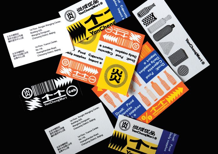
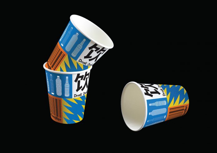
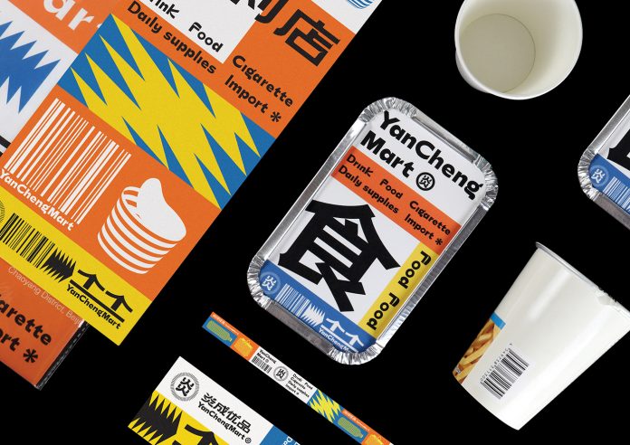
Graphic design studio Little Green (小 绿) has created a stunning supermarket rebranding for Yan Cheng Mart (炎成优品).
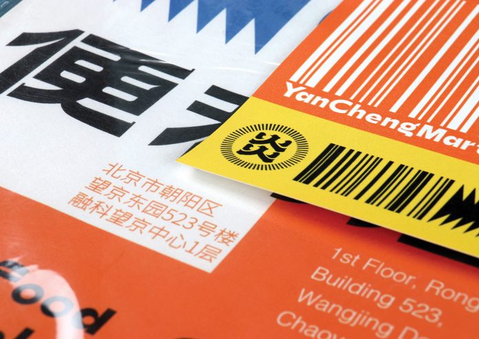
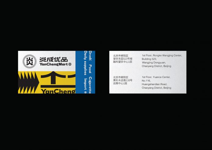
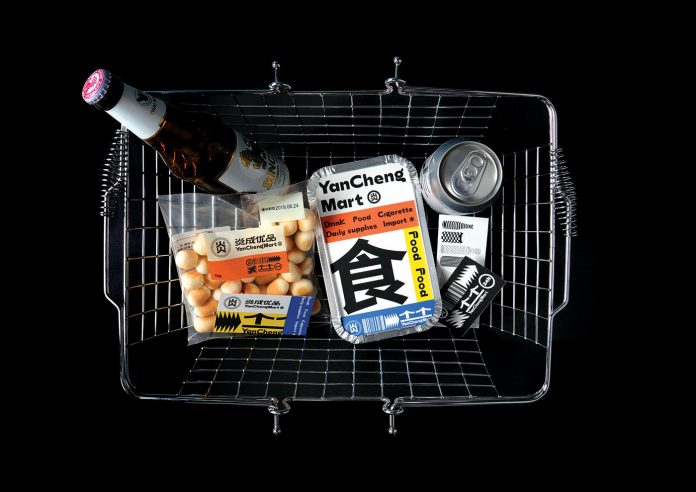
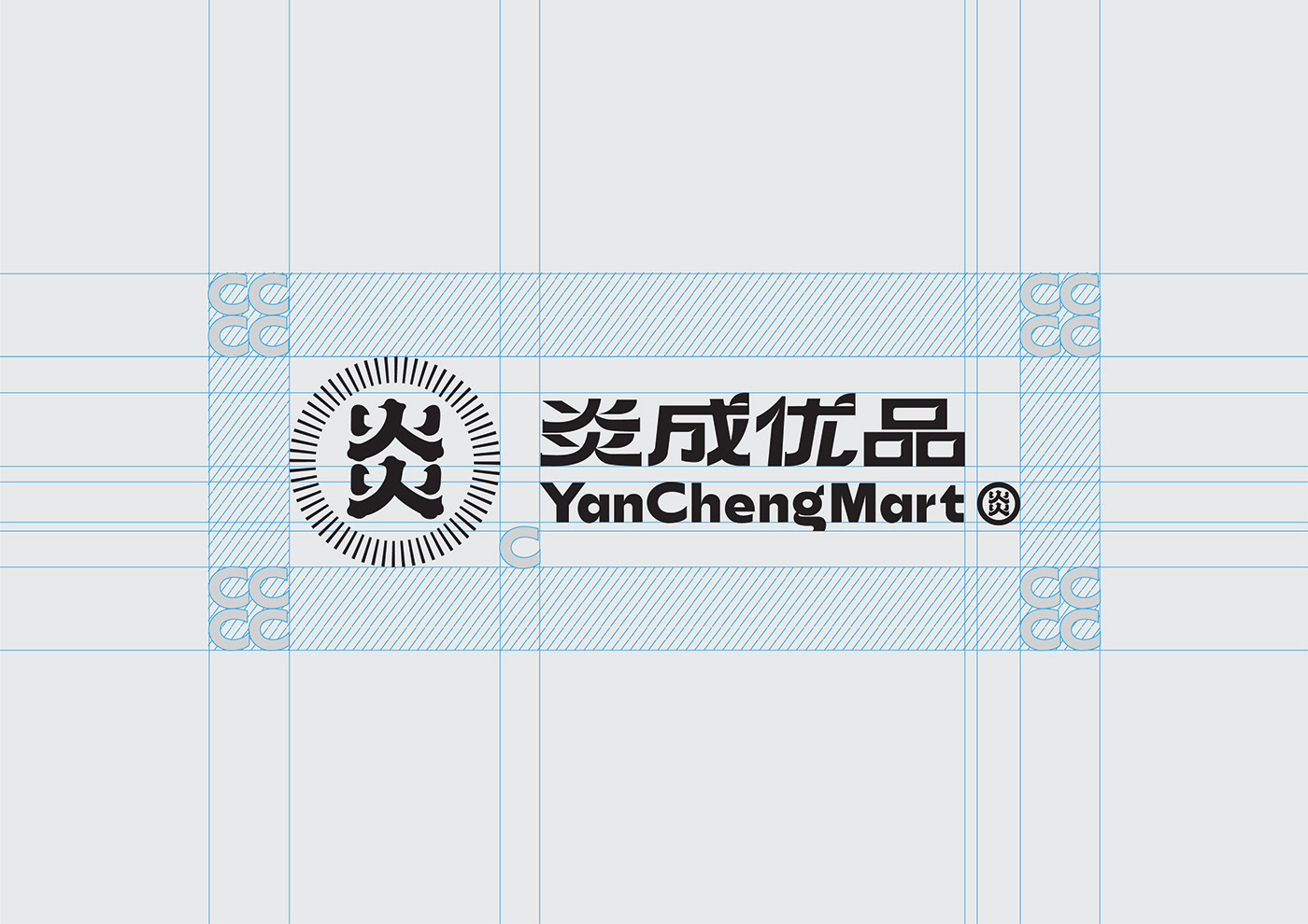
Beijing, China-based studio Little Green (小 绿) was responsible to work on a redesign of the existing brand identity of Yan Cheng Mart (炎成优品). They choose the Chinese character “yan” as the base, imitating a burning flame and the divergence of light to complete the logo. In the application of auxiliary graphics, they mainly used two-dimensional lines and color blocks to create a three-dimensional effect in a regular manner to visualize common groceries such as buns, noodles, rice, etc. This way, they came up with a visual experience based on simplicity. Due to the consideration of functionality and different consumption scenarios, tones of warm orange, blue, and yellow have been used to cope with product promotions, and to convey a festive atmosphere.
Below you can see a few images of the project. For more, please check out the portfolio of studio Little Green (小 绿).

All images © by Little Green (小 绿). Do not hesitate to have a look at our Graphic Design, Branding, and Packaging categories to find more inspiring work.
Subscribe to our newsletter!
The post Chinese Supermarket Branding by Little Green (小 绿) appeared first on WE AND THE COLOR.

