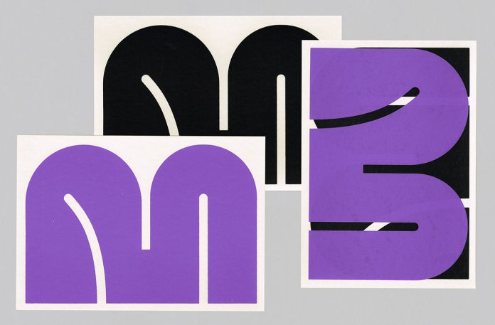
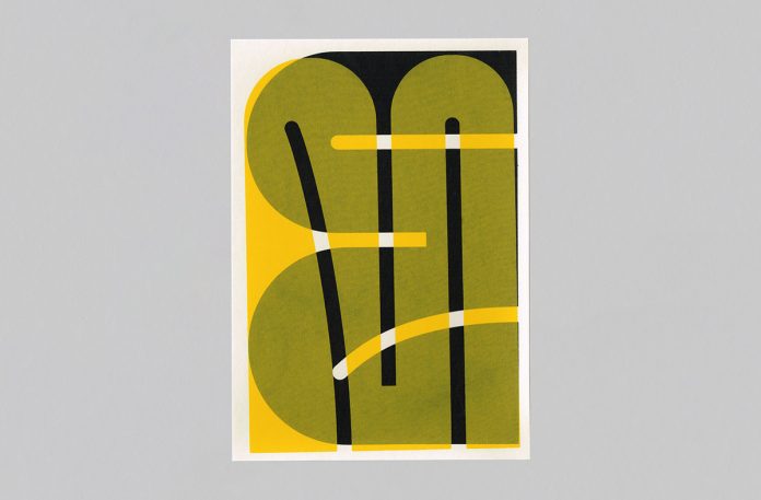
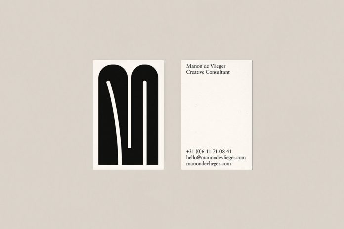
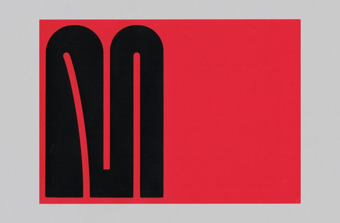
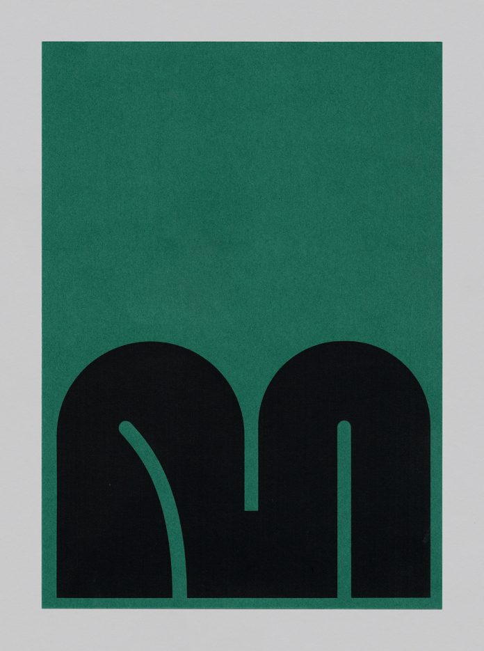
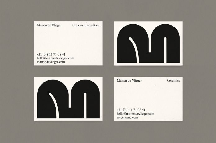
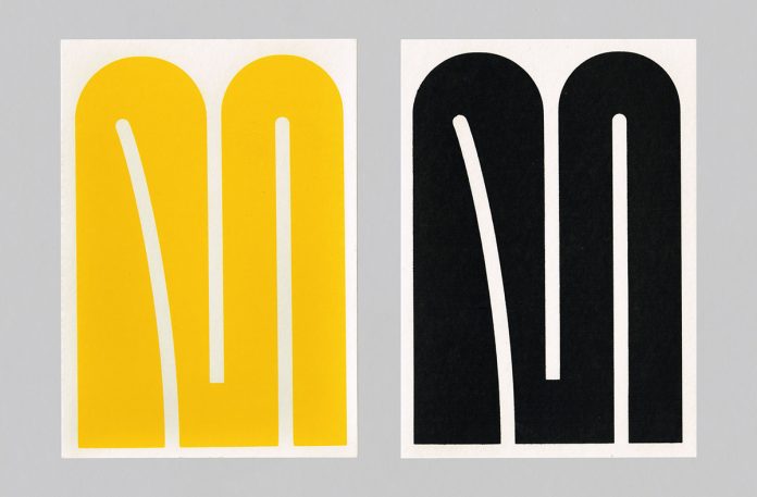
The creative team of Studio Lennarts & De Bruijn developed a simple but eye-catching brand identity for Manon de Vlieger.
Manon de Vlieger approached Studio Lennarts & De Bruijn to create a suiting brand identity for her eponymous company. The designers came up with a branding concept based on typography as a key visual. They have created a clear and simple logo and identity elements to visualize a strong, iconic, and recognizable logo.
Below you can see a few images of their work. For more, please visit SL&DB’s website or follow them on Behance.
All images © by Studio Lennarts & De Bruijn. Do not hesitate to browse through our Graphic Design and Branding category to find other inspiring work.
Subscribe to our newsletter!
The post Manon de Vlieger Branding by SL&DB appeared first on WE AND THE COLOR.

