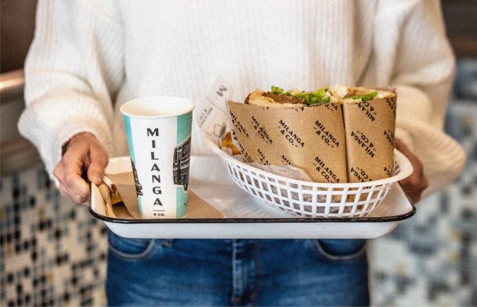
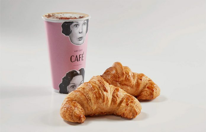
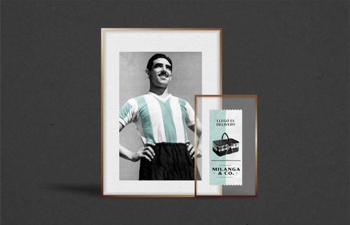
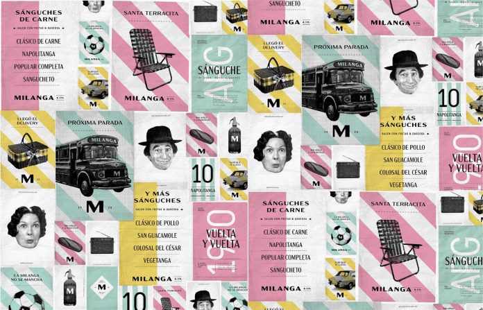
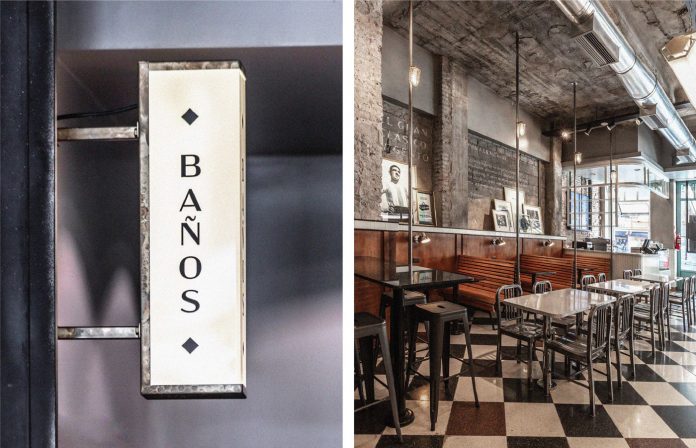
Estudio Nuar created a lovely vintage-inspired brand identity for Milanga & Co.
Estudio Nuar, a Buenos Aires, Argentina-based design firm was asked to work on a brand identity for the sandwich fast food restaurant Milanga & Co. They teamed up with Pablo Chiappori’s interior design studio to produce a visual experience based on the idea of recreating a train station, on-the-go sandwich feel. From the branding point of view, they aimed to create a design that recalls childhood memories. They included several design elements and sayings that belong to the collective imagination of the Argentinian people. The result is an identity that is timeless, instantly recognizable, and endearing. Classic images from this heritage of symbols were remixed in a contemporary visual language. Public transports and their iconic ticket patterns, pop culture references, and everyday items have been combined in a nostalgia-tinged patchwork. Below you can see a few images of the project. For more, please visit Estudio Nuar’s website or check out their portfolio on Behance.
All images © by Estudio Nuar
Creative Direction: Melisa Rivas, Manuela Ventura, and Crista Bernasconi
Graphic Design: Crista Bernasconi, Melisa Rivas, and Malena Sueiro
Copywriting: Crista Bernasconi
Architecture & Interiorism: Pablo Chiappori Estudio
Photography: Federico Kulekdjian (architecture, situations) and Milanga&Co (coffee cup, sandwich with hand)
Subscribe to our newsletter!
The post Milanga & Co. Branding by Estudio Nuar appeared first on WE AND THE COLOR.

