
![]()
![]()
Tamarind of Mayfair was the first Indian restaurant in London to receive a Michelin star. They wanted to continue to explore new ground with a new menu, interiors, and brand that was light and feminine.
We worked closely with interior designers Sagrada, who we have collaborated with on many projects.

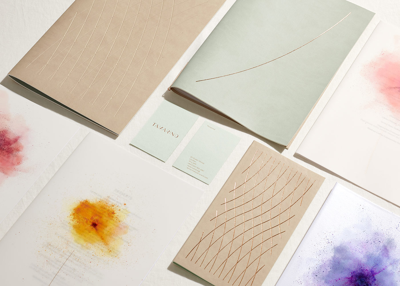
A “floral” visual language was created, loosely inspired by the holi festival and smoke from the tandoor. We commissioned and art directed John Ross on the photography of the “powder flowers.” John had done a few shoots like this but always on black and only an abstract explosion, not multiple colours creating a “form.” Changing the background from black to white had more issues than you can imagine — basically a one-day shoot turned into four and it was very messy! We then had a fair amount of help from our friends at Smoke & Mirrors on the retouching. It became a labour of love for all of us and we were delighted with the results.


Interior designers Sagrada had a subtle floral theme running throughout, from organic, curving floorboards, to botanical fabrics and wild flowers along the glazed entrance.


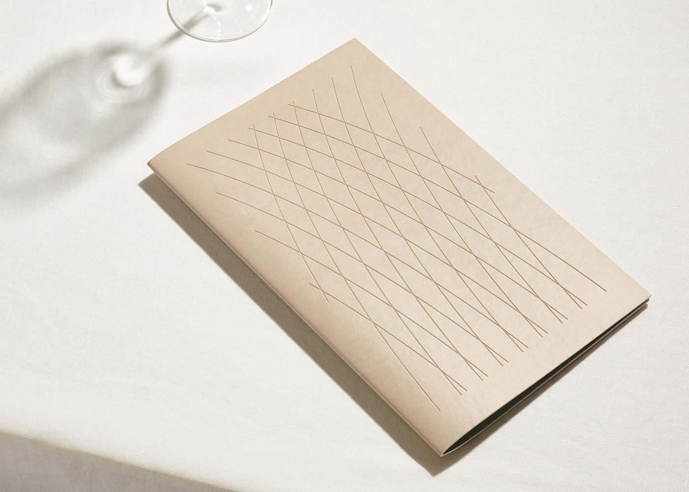
Flower stem inspired patterns were used on menus and informed typographic layouts including the tasting menu and business cards. The logo and typeface reflected the thicks and thins of flower stems. Menus used tactile materials and were a smaller format to reflect the light touch of the new cuisine. The brand “flowers” were printed onto a translucent material which took inspiration from steamy conservatories.
The website interpreted the tactility and materiality of the printed items through soft colour fades and images gently going in and out of focus. We commissioned a suite of interior and food photography as well as the copywriting which all imbued the light and delicate quality of the surroundings.


“Flower” imagery: John Ross
Retouching: Smoke & Mirrors
Print: Boss (business cards by Generation Press)
Website programming: Neal Fletcher
Interiors & food photography: Yuki Sugiura
Copywriting: Nick Asbury
Dutchscot elsewhere on ID: Meraki.