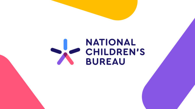
UK children’s charity, the National Children’s Bureau (NCB) has launched their first rebrand in 12 years.
The charity, which works across the issues affecting children to influence policy and deliver a better childhood for the UK, approached us to help tell its story with renewed clarity.
NCB’s role has never been more important. Years of austerity have seen funding for children’s services and education cut by local authorities and central government while the demand for support has increased. In this climate, the charity wanted to refocus how it articulates its impact.
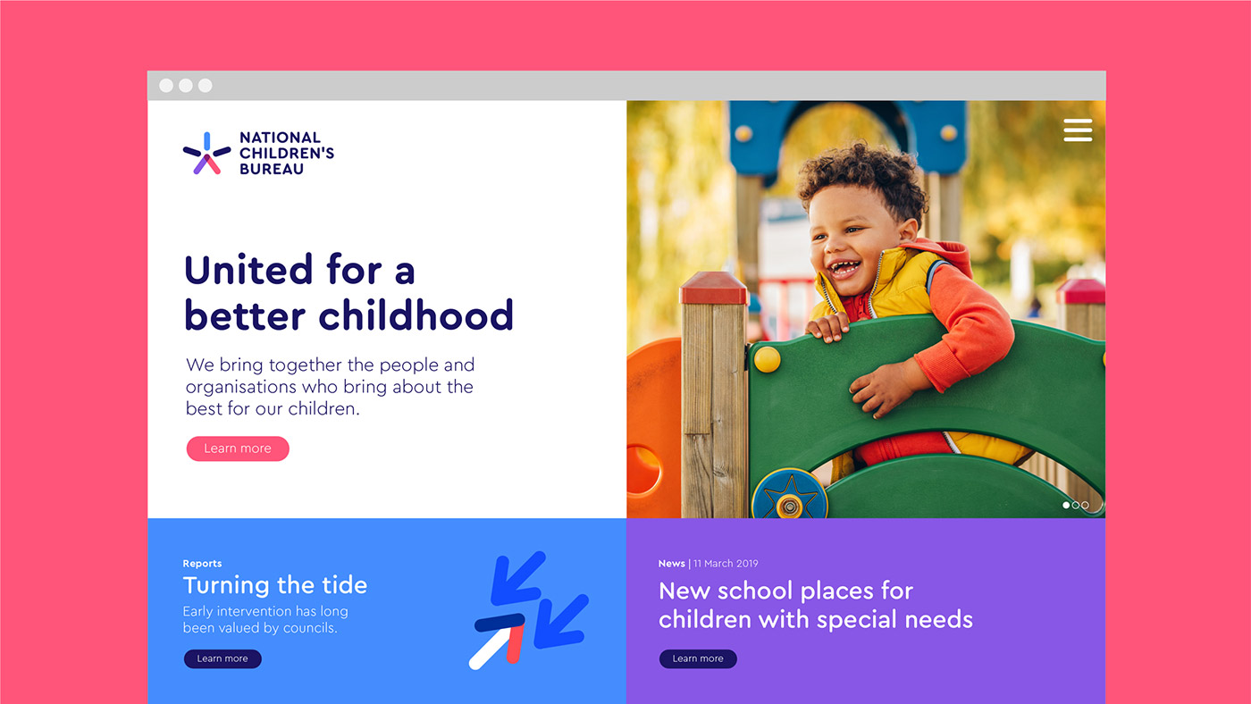
NCB’s strapline “United for a better childhood” was the springboard for evolving the story. The charity was doing a great job talking about how it was united internally, across its family of brands, but there was so much more it was doing for external partners. From parents and children, to central government and other partners, NCB brings together the people and organisations who bring about the best for our children.
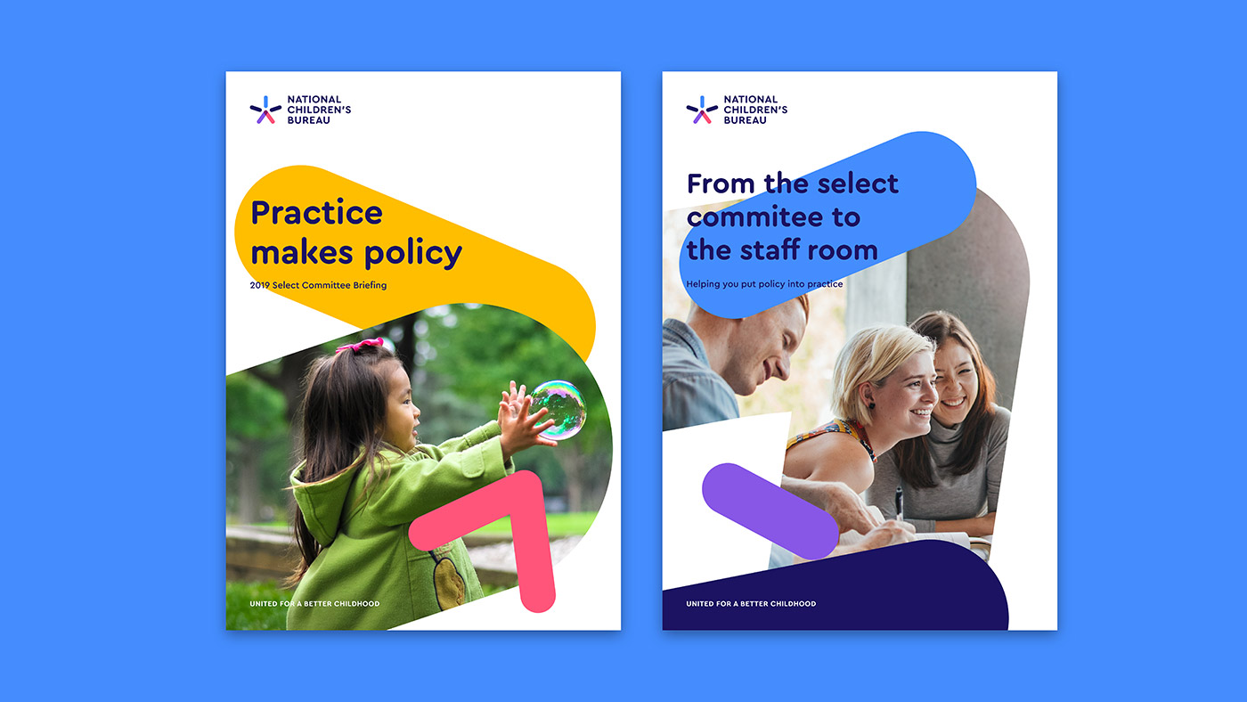
This truth informed a playful tone of voice, with headlines including “From the playground to Parliament” and “From the staff room to the select committee” capturing the breadth of NCB’s impact and delivering a clearer message for funding sources.
Visually, the challenge was to deliver a brand identity system that could flex for such a wide range of audiences – from a pre-schooler to the Prime Minister — also flexing from issues as sensitive as childhood bereavement, to celebrating successes in childhood and teaching.
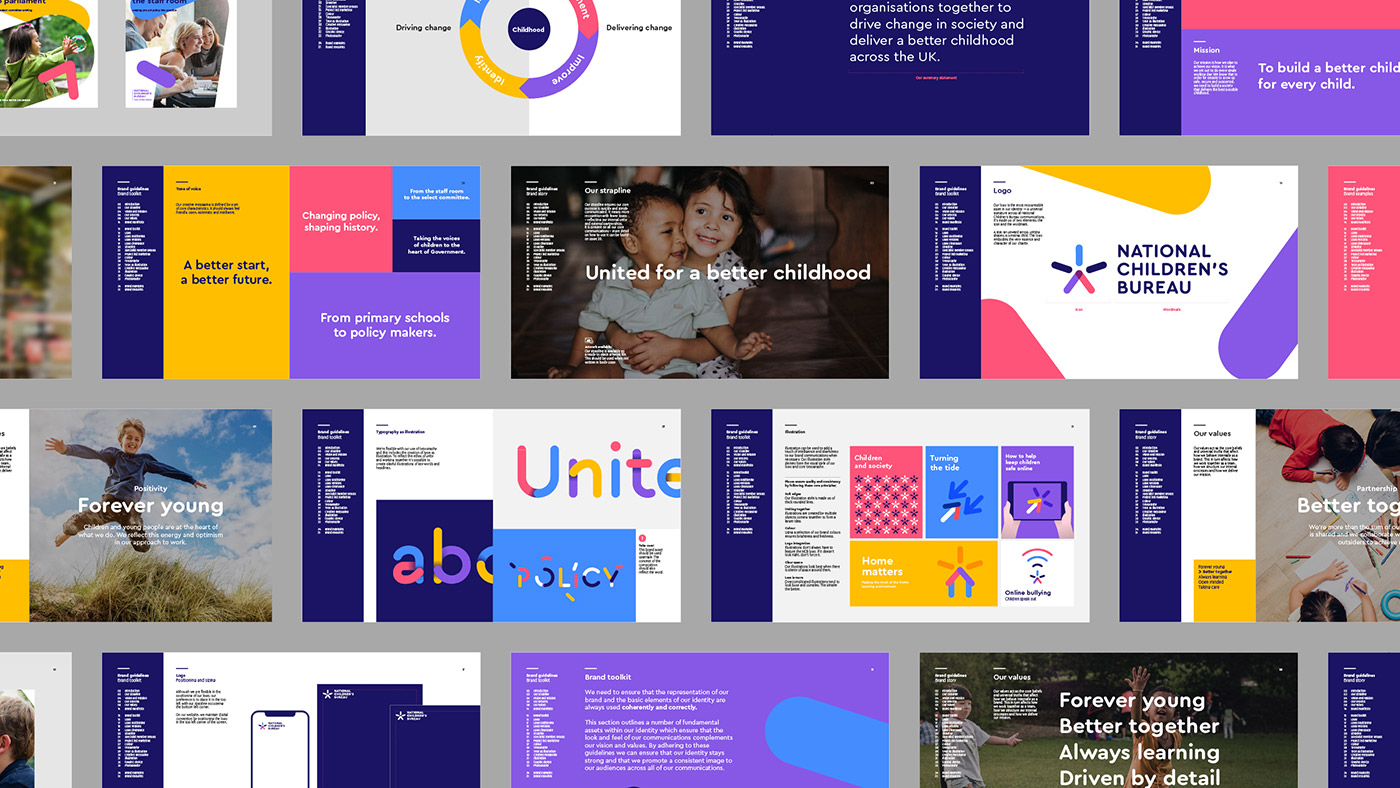
The logo captures the very essence of “United for a better childhood.” It’s a star, a jumping figure, an upwards arrow – the symbol provides a refreshed energy and sense of optimism.
The colourful shapes that inform the logo are also used throughout the rest of the look and feel, reinforcing the concept of working together and creating positive, long-lasting change.
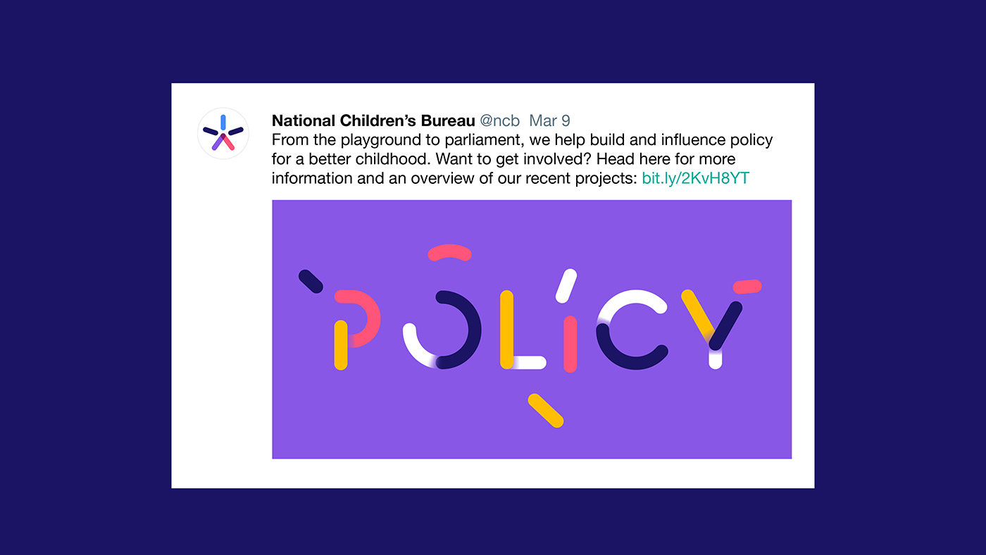
We also created an illustrated typeface to build on the concept of unity. This is combined with an illustration style that enables the charity to communicate complex issues in a simple and intelligent way, now and into the future.
Anna Feuchtwang, Chief Executive of the National Children’s Bureau, was closely involved in brand refresh:
“For more than 50 years, the National Children’s Bureau has worked to champion the rights of children and young people in the UK. In 2019, we started work in a new office, so we decided it prudent to update our brand and look forward to the next chapter of our work. The brand re-design was achieved using our business-as-usual communications budget, with much of the work implemented by our hardworking in-house communications team. The new look is an exciting improvement, and applying the brand as we moved into our new office space in East London, has helped keep costs down to a minimum, while emphasising a new era in NCB’s long history.”
We worked with the charity’s internal marketing team to help launch the identity across applications including brand guidelines, office graphics, and a new website.
Lantern elsewhere on Identity Designed: Primal Roots.


