We are always in awe of the exceptional work coming from agency A Friend of Mine. Creative Director Suzy launched the agency in 2009, with 15+ years of design experience. Their work continues to impress us and this piece is no different.
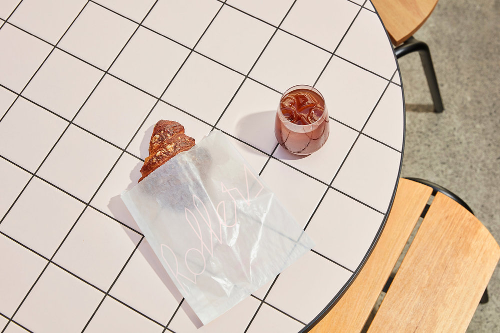
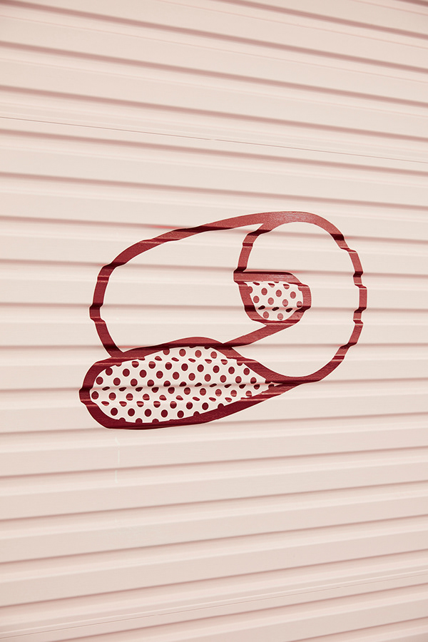
Rollers, based in Sydney, is a new pastry bakehouse experimenting with simple pastry formats to create new and exciting flavours. A Friend of Mine created a relaxed, clear and quirky brand identity featuring custom typography.
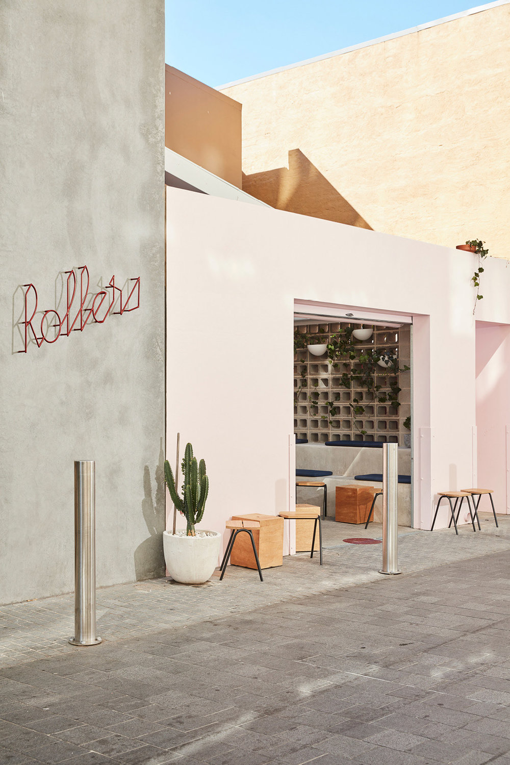
The strong, cursive typography leads this interesting brand identity. The typography style reminds us of a 50s American diner, which wouldn’t look out of place as a neon light. This familiar aesthetic is at once reminiscent of and at odds with their approach to food. Their pastries are intended to be new and refreshingly innovative within the confines of a traditional and familiar product.
According to A Friend of Mine, the signage was an integral part of the placemaking in a location so hidden away from main foot traffic. The logo adorns the wall outside the bakery. Made from wrought iron is designed to cast a different shadow throughout the day.
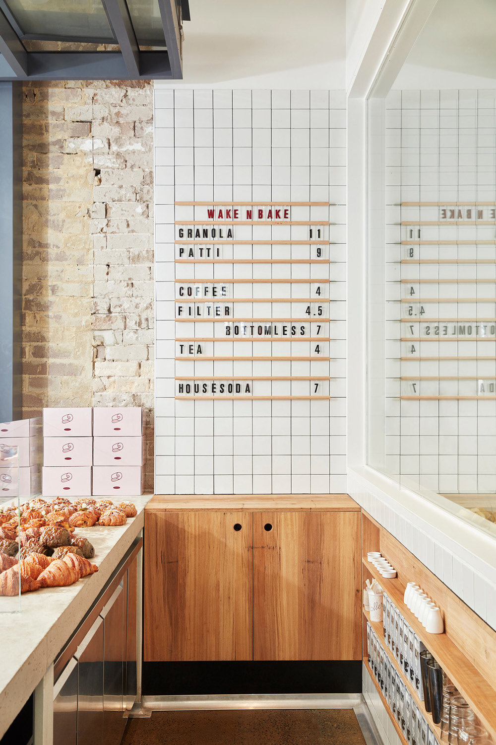
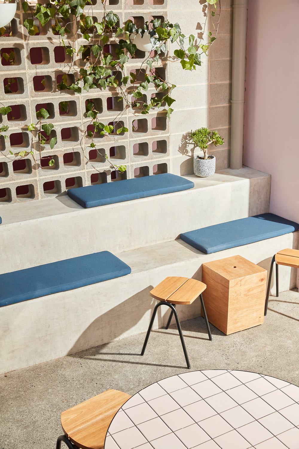
This trendy bakery is obviously branded angled toward the stylish Australian crowd, with their generous use of ‘millennial pink’ and stylish interiors made for Instagram. This simple but stylish approach is familiar in the realms of brunch and patisserie dining, with peers such as Hoeked Doughnuts and Tartine Bakery, and we love to see the continued use of satisfying simplicity in beautifying the places in which we meet, brunch and make merry!
See more from the outstanding A Friend of Mine on their website here.

