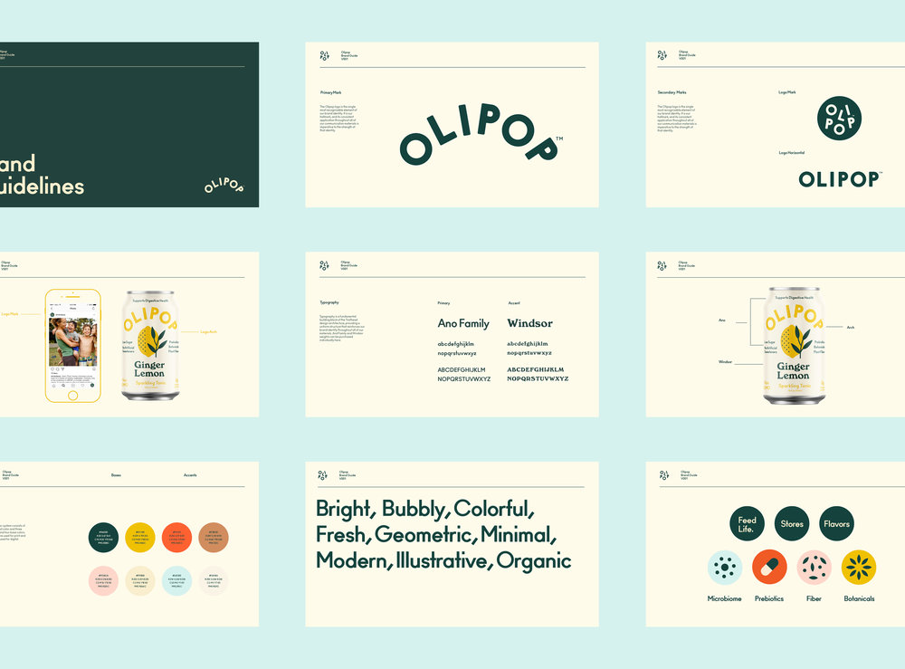
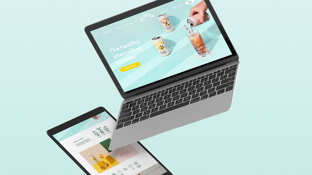
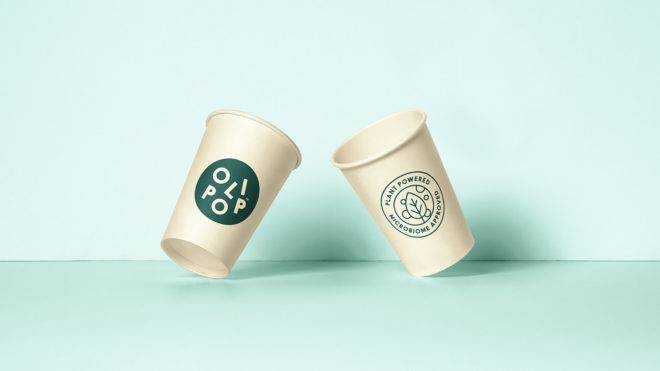
Break Maiden have designed a strong, bright and first-rate brand identity for Olipop drinks brand. The first clinically backed digestive health beverage was desperately in need of a brand refresh and Break Maiden have they done just that.
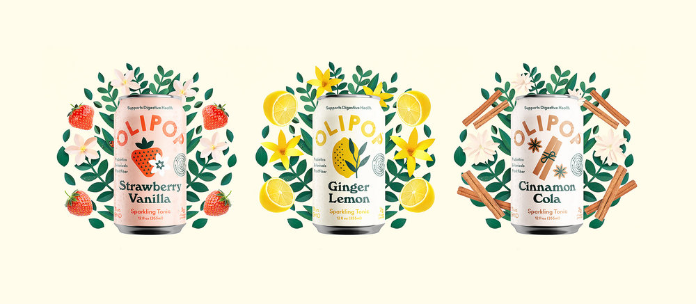
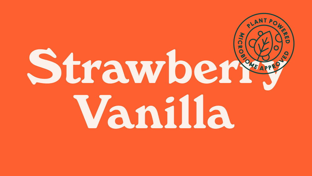
With links to old cola style typography, they’ve created a strong type approach with a classic look. This gives the packaging a fun, nostalgic look and feel with allusions to the simple and wholesome nature ascribed to many products of the past. Alongside the typography, Break Maiden have added some lovely fruit illustrations, these simple vector drawings give the packaging a clean and playful feel.
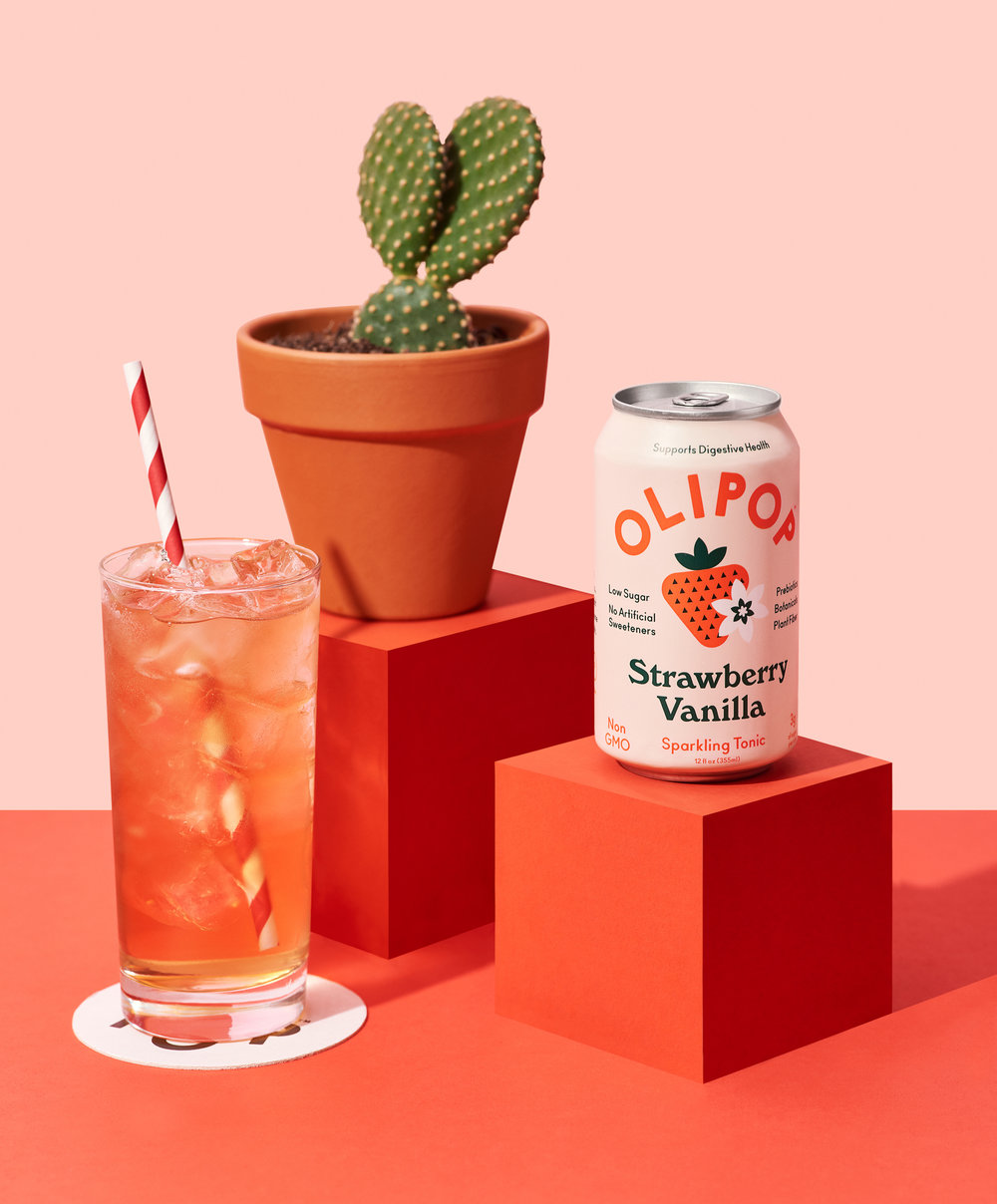
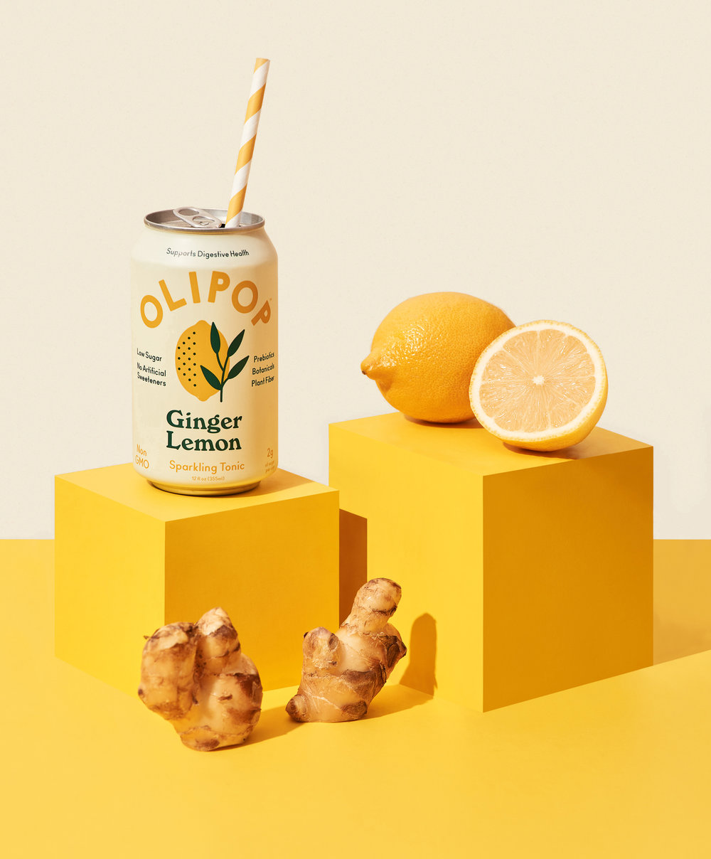
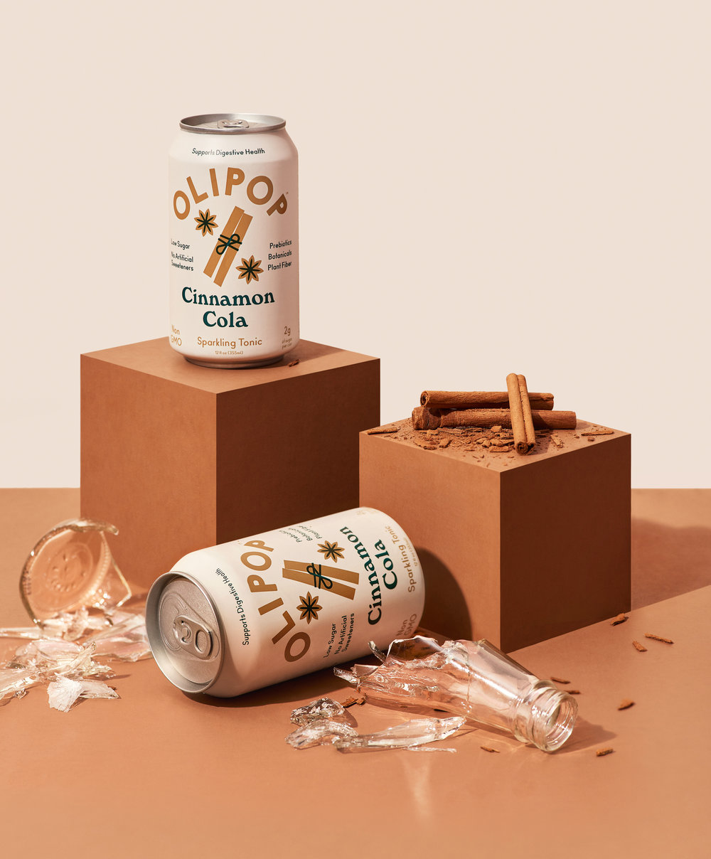
The launch of Olipop’s new look was presented with these brilliantly art-directed shots, photographed by Andi Devon. The photographs use the same colours as those on each pack and give a fun, cutesy approach using matching striped straws and feature some of the ingredients in the drinks. The photography certainly shows of the brilliant palette chosen by Break Maiden and these photographs help bring the whole project to life.
The branding screams tasty, stylish soft drink. A delicious and sparkling look for digestive health, with fibre, prebiotics and botanical extracts.
To see more work from Florida’s Break Maiden studio, see here.
And more photography by Andi Devon here.

