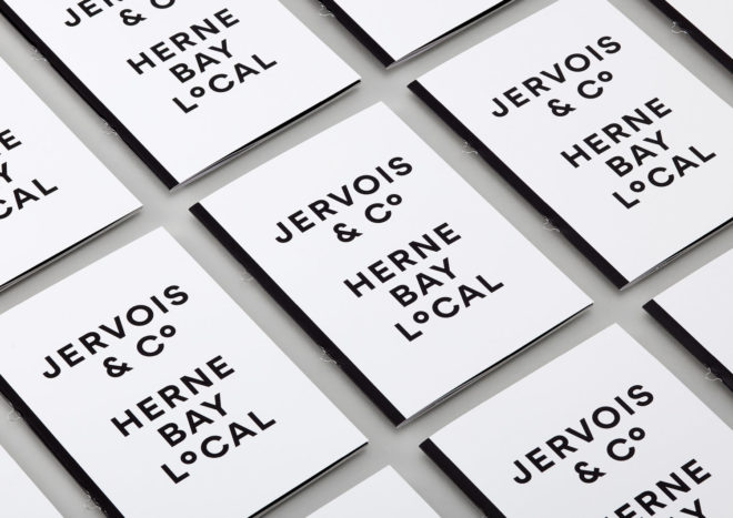
Jervois & Co is the big new player in Auckland’s local residential business. Led by Amy Wildman, a one-woman band, Jervois & Co focuses solely on Herne Bay. Amy offers a refreshing estate agent approach based on honesty, tailored marketing and a ‘charge less, do more’ ethos.
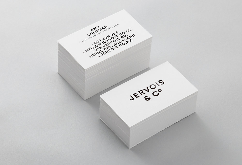
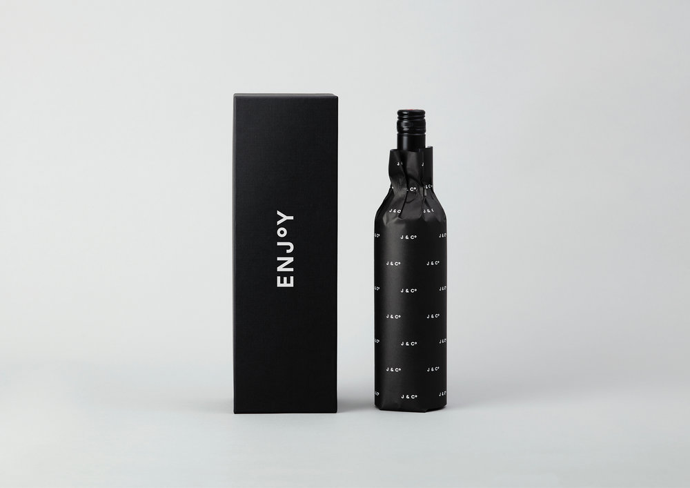
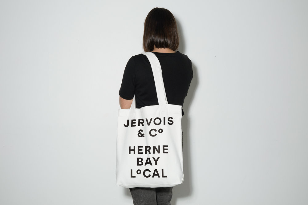
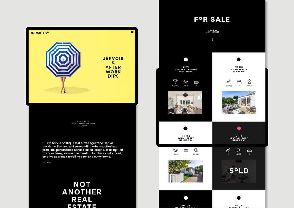
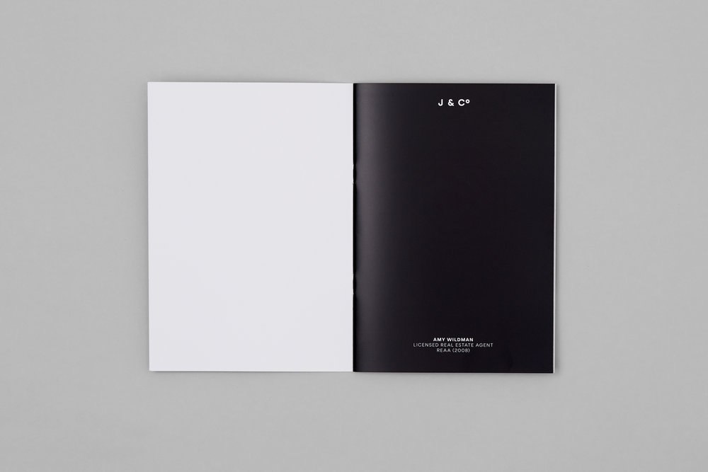
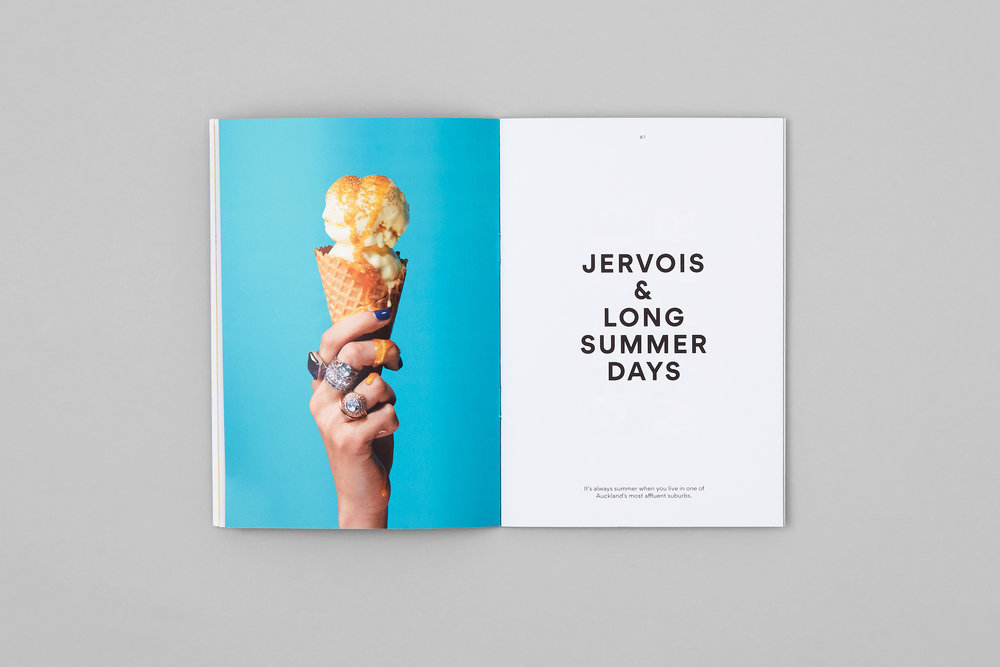
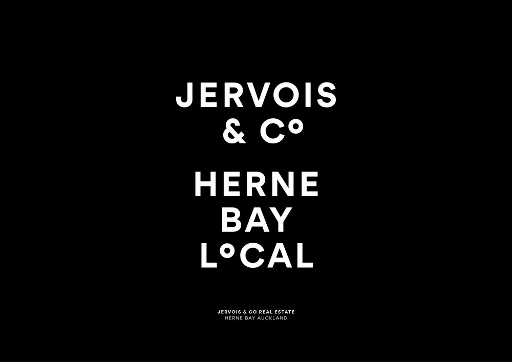
Seachange studio have developed a flexible, modern brand that speaks to all audiences. With a clean and classic san-serif doing most of the work, the design can be smooth and fresh whilst remaining enthusiastic and message-driven. In the brand’s logo, Seachange have opted for a superscript ‘o’, linking back to the ‘Co’ in the logo, as well as referencing the longitudinal/latitudinal degrees symbol.
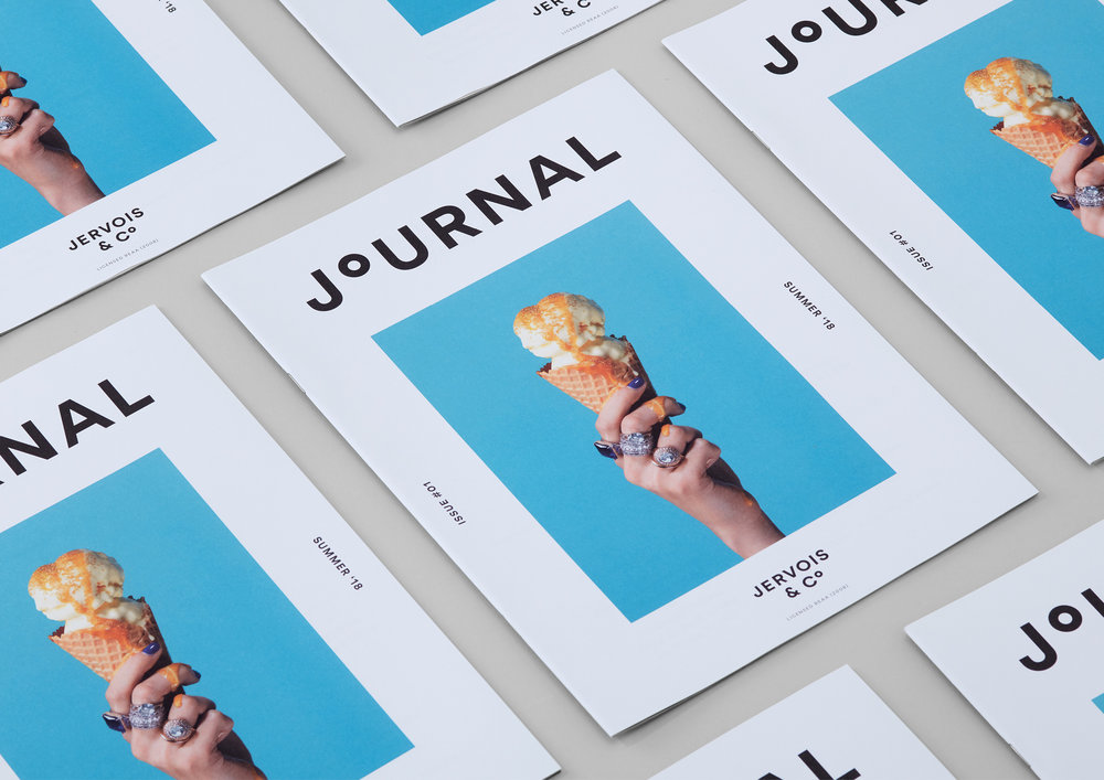
The branding itself stands well out in a corporate estate agent world, it wouldn’t look out of place as a new fashion brand. The campaign images aren’t like the usual competition, it’s smooth and stylish, with a pop-art, attention-grabbing look.
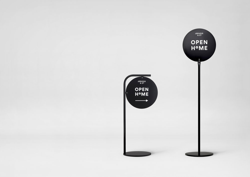
Seachange also created a number of custom made For Sale and Open Home signs, made from powder-coated steel, to fit in with the brand. The straightforward signs are understated but have a modern flair to them thanks to a combination of the typography and unusual signage as a medium.
A well thought out brand which is distinctive within it’s corporate world, with lovely typographically-led branding. Amy is sure to show the competitors who’s top dog.
To see more work from Seachange, click here.
