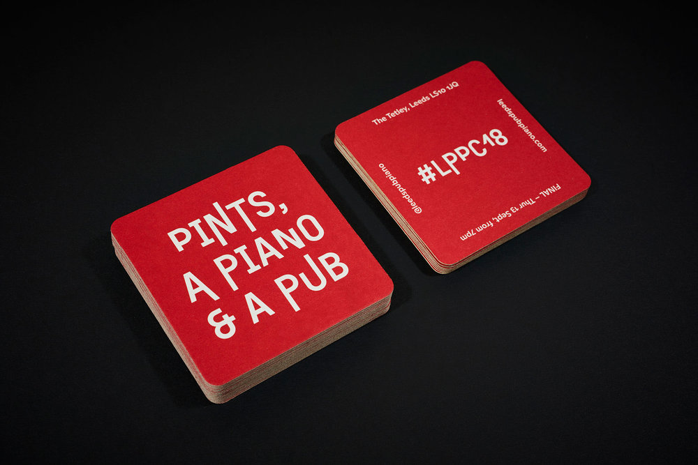
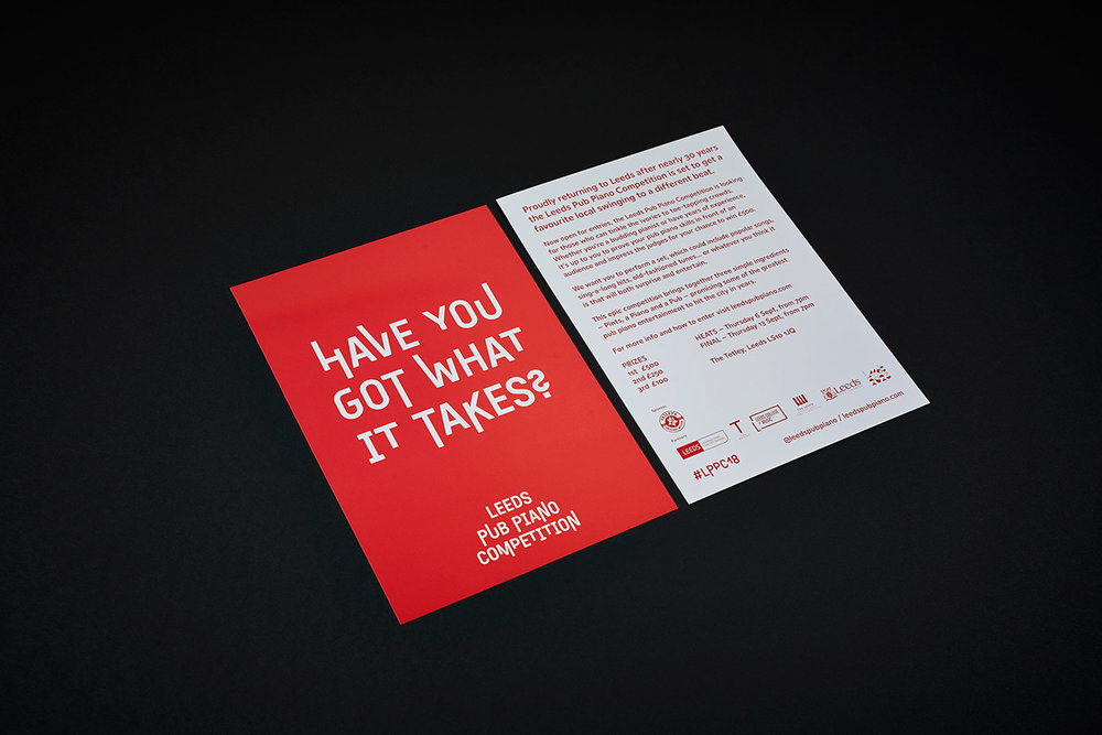
Leeds Pub Piano Competition returned to Leeds after nearly 30 years this year. The LPPC, for short, brings together three simple ingredients: Pints, a Piano and a Pub. A fine combo!
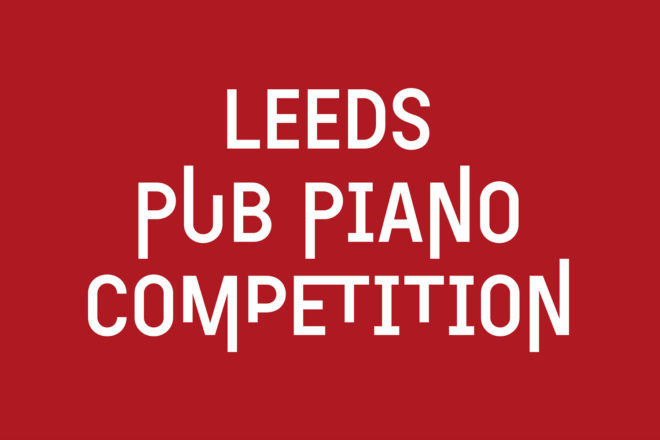
The brilliant Saul Studio, also based in Leeds, were asked to create this exciting brand identity. Using typeface Exposit (TIGHTYPE), who’s vertically changing characters develop and respond to the music of a Yorkshire folksong, they’ve added a playful side in the logo (see here!). The brand is placed squarely in the atmosphere of a lively pub, tying together type, style and attitude to emulate a pint, piano and pub feel in the design itself.

An effective brand identity that’s been pushed typographically and implemented to a sharp, well thought out standard.
You can find out more about Leeds Pub Piano Competition over on their instagram and more brilliant work from Saul Studio can be found here.


