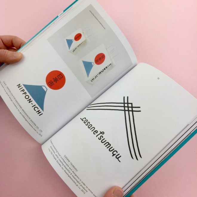
A few years ago, the UK-based design store and publisher Counter-Print released a book that surveyed contemporary graphic design in Japan. Realizing that it had amassed a massive range of logos, the team decided to work on a follow-up publication focused on these symbols of identity alone. The result, published late last year, is an simple but elegantly printed reference that captures current trends in Japanese visual branding.
At 60 pages long, the book features a diverse variety of logo types, from those for factories to those for pharmacies, bookstores, bakeries, and even a tofu store, whose geometric logo is a clever take on its blocky products. There are a few examples that might be recognizable to readers outside of Japan, such as Uniqlo’s red-and-white logo, but most are designed by smaller businesses. Logos from Japan is image-heavy, with just a short introduction by Counter-Print’s co-founder Jon Dowling, which provides a very brief history of Japanese logo design.
“One reason Japanese design stands apart from that of many other countries is that it doesn’t always follow the strict international code of design in evidence today,” Dowling writes, referring to the influences of the International Typographic Style, or Swiss Style. “Japanese design is unique in the way that it unites traditional and modern aspects of design.”
Dowling explains how Japanese graphic design has roots in the traditional artistry of ancient seals, beautifully handcrafted shop signs — known as kanban — and family crests. Uniqlo’s logo, for instance, is a modern take on the four character stamps, usually dipped in red ink; many other logos are structured within the circle, which was used for centuries to contain mon, the embellished emblems of different clans.
The book is divided into thematic chapters that highlights some interesting trends across different industries. “Architecture,” for instance, centers entirely on logos that integrate the shapes of roofs, both western and Japanese; “Nature” focuses on those that incorporate natural landforms — Mount Fuji, unsurprisingly, is a common motif. There are also separate sections for logos with the Latin alphabet and for those with Hiragana, Katakana, and Kanji characters. The latter stands out on its own as a fascinating overview of contemporary Japanese typography.
Logos from Japan is not a comprehensive survey but rather a collection of logos handpicked by Counter-Print, so the selections inherently reflect a bias. But the hundreds of examples collected succeed in representing a range of styles; together, they offer a satisfying glimpse into the lively landscape of Japanese design.
Logos from Japan is available through Counter-Print.


